Food Packaging
Yellowbird by Gander
Sauces, oils, seasonings and condiments are consistently thriving categories in direct-to-consumer packaged goods. These high-margin, shelf-stable products can be easily differentiated with unique flavours and ingredients, and have high branding potential that can quickly adapt to trends. Right now, hot sauce its having its moment, with celebrities from Ed Sheeran to Brooklyn Beckham jumping on the band wagon, following trailblazers...
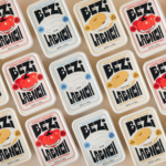
Bezi by Red Antler
Bezi was founded by Ilay Karateke – an Istanbul-raised, New York-based, ex-McKinsey consultant turned cheesemaker – and Hasan Bahcivan – a Berkeley-trained engineer from one of Turkey’s largest and most legacied cheesemaking families. Both grew up in large families, with their lives punctuated by big family-style meals shared with friends and neighbours. Labneh, a Middle Eastern spreadable cheese, was ever...
Wholy Greens by Control Studio
Wholy Greens is a B-Corp certified Dutch food brand dedicated to transforming the way people perceive and enjoy vegetables. Its mission is to create a mindset shift from ‘having to eat veggies’ to ‘genuinely loving veggies’ – and it uses pasta as its primary vehicle. It’s a smart set up, not least because, frankly, what experiences aren’t more enjoyable when...
Coolhaus by &Walsh
Dessert-centric power couple Natasha Case and Freya Estreller met in around 2008, soon forming a partnership in both life and business: Coolhaus, a range of ice creams and other frozen treats that looks to inspire other female and LGBT+ founders. For those thinking, ‘what, like Rem Koolhaas?’ – yes, you’re right. Estreller originally trained as an architect, and before Coolhaus-proper...
Isle of Wight Tomatoes by B&B Studio
Having grown up near Portsmouth, the Isle of Wight carries a certain resonance, though perhaps unfairly. Aged around 14, when getting served in off licences/particularly lax pubs wasn’t always a given, we’d sometimes pass the time watching the IoW ferry. It felt rather bleak, and somehow a bit futile, just bobbing back and forth between two destinations (Southampton and Cowes)...
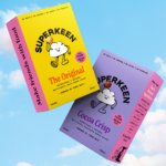
Superkeen by B&B Studio
There has never been more awareness of allergens and inflammatory ingredients, with lupins and sulphites now on the mainstream radar alongside common culprits like gluten and dairy. At the same time, nostalgia and anemoia (‘a feeling of yearning for a past that you never experienced’) have become driving forces shaping contemporary tastes. Direct-to-consumer cereals neatly bridge a gap in this...

Toundra by LG2
There’s always something intriguing about niche, singular companies, stores and brands. When I was growing up, I distinctly remember a shop that sold only various things made out of wicker, for instance. It both intrigued and baffled me then, before I understood the concept of a ‘front’, a la (or so rumour has it) the numerous shops that once lined...

PURLOM’s ¡A LA MESA! by Onmi Design
I’m reluctant to bring up the pandemic again, four years later. But I can’t help think back to that period when seeing images related to gatherings, which are employed to great effect in Onmi Design’s work for PURLOM, a family business with more than 40 years of experience producing and distributing a wide variety of meats. This kind of imagery...

Erbert by AUGE
Few countries on Earth take their food as seriously as Italy. It’s not difficult to justify the enormous pride Italians take in their spectacular culinary heritage, with their cuisine considered the ‘most exported’ on the planet. But while the wider world is undeniably in thrall, Italians’ patriotic palettes create and necessitate a notoriously conservative domestic cooking culture. Italian ingredients, recipes...

Entrée by Saint Urbain
More than three years since the outbreak of the Covid pandemic, we’re in a strange situation when it comes to all the things that flourished due to lockdown – grocery delivery services like Getir, et al; streaming services that poured literally billions into what once seemed like a never-ending gold-rush of content-consumption; flashy home-centric lifestyle brands like Peloton. Indeed, the...
Food Nation by Seachange
It’s about time plant-based brands found their sense of humour. Having been a vegan for 17 years now, I can safely say that veggie/vegan brands have historically been tiresomely dull – and until recently, they’ve been allowed to be. But with the recent years’ boom in all things ‘plant based’, simply existing because there’s no other type of soy milk...
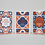
Riso D’uomo by Here Design
Riso D’uomo is a Milanese Carnaroli rice brand, cultivated from the same stock over hundreds of years, and grown within sight of the historic Duomo di Milano. Carnaroli is often referred to as ‘the king of rice’, and is known for its high-quality nutritional properties, cooking consistency and a ‘bite’ that makes it ideal for risotto. Taking inspiration from Riso D’uomo’s provenance, specifically the ornate...