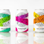
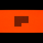
Vocation Brewery by Robot Food
Vocation is a UK microbrewery, established and run by John Hickling, with a range of craft beers that have distinctive and punchy flavour profiles, and a visual identity, packaging design and naming convention created by Leeds-based studio Robot Food. This draws on the tropical, fruity, floral and hoppy characteristic of the range, and the brewery’s fearless, daring and renegade attitude. This post was updated March...
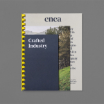
Enea by Clase bcn
Enea is a contemporary furniture manufacturer with a site in the Basque Country. Collaborating with designers Josep Lluscá, Gabriel Teixidó and the trio Lievore Alhterr Molina, Enea has developed a catalogue of versatile, comfortable, durable and functional products for the private and commercial markets. Seeking to differentiate itself from its competitors and with a desire to avoid cliches of the...
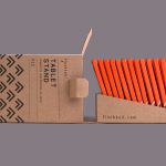
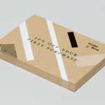
Finchtail by Believe in
Finchtail is dedicated to the design and manufacture of simple, useful and sustainable solutions to everyday problems. Its first product, a low-cost, flat-packed card tablet and mobile phone stand, features a distinctive brand identity and packaging design treatment developed by UK based graphic design studio Believe in. Monospaced type and corrugated card sit alongside die cut detail, white ink, a bold pattern...
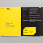
The National Institute of Dramatic Art by Maud
The National Institute of Dramatic Art is a national education and training organisation for the performing arts in Australia, and is responsible for developing the talents of some of the country’s biggest stars. With the continued democratisation of performance through digital platforms such as Youtube, and concerns that this had the potential to undermine NIDA’s conservatoire approach, NIDA pursues a...
Simon Pengelly by Spin
Pengelly Design is a British furniture and product design studio, founded by Simon Pengelly in 1993, that embraces a material and process led approach to problem-solving, and an aesthetic that has a lightness, simplicity and timelessness. Since its foundation, the studio has gone on to secure and complete a variety of national and international furniture, transport and product design projects in collaboration...
Design Museum by Bond, Finland
Designmuseo is a Finnish design museum, housed in a late 19th century building by architect Gustaf Nyström, and located on Helsinki’s Korkeavuorenkatu Street. The museum exhibits national and international work from the fields of fashion, industrial and graphic design, and, alongside its permanent exhibition of Finnish design from 1870 to the present, also hosts a variety of temporary exhibitions throughout the year....
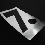
Hardpop 7 Years by Face
Hardpop is an electronic music venue located in the Mexican city of Juárez. It plays host to both international and national DJ’s and has been acknowledged twice by DJ Magazine as one of the best clubs in the world. Hardpop’s brand identity, a contemporary interpretation of military insignia, and a mix of conventional and unconventional typographic forms created by graphic design...
Markus Form by Lundgren+Lindqvist
Markus Form is a contemporary furniture company, founded with the intention of revitalising Sweden’s furniture industry, and with an ambition to produce relevant, practical and easy to match designs that are durable and sustainable. The company’s furniture will also draw on a significant Swedish and Scandinavian design culture and heritage that unites ergonomics, functionality, craftsmanship and a good working knowledge of materials, whilst also...
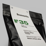
Beanworks by Paul Belford Ltd
Beanworks is a UK wholesale coffee roaster and supplier, coffee machine specialist and barista training school. It prepares its beans using a customised vintage Italian drum roasting machine that allow it to digitally monitor process, and produces a range of single and multi-origin coffee varieties. Although the roaster embraces contemporary artisanal coffee culture, when it comes to naming conventions it favours the utility of numbers,...
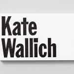
Kate Wallich by Shore
Kate Wallich is an American award-winning choreographer, dancer and director whose work has been commissioned and presented nationally and internationally by arts organisations such as On The Boards, The Frye Art Museum and Northwest Dance Project, amongst many others. Alongside Lavinia Vago, Kate Wallich is also founder of Seattle based contemporary dance company The YC, and teaches her own brand of movement...
Decontoured by Bunch
Decontoured is a Milan based, by appointment only, fashion label that provides a bespoke service for redesigning existing garments. Its philosophy is firmly rooted in an aesthetic sustainability and value that transcends seasonal fashion trends, and acknowledges a shift in consumer behaviour from the mass-market towards conceptual products and personalised practices. The label’s approach is one of collaboration, craft, innovation...
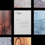
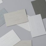
Husler & Rose by Post
Husler & Rose is an online boutique and occasional pop-up store that retails thoughtfully designed, carefully constructed and long-lasting furniture, homeware and lifestyle objects sourced from across the UK and Europe, professionally and sensitively restored by owner and furniture maker Ben Rowland. Inspired by Herbert Bayer’s Bauhaus posters and the jazz record sleeves of Duke Ellington, London based graphic design studio...