Raiffeisen Rechenzentrum by Moodley
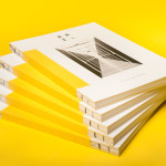
The Raiffeisen Rechenzentrum is a customised IT infrastructure service provider and subsidiary of Raiffeisen Landesbank with a modern, ‘high availability’ and maximum security data centre located in Austria. Design agency Moodley recently developed RRZ’s brand identity—which included a logo, business cards, brochure and website—based around a single sans-serif, a contrast of humanistic and technological imagery and a white, black and bright...
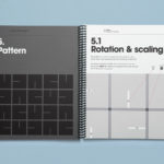
Norwegian Academy of Music by Neue
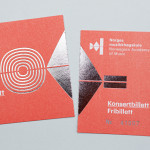
Located in the Majorstuen district of Oslo The Norwegian Academy of Music is Norway’s largest music academy. It offers both undergraduate and post-graduate courses, has educated some of Norway’s most prolific musicians, and, according to Wikipedia, ‘attempts to lay the foundation for research within the various fields of music’. Based around the concept of an ‘endless visual pulse’, design agency Neue developed a new generative...
December’s Top 5 Projects 2013
This month’s highlights have included new packaging work from Believe In, Graphical House, Port Clarendon and Peter Gregson, brand identity projects by RoAndCo and For Brands, as well as a new visual identity and interior design solution by Savvy for Mexican seafood restaurant La Peñita De Jaltemba. However, five projects really stood out for me which have made it into BP&O’s...
Seam by For Brands
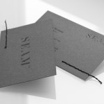
Polish design agency For Brands were recently commissioned to create a new visual identity for Seam, a distributor of luxury clothing brands, that would convey a sense of craftsmanship and an eye for detail. For Brands mixes classic typographic detail with contemporary customisation delivered across tactile material choices with hand finished detail, fusing urban, craft and fashion sensibilities....
Cemento by S-T
Cemento is the UK distributor of an Italian lightweight concrete product that can be used for wall panelling and furniture. Inspired by brutalist design — a movement that grew out of early 20th century modernist architecture and described by Wikipedia as being “linear, fortresslike and blockish” — London based studio S-T developed a visual identity for Cemento that included logo, logotype, brand...

Bundle by The Company You Keep
Bundle is a service established by Sarah Cole that provides mums-to-be with a curated bag containing everything they need for their stay in hospital. Melbourne based design studio The Company You Keep (TCYK) developed a visual identity for Bundle that, through colour, bold sans-serif typography, the high quality perceptions of embossed and debossed print work and plenty of space, reflects the quality of...
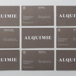
Alquimie by Thought Assembly
“Released quarterly as a printed magazine, Alquimie is a written emulsion of alcoholic and non-alcoholic drinks. Covering wine, beer, spirits, bitters, coffees and other solutions of interest; Alquimie explores the liquids themselves — their origins and stories. Working with photographer James Morgan, the inaugural edition of Alquimie included over 160 images across 152 pages.” – Alquimie Melbourne based graphic design and visual communications...
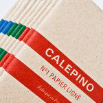
Calepino by Studio Birdsall
Calepino is a french manufacturer and brand of “traditional yet technical notebooks with an authentic vintage spirit” made from 100% recycled, locally sourced paper, covered with a cardboard from a factory with a heritage dating back to 1927 and assembled by hand. Calepino’s brand identity and print, recently designed by Florida based Studio Birdsall, juxtaposes the earthy craft textures of an...
Food Studio by Bielke&Yang
Food Studio is a group of food professionals, designers and photographers that come together to create unique and unconventional shared, natural and Nordic food experiences, table talks and workshops where “food becomes conceptualized through physical and mental experiments”. Design agency Bielke&Yang, who have been part of Food Studio from the beginning, recently worked with a team of copywriters, film producers and photographers to...
Jeremy Maxwell Wintrebert by Hey
Jeremy Maxwell Wintrebert is a glassware designer and manufacturer currently working in France with a free hand glass blowing philosophy mastered while traveling internationally across the US and Europe. Spanish design agency Hey recently developed a new visual identity solution for Jeremy that captures the heat, craft and art of glass blowing through a smart combination of colour and laser...
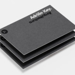
Adrián Key by Face
Adrián Key is a San Pedro based architecture firm and architect working with the rich and famous from “one of the most exclusive corners of northern Mexico”. Design agency Face Creative developed a new visual identity for the firm with a “clean, simple aesthetic with bold and modern touches, an icon that cleverly encases the name of the brand in its design, and...
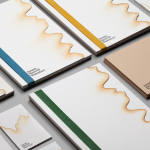
Club at South Place Hotel by This Is Colt
Club is an exclusive private members area hidden from the public within London’s South Place Hotel. Its visual identity, developed by This Is Colt and designed to establish a connection with the parent brand but with “a personality of its own”, is built around a logotype constructed from the same contemporary, condensed sans-serif characters of the hotel’s identity but is paired with a morse code...