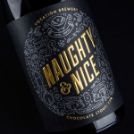
Vocation Brewery Limited Edition by Robot Food
Vocation is a UK microbrewery, established and run by John Hickling, with a range of craft beers described as having distinctive and punchy flavour profiles. Communicating the brewery’s unique personality and the crafted quality of its range rested in the hands of UK based graphic design studio Robot Food. Drawing on the beer’s tropical, fruity, floral and hoppy characteristics, the brewery’s fearless, daring and renegade attitude, and the...
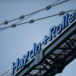
Haydn & Rollett by Richards Partners
Haydn & Rollett is an Auckland based construction company that has been in business since 1946. To coincide with its 70th birthday and in acknowledgement of the broadening of its services beyond just construction, the company worked with graphic design studio Richards Partners to develop a new brand identity that would better communicate who they are today whilst not abandoning their past. This...
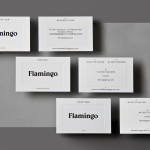
Flamingo by Bibliothèque
Flamingo is an insight and strategy consultancy, founded by Kirsty Fuller and Maggie Collier in 1997, that works with businesses, and at the intersection of people, culture and brands, to help enrich lives by shaping culture and evolving behaviours. The consultancy is described as a group and not just a network, collaborating and sharing across its seven offices throughout Europe, Asia, India and South America....
Helsinki Philharmonic Orchestra by Bond
Helsinki Philharmonic Orchestra is a 102 strong ensemble, currently led by chief conductor John Storgårds, with its primary venue being the Helsinki Music Centre. It has a significant history, beginning as the Helsinki Orchestral Society in 1882 and acquiring its current name following a merger with the Helsinki Symphony Orchestra in 1914. In 2016 the orchestra will have its first female chief conductor following...
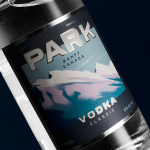
Park Distillery Vodka by Glasfurd & Walker
Park is a bar, restaurant and distillery located in the Canadian resort town of Banff, within the Banff National Park, and the province of Alberta. It is a region of diverse natural beauty, with mountains, prairies, forests and desert badlands that attract walkers, campers and skiers. Park Restaurant is a celebration of Banff’s alpine history and lifestyle. This runs throughout its interior, campfire-inspired menu and a...
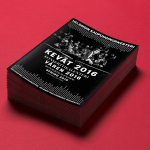
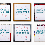
Flow Festival 2015 by Bond
Flow is an annual three day music and arts festival that this year took place across the weekend of the 14th of August in Helsinki, and played host to a variety of artists including Florence and the Machine, Major Lazer, Nina Kraviz and Willey. Finnish graphic design studio Bond worked with the festival to create a visual identity treatment for its 2015 event...
Mita Chocolate Co. by Moniker
Mita is an artisanal bean to bar chocolate business grinding and moulding on a single site in Bogata, and sourcing its beans from across Venezuela, Peru, Ecuador and Colombia. Mita worked with San francisco based graphic design studio Moniker to create a visual identity and package design system that would easily scale as new products are introduced....
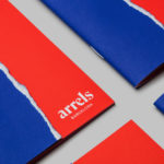
Arrels by Hey
Arrels (roots in English) is a Spanish shoe brand, established by cousins, friends and partners Javier & Pepe Llaudet, and inspired by the Mediterranean, its traditions, rhythm, colour and creative atmosphere. Javier & Pepe also draw on the city of Barcelona (the place they want to be), the countryside (where they are from), and their passion for music. These inspirations make their way into Arrels’ new brand identity,...
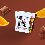
Naughty But Rice by Robot Food
Naughty But Rice is a rice pudding range created by The Hain Daniels Group in response to an increase in the dessert’s popularity in the United Kingdom. Unlike the product’s of established and mainstream brands, Naughty But Rice, as the name suggests, offers consumers a modern and indulgent twist on the traditional favourite, with flavours that include Coconut & Raspberry, Salted Caramel and Chocolate...
Moomin & Moomin Shop by Bond, Finland
The Moomins are characters from a book, picture book and comic book series created by Swedish-speaking Finnish illustrator and writer Tove Jansson. These were published in Sweden and Finland between 1945 and 1993. Alongside the comic strip, the characters have also featured in their own television series and film, and populate the theme park, Moomin World, on the Finnish island...
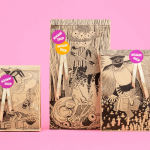
Second Hand Orchestra by Bedow
Second Hand Orchestra is a collection of tracks recorded for a documentary that was unfortunately and abruptly cancelled. Rather than let the work fall by the wayside, band leader Karl-Jonas Winqvist has released these as a limited edition album of 300 LPs. These feature a visual identity and packaging design of custom typography, individually numbered and block foiled sleeves, and screen printed t-shirts created by Stockholm...
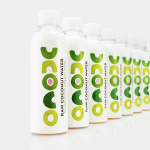
Unoco Raw Coconut Water by B&B Studio
UK based Unoco works with a community of smallholders in the Philippines to produce an unrefined, unpasteurised and untreated raw coconut water. This is drawn from young coconuts, characterised by their green rather than brown colour, picked at their nutritional prime and placed into bottles rather than tetra pak or cans using HPP. This process gives the water a distinctive pink colour, a result...