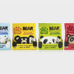
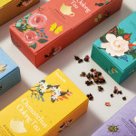
Bear Paws by B&B Studio
Bear Paws is a baked and shaped pure fruit snack range available in four distinct flavour combinations and produced by the British health food brand Bear Nibbles. To draw attention to endangered species such as pandas, polar and sun bears, the brand recently launched a limited edition pack design alongside a pledge to donate 5p per sale to the WWF. This limited...
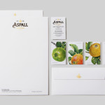
Aspall by NB Studio
Aspall is a British family run cyder maker with a significant history, now into its eight generation and third century. In response to increased competition from both the Cyder and Vinegar categories, Aspall recently worked with NB Studio to help reinvigorate and re-craft its brand identity. This included new logo and packaging treatments for retail and trade as well as website, point...
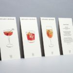
Merchants of Beverage by Manual
Merchants of Beverage is an online service that aims to make buying and gifting luxury items easy. Products include wines, spirits and Champagne’s, as well as hand-blown crystal stemware and professional barware. Each item has been handpicked and curated by a team of experts and sourced from a variety of international artisans. The service’s new brand identity, which included monogram, logotype,...
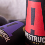
Awestruck Hard Cider by Buddy
Awestruck is a premium hard cider range from Gravity Ciders. It was created to offer America’s craft brew fanatics a refreshing alternative to beer. Awestruck is made from 100% fresh-pressed New York State apples and infused with unique flavours that reflect the company’s enthusiasm for experimentation. The range includes Lavender Hops, Hibiscus Ginger and Eastern Dry. Design studio Buddy were commissioned by Gravity...
Daebeté Scented Tea by Victor Design
Daebeté is a floral infused tea range that uses a high-grade Taiwanese oolong variety, made using a unique process of withering, oxidation, curling and twisting, that has then been given a floral hint using ancient baking methods. This process creates a subtle yet sweet flavour profile that carefully balances the aroma of flowers with the flavour of tea. The packaging for the...
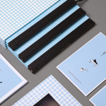
Blue Baths by Ryan Romanes Design
Blue Baths is a renovated bath house originally opened in 1933 and located in Government Gardens, Rotorua, New Zealand. Blue Baths features geothermal heated pools and art deco detail, and has the distinction of being one of the first places in the country to have offered mixed sex bathing. The venue is open to the public and hosts private functions including...
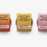
The Tomato Stall by Designers Anonymous
The Tomato Stall is a grower of speciality tomatoes whose distinct flavour is attributed to the increased sunshine they receive from being farmed on the southern English island of the Isle of Wight. From these, The Tomato Stall produces a range of ‘tomato inspired’ artisanal products that are stocked by farm shops and delis throughout the UK and sold from...
Waffee by A Friend Of Mine
Waffee is an authentic Belgian waffle and coffee chain with locations across Melbourne and Altona. Developed by holistic design practice A Friend Of Mine, Waffee’s brand identity, which included logo and packaging design, menu boards and a signage system created in collaboration with architects Hecker Guthrie and Foolscap Studio, mixes a typographically adventurous logotype with an illustrated character to establish a rich communicative duality and contrast...
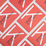
Colours Of The Kalahari by Believe In
Believe In recently published images of their print and brand identity work created for the Mall Galleries’ exhibition Colours Of The Kalahari, the first major display and sale of southern African Bushman art ever to be held in London. The exhibition represents the latest generation of contemporary San artists from an unbroken line that stretches back 20,000 years, and includes 150...
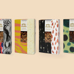
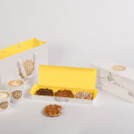
The Beginnings by Asketic
The Beginnings is a Latvian raw food and ingredients business creating and sourcing a variety of mueslis, jams, honeys and spices from around the world. Developed by multi-disciplinary design firm Asketic, The Beginning’s brand identity and packaging treatment goes all in for handcraft and contrast, mixing a variety of patterns and images informed by the origins of each ingredient to establish an ever changing and...
Milk Lab by Studio fnt
Milk Lab is a 100% pure milk dessert, flake and roll cake restaurant located in the South Korean city of Busan. The restaurant’s visual identity, designed by Studio fnt, conveys some of the chill and smoothness of its desserts through the rounded terminals of a slab serif logotype, its container, similarly styled monolinear icons, icy photography and a milky pastel colour palette, and...
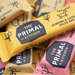
The Primal Kitchen by Midday
The Primal Kitchen is a UK based health food brand founded by nutritionist Suzie Walker with the intention of making the paleo lifestyle, a modern nutritional plan based on the presumed diet of Paleolithic humans, easier and more accessible. The Primal Kitchen commissioned design studio Midday to create a visual identity for the brand which would extend across the packaging for its cold pressed...