
Grand Ferdinand by Moodley
Grand Ferdinand is hotelier Florian Weitzer’s fifth hotel. It features a distinctive interior of green leather upholstery and Lobmeyr chandeliers, rooms with ornate and functional furnishings, and a restaurant that is said to serve the best French champagne and the grandest Viennese cuisine, all set within a landmark building located on Vienna’s Ringstraße. Grand Ferdinand has a philosophy that celebrates the past whilst moving forward. This meeting of tradition...
Tenderloin Museum by Mucho
The Tenderloin Museum tells the story of, and celebrates, the people and rich history of the Tenderloin district, a 31 block region of San Francisco. The museum’s permanent exhibition covers the area’s rebuilding, from 1906, following the great earthquake, until the present, and captures its diversity. It is a neighbourhood that has been filled with, what Mucho, the graphic design studio behind the...
Johnny Roxburgh by Bunch
Johnny Roxburgh is an entertainer and party designer working with the rich and famous nationally and internationally. He has over thirty years of experience and has held a royal warrant for the last nine. In the words of The Scotsman, Johnny is capable of turning the whims and fancies of the world’s wealthiest one percent into glittering realities. These have included, but are certainly not limited...
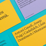
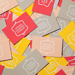
Urbanna by Forma & Co
Urbanna is a small Spanish tourist business, led by Anna Permanyer Jordi, that provides experienced guides who can speak Spanish, Catalan, German, French and English, to those visiting the city of Barcelona. Design studio Forma & Co worked with Urbanna to develop a visual identity solution that, rather than rely on ubiquitous images of the city, favours a convivial colour palette...
Marbella Club by Pentagram
Marbella Club is a hotel, spa and golf resort located in the Spanish coastal city of Marbella, on the shores of the Mediterranean sea. Built as the private residence of Prince Alfonso of Hohenlohe-Langenburg, and converted by the prince into an exclusive, private hotel and retreat in 1957, Marbella Club has a significant heritage, one that has played host to royalty,...

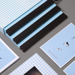
Ona by Mucho
Ona is a Spanish boutique travel agent providing its clients with personal, unique and private tours, day trips and stays in Barcelona and Catalonia. Its experienced guides offer professional insight into local culture, gastronomy, history, architecture, art and design, and provide round-the-clock assistance. Ona’s brand identity, designed by Mucho and based around the tagline “Tailored travel experiences”, is an unusual and distinctive...
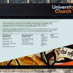
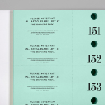
University Church by Spy
Located at the heart of Oxford, University Church of St Mary the Virgin, abbreviated to University Church, has been a site of worship and debate for over 700 years and is the “spiritual home” of the oldest university in Britain. The church recently received a grant from the Heritage Lottery Fund to raise awareness of the historical nature of the site...
Blue Baths by Ryan Romanes Design
Blue Baths is a renovated bath house originally opened in 1933 and located in Government Gardens, Rotorua, New Zealand. Blue Baths features geothermal heated pools and art deco detail, and has the distinction of being one of the first places in the country to have offered mixed sex bathing. The venue is open to the public and hosts private functions including...
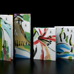
Simone Handbag Museum by Charlie Smith Design
Simone Handbag Museum is dedicated to the history of handbags with ‘international significance’ and provides its visitors with a curated, contemporary and historical collection to explore over two floors at the centre of the South Korean city of Seoul. London based Charlie Smith Design were recently commissioned to develop a brand identity for the museum that would resonate with and unite its diverse collection across...
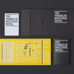
The Franklin Boutique Hotel by Band
The Franklin Boutique Hotel provides seven room accommodation at the heart of the city of Adelaide. Rooms feature interior detail such as white tiles, exposed utilities, chipboard panels, high quality finishes and original artwork from local artists, as well as modern conveniences that include en suite bathrooms, Nespresso machine, ipod dock radios, refrigerators and irons. Following a successful reinvention of the attached pub,...

Hotel Cycle by UMA
U2 is a cyclist-friendly retail and hospitality destination, located in the Japanese city of Onomichi, made up of shops, bakeries, restaurants and hotels. Design studio UMA were recently commissioned to develop a visual identity for U2’s Hotel Cycle as part of a larger brand identity project that covered a variety of spaces, packaging and signage within the complex. UMA’S brand identity solution...
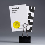
Mendeli Street Hotel by Koniak
Mendeli Street is a city-beach hotel, designed by BK Architects, that celebrates the modern spirit of Tel-Aviv. Design studio Koniak developed a brand identity for the hotel, which included a logotype, stationery set, key cards, door-hangers and website, that reflect its contemporary qualities and the bright sunny climate of its location....