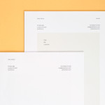
Peter Ahrens by Studio Jubilee
Independent London-based design agency Studio Jubilee have recently updated their website and portfolio. Their brand identity work for South Australian photographer Peter Ahrens—which included a new logo-type, website and stationery set—really stood out for its use of a weighty fluorescent white material choice and tactile print process to enhance a reductionist single font approach. The project is accompanied by a great write-up, published...

Mellbye by Heydays
Mellbye is a Norwegian architecture firm founded in 1954 with a “mindset anchored in modernism”. Design studio Heydays created a new brand identity for the firm based around a geometric M symbol built from the initials of their two main services, architecture and interiors. Executed as a combination of blind deboss and die cut detail across a earthy and urban...

Candela by RoAndCo
“Candela is a women’s footwear and ready-to-wear line created by Gabriela Perezutti. Influenced in part by her childhood spent on a horse ranch in Uruguay, the collection embodies Gabi’s soft femininity, adventurous gaucho spirit and South American roots. We [RoAndCo] conveyed this spirit throughout all iterations of the company’s branding—from business cards and lookbooks to art direction and campaigns—through elements...
Fieldwork by Fieldwork & Hey
Fieldwork is a Manchester based digital design and branding agency who specialise in “crafting engaging experiences across digital, web and brand”. Their visual identity, a utilitarian mix of stencil cut logo-mark, a bright yet economical single colour palette, weighty boards and sticker detail, is now complemented by the launch of their self-initied print and digital project A Guide To Making Things, illustrated by Hey....
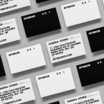
Interior XIII by Anagrama
Interior 13 is a distributor of Mexican and international auteur films and promoter of independent cinema. Design agency Anagrama were recently commissioned by Interior 13 to develop a new visual identity that would be “easily relatable to the cinematographic world” as well as being “functional in terms of online promotion.”...
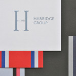
Harridge Group by Igloo
Harridge, formerly Ealing Travel Services, is a corporate travel group made up of Harridge Business Travel, Harridge Luxury and Harridge Events. London-based design studio Igloo were recently commissioned to design the group’s visual identity and brand architecture which would reference its “significant history and experience”. Their design solution, a combination of serif detail, sans-serif characters and a modern colour palette and pattern set, drawing on...
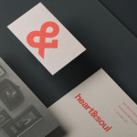
Heart & Soul Interiors by Band
Heart & Soul is an Australian interior decoration firm, specialising in residential properties, with a holistic, adaptable and flexible philosophy. Adelaide-based design studio Band were commissioned by the firm to update their brand identity so that it would better reflect their contemporary approach. Based around the duality of a heart/ampersand marque, a sans-serif logotype and print that juxtaposes a modern bright red...
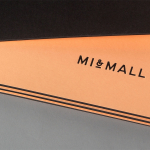
Mi&Mall by Atipo
Mi&Mall is an online shopping destination and resource that brings together and supports small to medium designer brands for people interested in fashion, trends and exclusive collections. Based around a simple logo-type, ampersand, a pale colour palette and a tactile print and material choice, Mi&Mall’s visual identity, created by Spanish multidisciplinary design studio Atipo, mixes high fashion and boutique craft...