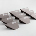
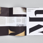
Mitsuori Architects by Hunt &Co.
Mitsuori Architects is an architectural design studio that creates high quality structures and spaces that merge aesthetic beauty with careful planning and thoughtful detailing. Their large scale project experience is combined with the flexibility of a smaller practice allowing them to provide big clients with a personalised service. Mitsuori’s visual identity, designed by Melbourne based Hunt & Co. and informed by a name that translates from Japanese as...
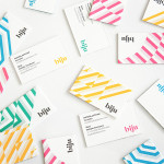
Biju Bubble Tea by ico
Biju is bubble tea brand and cafe located in London’s Soho district that looked to bring and translate a product and experience well-established in South East Asia to the UK in a way that would appeal to a modern discerning market. This was achieved by focusing on fresh, natural and high quality ingredients, a simple menu with an emphasis on taste, a focus on the social aspects...
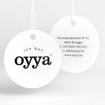
Oyya by Skinn
Oyya is an ice bar located in the Belgium city of Bruges that retails a variety of frozen yoghurts, yoghurt drinks, waffles and 28 ice creams — the most in the city. Its brand identity, which included logotype, print, signage, uniforms and interior design created by local studio Skinn, while largely logo-centric and having a strict consistency across stickers, tubs,...
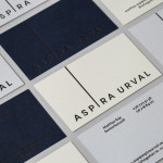
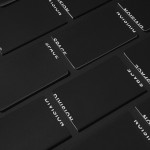
Aspira Urval by BVD
Aspira Urval is a banking, finance and insurance recruitment specialist with offices in the Swedish city of Stockholm. Its new brand identity, designed by BVD, draws its inspiration from the name and the themes of ‘elevated ambitions’ and ‘reaching new heights’. These are visualised as a generously spaced, uppercase, sans-serif logotype with an adaptive ascender that changes depending on its context. It is...

Neometro & Nine Smith Street by Studio Hi Ho
Nine Smith Street is the latest residential property project from Neometro, a company that describes itself as having a reputation as Melbourne’s most design-focused development group and recognised as one of the first holistic design and construction businesses in Australia. Neometro are dedicated to creating architectural buildings that are beautiful, functional and timeless, and have a sense of place and belonging. Neometro’s brand...

Tamarindo by La Tortillería
Tamarindo is a kitchen and bar with an international menu due to open in October 2014. Located in Ourense, Spain, Tamarindo was created as a refreshing alternative for local walkers who are used to traditional bars and restaurants, and is described as a place with two distinct moods and spaces, the casa cocina or house/kitchen, a place for coffee and...
Mauritshuis by Studio Dumbar
Mauritshuis is an art museum and state-owned building constructed in the 17th century and located in The Hague. The building is described as being a fine example of Dutch Classicist architecture. It was formerly the residence of count John Maurice of Nassau and has been home to the Royal Picture Gallery since 1822. Today, it houses a plethora of Golden...
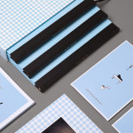
Space Division by Inhouse
Space Division is an architectural studio established in 2010 with an office in Auckland, New Zealand. It looks to contribute to and positively impact on the lives and environments of its clients and the communities it serves by producing simple and succinct spaces. The studio describe their projects as being inclusive and client-focused with physical constraints, budgets, time frames and compliance being...
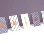
Violeta by Anagrama
Violeta is described by Anagrama, the design studio behind its new brand identity and packaging treatment, as an Argentinian bakery, named after its founder, that creates hand-crafted breads, cakes and pastries from its location in the Buenos Aires district of Las Lomas de San Isidro. Following more than 30 years of business and in lieu of a plan to begin...
Blue Baths by Ryan Romanes Design
Blue Baths is a renovated bath house originally opened in 1933 and located in Government Gardens, Rotorua, New Zealand. Blue Baths features geothermal heated pools and art deco detail, and has the distinction of being one of the first places in the country to have offered mixed sex bathing. The venue is open to the public and hosts private functions including...
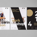
Carin Wilson by Studio Alexander
Carin Wilson is a renowned furniture maker, sculptor, design educator and leader of the New Zealand craft movement throughout the 1970s, 80s and 90s. As well as precisely crafted functional furniture, Carin also creates pieces that look to explore narrative through alternative form — check out his work Royal Pain in the Arse — and are influenced by his Maori heritage. Carin Wilson’s...

Ritualize by Shorthand
Ritualize is a cross-platform fitness and lifestyle app that utilises leaderboards, education, challenges and exercises to establish and track small habits that should lead to improved physical and mental health, and a sense of well-being over time. Shorthand, an independent brand identity and graphic design studio based in Newcastle, Australia, were recently commissioned to help bring the app to market. This included naming,...