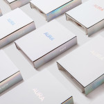
Lorient — Aura by Believe In
Aura is a new range of high end products from door sealing system manufacturer and specialist Lorient. These include drop seals, perimeter seals, door bottom seals, threshold plates and ramps designed with a distinctive curved profile that is described by Lorient as creating a sophisticated visual aesthetic that also spreads and diffuses sound. Design studio Believe In recently worked with Lorient to develop a brand identity for...
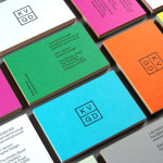
KVGD by Kerr Vernon
KVGD is a Glasgow based graphic design studio run by Kerr Vernon that works within the fields of brand identity design and print, has a ‘be nice, do good work’ philosophy, and a reputation for producing engaging, thoughtful and crafted projects. The studio’s client base is diverse, local and national, and includes businesses such as gallery, event and creative workspace The Whisky Bond,...
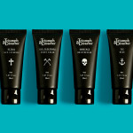
Triumph & Disaster – On The Road by DDMMYY
Triumph & Disaster (T&D) is a male skincare and accessory brand that appropriates the traditional grooming experience associated with the past and fuses it with the high quality, natural and scientifically formulated expectations of today’s market. T&D’s packaging, created by New Zealand based design studio DDMMYY, references and confidently brings the type-heavy, heraldic detail, and traditional structural and material choices of the past into the...
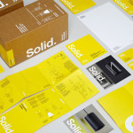
Terence Woodgate by Charlie Smith Design
Terence Woodgate is a lighting design and manufacturing business, founded by industrial designer Terence Woodgate in 2014, that looks to “fully optimise the benefits of LED technology”. Charlie Smith Design recently worked with Terence Woodgate to develop a visual identity for the business and modular packaging treatment for its first line of products as well as manuals, fitting instructions and website....
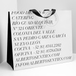
Alberto Senties Catering by Anagrama
Alberto Senties Catering is a Mexican ‘food experience’ company established by chef Alberto Sentíes that designs and prepares large and small banquet menus, offers cooking classes, provides bar tending, equipment rental and consultation services, and has built up a reputation for culinary excellence over its ten years of business. Design studio Anagrama recently worked with Alberto Senties to develop a new brand identity, which went on to...

Casa Virginia by Savvy
Casa Virginia is a restaurant and culinary project in Mexico City, created by chef Mónica Patiño, that mixes the highest quality cuisine and meticulous processes with the familiarity of eating at home. This fusion of restaurant quality and easiness is perhaps most acutely manifested throughout its interior design, a space that juxtaposes the modesty and simplicity of wooden and basketweaved furniture...
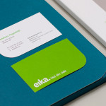
Eika by Mission
In response to the financial crash the Terra-Gruppen, a Norwegian financial group owned by and in alliance with 80 local banks, looked to take positive steps to reaffirm its commitment to local customers and the continued contribution it makes to the growth and development of the communities it serves. This came in the form of a rebranding exercise that led to the name Eika and...
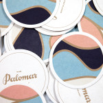
The Palomar Restaurant by Here
The Palomar Restaurant is located at the heart of London’s Soho district with a menu that is described as being reflective of the foods of modern-day Jerusalem and influenced by the cultures of Southern Spain, North Africa and the Levant. Its interior features a zinc kitchen bar, mosaic marble and reclaimed parquet floors, marble surfaces, oak panelled walls, a skylight providing natural light and royal blue...
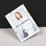
Iona Brown by Sam Flaherty
Iona Brown is a London based contemporary jewellery designer who favours classic simplicity, understated detail, precise finishes and minimalist lines, shapes and materials. Graphic designer and art director Sam Flaherty recently worked with Iona to develop a new visual identity for her expanding collection. Built around a customised logotype and a simple print and packaging treatment that uses few but good quality and contrasting...
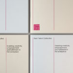
Rush Talent by Bunch
Design studio Bunch worked with Rush Talent, a London based public relations company, to develop a visual identity, this included monogram, logotype and stationery design. Rush Talent describes itself as at forefront of the factual and lifestyle television scene and represents emerging UK broadcasters working within the fields of fashion history, sports, science, architecture, food and art, and includes the likes of Amber...
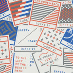
Lucky 21 by Blok
Lucky 21 is a film production company, located in the US city of Dallas, who bring a “contagious energy and tireless drive” to the industry and have a production team and director roster that includes the talents of Jeff Bednarz, The Chartrands, and Tom Ryan, some of whom have worked for big brands such as TGI Fridays, AIG and Home Depot. Lucky...
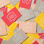
Simone Handbag Museum by Charlie Smith Design
Simone Handbag Museum is dedicated to the history of handbags with ‘international significance’ and provides its visitors with a curated, contemporary and historical collection to explore over two floors at the centre of the South Korean city of Seoul. London based Charlie Smith Design were recently commissioned to develop a brand identity for the museum that would resonate with and unite its diverse collection across...