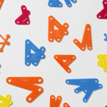
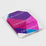
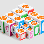
Making: by Garbett
Making: is the Australian Institute of Architects’ 2014 conference. Working in collaboration with creative directors Sam Crawford, Adam Haddow and Helen Norrie, Sydney based design studio Garbett developed a brand identity for the conference, which included logo, lanyard, merchandise and print design, that explores the role of the architect as maker of environments and connections that extend beyond the bounds of traditional practise. This was expressed...
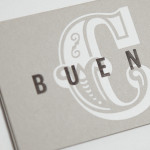
Buena C by Tres Tipos Gráficos
Buena C is an event planning agency, founded by Carolina Arjones, with offices in Madrid and Alicante. The agency provides both individuals and businesses with exclusive, individualised and detail orientated event consultation and organisation services that include, but are not limited to, sourcing locations, photographers, catering, stationery, transportation and accommodation for presentations, conventions and weddings. Alongside event planning the agency...
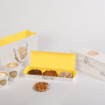
Scotland Can Make It! by Graphical House
Scotland Can Make It! is a limited edition collection of souvenirs, created by leading Scottish designers and artists in collaboration with manufacturers from across the country, for the Glasgow 2014 Commonwealth Games. The souvenirs are described by Graphical House, the design studio behind the collection’s brand identity and website, as being part of a programme of events that celebrate ‘Scotland’s cultural heritage, creative...
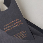
The Empire Café by Graphical House
The Empire Café is a pop-up venue located in Glasgow’s Merchant City that looks to explore Scotland’s relationship with the North Atlantic slave trade through coffee, sugar, tea, cotton, music, visual art, poetry, debate, workshops, walks, film and literature. The café’s brand identity, a ship-like logo, bold sans-serif typography and both a limited and rich approach to print, designed by Graphical House, is described as linking a contemporary ‘artistic programme...
Alphabeta by Village Green
Alphabeta is an extensive property redevelopment project, designed by architects Studio RHE and located in London’s Finsbury Square, that is described as the latest architectural expression of the ‘new economy’. Due to open in late 2014 and managed by Resolution Property, the project will reconfigure a ‘substantial landmark building’ to create a new standard in contemporary work environments for the creative and technology sectors. The space will feature large...
Waffee by A Friend Of Mine
Waffee is an authentic Belgian waffle and coffee chain with locations across Melbourne and Altona. Developed by holistic design practice A Friend Of Mine, Waffee’s brand identity, which included logo and packaging design, menu boards and a signage system created in collaboration with architects Hecker Guthrie and Foolscap Studio, mixes a typographically adventurous logotype with an illustrated character to establish a rich communicative duality and contrast...
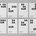
Dadadum by Demian Conrad Design
Dadadum is a Swiss contemporary furniture brand created out of respect for and in homage to the functionality, technical expertise and minimalism associated with Swiss design, and that strives to bring out the beauty of each raw material. The brand draws on the ‘talents of local designers who have made an international name for themselves and whose specifications are to re-establish the notion of Gute...
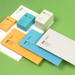
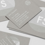
Dosatres by Comite Studio
Dosatres is a Spanish company that connects and manages a wide network of creative and strategic business centres that help brands to discover the best way to grow and communicate. Created by design studio Comite and based around the name ‘two to three’ — informed by the company’s ability to broaden communicative opportunities and paths to growth, and the concept of moving from two to three-dimensional...
Kid O by Studio Lin
Kid O is a modern American toy company that creates products that engage and stimulate children through a rich variety of shapes, colours, and sizes. Designed by Studio Lin, Kid O’s new packaging treatment — which included over 50 boxes — takes the vivid colours of the industry, reduces these down to four, contains them within geometric boundaries and pairs...
The Confidante by RE:
The Confidante is a group of CEOs who draw on their extensive networks to provide business leaders with tailored executive coaching and mentoring services. Designed by Re: Sydney, The Confidante’s new brand identity effectively visualises the confidential and discretionary nature of their work and the executive level of their service through a simple negative space keyhole logo that has been given...
Fort Standard designed by Studio Lin
Fort Standard is a New York based industrial design studio using long-lasting natural materials and traditional production methods in an innovative way to produce products, lighting and furniture with a simplicity, high functionality and an attention to detail. As the studio explain online, their ability to act as both designers and manufacturers not only informs their process, but yields smarter products...
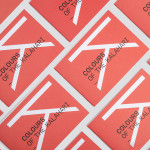
Colours Of The Kalahari by Believe In
Believe In recently published images of their print and brand identity work created for the Mall Galleries’ exhibition Colours Of The Kalahari, the first major display and sale of southern African Bushman art ever to be held in London. The exhibition represents the latest generation of contemporary San artists from an unbroken line that stretches back 20,000 years, and includes 150...