Minimal Logos

Hello Klean by Two Times Elliott
Beauty is, of course, in the eye of the beholder, but there’s no denying that objectively, its branding and identity design has undergone some huge changes over the past decade or so. Gone are the days of faux-luxurious designs that were all about swathes of abstract silk; women coiffured to within an inch of their life; a microscopic lens on...
Compound by DesignStudio
What does ‘healthcare’ look like today, especially when we’re increasingly talking about preventative treatment? For Parsley Health and GlycanAge, which promote functional medicine, it’s serene – all blush pink, forest green and rounded corners; for Modern Age, which focuses on longevity, it’s more clinical, with high-resolution botanical imagery and classical icons; Ezra, which offers full-body MRIs as cancer prevention, goes...
Recchiuti by Manual
Recchiuti Confections is a San Francisco-based gourmet chocolatier that creates chocolates with unique flavour combinations. Using traditional European techniques, with locally sourced ingredients from Northern Californian farms and markets, Recchiuti’s chocolates have earned a loyal customer base and several accolades. After 25 years in business, Recchiuti sought the expertise of Manual – a local design studio – for a brand...

The Wool Pot by Seachange Studio
More plants, less plastic. A noble mission. Over the last decade, revelation has followed revelation with regards to the environmental impact of what seemed like the most innocuous of objects. Now it’s the turn of the humble flower pot. Yep, that. Stacked and sitting empty in the shed, or at the bottom of the garden. It turns out that these...
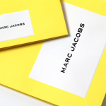
Marc Jacobs by Triboro
Fashion designer Marc Jacobs heads his own eponymous fashion brand, as well as diffusion lines The Marc Jacobs and Heaven by Marc Jacobs. He was also creative director at Louis Vuitton from 1997 to 2014, where he created the company’s first ready-to-wear clothing line. In his own words, Jacobs’ work is ‘a little preppy, a little grungy, a little couture’, and this...
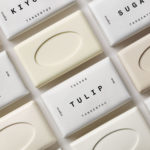
Tangent GC Organic Soap by Carl Nas Associates
Tangent GC began as a Scandinavian organic garment and shoe care company developing products that intended to increase the life of clothing and footwear, and entered the organic skincare market in 2016. The concern given to the longevity of skin becomes an understandable extension of that original intention. Carl Nas Associates, who have been working with Tangent GC on their packaging treatments for...
Leapling Films by F37
Leapling Films is a Manchester-based independent production company founded by ‘leap year baby Chris Lane’. For those that don’t know, this included myself until an hour ago, the word ‘Leapling’ is used to describe somebody who was born on the 29th February. Chris is a member of The Production Guild. His work has been seen by millions of people worldwide, and his credits as...
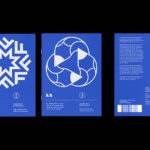
LogoArchive Issue 7
LogoArchive Issue 1 was conceived, designed and sent to print in a day. It was inspired by a panel discussion at Somerset House as part of the exhibition Print! Now on to its seventh numbered release (and the tenth in the series), LogoArchive continues to reconfigure itself with each new issue with the intention of surprising and delighting. This issue...
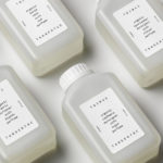
Tangent GC Organic Detergents by Carl Nas Associates
Tangent GC began as a Scandinavian organic garment and shoe care company developing products that intended to increase the life of clothing and footwear, and entered the organic skincare market in 2016. The longevity of skin being an understandable extension of that original intention. The company’s graphic identity, a typographical system designed by Essen International under the creative direction of Carl Nas, established...
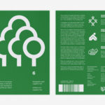
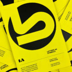
LogoArchive Issue 6
LogoArchive was conceived, designed and sent to print in a day. It was inspired by a panel discussion at Somerset House as part of the exhibition Print! Now on to its sixth numbered release, LogoArchive continues to reconfigure itself with each new issue with the intention of surprising and delighting, particularly at a moment of intentional difficulty. This issue, launched...
LogoArchive ExtraIssue – Past & Present
The distinctive smaller format of LogoArchive–a zine on mid-century symbols that channels the independent spirit of niche publishing–has created a space for experimentation and collaboration with those who also share a similar interest in symbols and corporate identity programmes of the past. BankerWessel is one such studio. Their brand identity work brings the spirit of mid-century form language into the...
LogoArchive ExtraIssue – Letters As Symbols
LogoArchive in print was conceived, designed and sent to print in a day. It was inspired by a panel discussion at Somerset House as part of the exhibition Print! Now on to its seventh release, LogoArchive continues to reconfigure itself with each new issue with the intention of surprising, graphically and materially, within the context of archival. The distinctive smaller...