
Hegel Music Systems by Neue
Hegel is a Norwegian amplifier, pre-amplifier and multi-media player business with a proprietary Error Correction System that limits harmonic distortion without compromising other parameters. Established in the early 1990’s, Hegel has grown to become a well-established supplier of high-end hi-fi products, nationally and internationally, and is committed to sound reproduction that adds nothing (or as little as possible). This is the foundation of their new packaging...

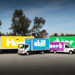
Forgotten Boardwalk Brewing by Perky Bros
Forgotten Boardwalk is a New Jersey microbrewery producing uniquely flavoured, year-round and seasonal craft beer. It was set up by Jamie Queli, one of the youngest female brewery owners in the US, and draws its name from the folklore of the Jersey Shore Boardwalk. This is the foundation of an extensive new brand identity, designed by Tennessee based Perky Bros, which brings to life the sideshow...
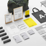
InsideSource by Mucho
InsideSource is an American office space planning, design and installation business with 25 years experience and past clients that have included Facebook, Box, Shutterfly and Tango. InsideSource worked with graphic design studio Mucho to help them better express who they are and what they do through a new visual identity. This was achieved using a modular and custom type-based system that runs across tote bags,...

Swedish Forest Industries Federation by BVD
With the intention of better communicating the endless possibilities of the forest, the concept of Bioeconomy and a commitment to a sustainable future, Skogsindustrierna, the representative of the Swedish pulp, paper and woodworking industries, worked with Scandinavian design studio BVD to help move them away from a complicated tonality and give their communication a clarity, focus and accessibility. With this in mind,...
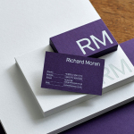
Richard Moran by Journal
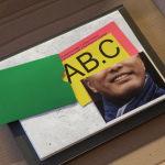
Richard Moran is a lifestyle and portrait photographer with over 25 years of experience. He has worked with international businesses such as GSK, Pizza Express and Grey Goose Vodka, and secured a reputation as a passionate, straight-talking professional with a meticulous attention to detail and a portfolio of high-quality and emotive work. With a desire to communicate this and with the intention of...

James Cohan Gallery by Project Projects
James Cohan is a contemporary art gallery with two locations in New York, one in Lower East Side and the other in Chelsea. Recent exhibitions have included work by artists such as Mernet Larsen, Fred Tomaselli and Beatriz Milhazes, with Philip Hanson and Omer Fast to follow later this year. The gallery recently collaborated with American graphic design studio Project Projects to develop...
A-TO-B by Stockholm Design Lab
A-TO-B is a retail destination dedicated to all things travel. It curates and sells smart practical products for the modern traveller, complimented by insight and advice. Whether it be an around the world trip or the daily commute, a preference for small private labels or well-known bag brands, A-TO-B has it covered. Venue Retail Group—owners of A-TO-B and over 150 shoe, bag and...
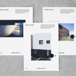
Obra Blanca by Savvy
Obra Blanca is an architecture studio, established in 2013, with offices in the Mexican city of Veracruz. The studio looks to transcend Mexico’s architectural landscape, remain independent and resistant to trends, and free to experiment and explore. It attributes a building’s value to its coherence, craftsmanship, materiality, functionality and context. Obra Blanca represents the last step in construction, the stage at which a building stops being just a structure and...
Antenne Books by OK-RM
Antenne Books is a London based distributor of independent publishers with a web shop that covers art, photography, design, illustration, theory, writing, fashion and culture. Their extensive catalogue of books, magazines and journals includes work by authors and artists such as Matt Lambert and Lutz Bacher, and the publishers Lodret Vandret and The Renaissance Society, amongst many others. Antenne Books recently worked with graphic design studio...

f32 by Blok Design
f32 is an American trend-watching company, founded by Gina and Lisa Priolo, with an office in LA and a commitment to finding and championing artists and brands that will go on to shape global culture. f32 worked with graphic design studio Blok Design to better express this vision, and their refined and highly contemporary aesthetic sensitivities. This was achieved through naming and...

Researchers In Schools by Paul Belford Ltd.
Researchers In Schools recruits and trains post-doctoral science researchers in the United Kingdom to become teachers with the intention of increasing subject expertise, promoting fields of research and improving university access. Researchers In Schools recently worked with London based graphic design studio Paul Belford Ltd. to develop a new brand identity system and visual language. This went on to include logo design...
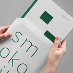
Smokovik by Studio8585
Smokovik is an exclusive property development, located on the Croatian Island of Krk, designed by renowned local architect Idis Turato. The development will be made up of both residential and commercial buildings that share a functional and sustainable build practice, a favour for modernity, flat surfaces and Mediterranean sea views. Smokovik’s brand identity, created by Studio8585 now working from Copenhagen, included logotype, brochure and website design, a...