Shaun Ford & Co. by Savvy
Shaun Ford & Co. is a Canadian bespoke furniture an interiors business that creates tailored environments for the sophisticated, style conscious consumer, and whose work revolves around a timeless approach to space. Each piece of furniture is designed with careful consideration given to the years that it will have to coexist within a particular environment and with the intention that each acquires further...
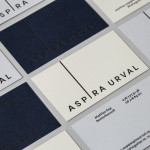
Aspira Urval by BVD
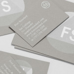
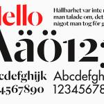
Aspira Urval is a banking, finance and insurance recruitment specialist with offices in the Swedish city of Stockholm. Its new brand identity, designed by BVD, draws its inspiration from the name and the themes of ‘elevated ambitions’ and ‘reaching new heights’. These are visualised as a generously spaced, uppercase, sans-serif logotype with an adaptive ascender that changes depending on its context. It is...
Space Division by Inhouse
Space Division is an architectural studio established in 2010 with an office in Auckland, New Zealand. It looks to contribute to and positively impact on the lives and environments of its clients and the communities it serves by producing simple and succinct spaces. The studio describe their projects as being inclusive and client-focused with physical constraints, budgets, time frames and compliance being...
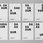
Dadadum by Demian Conrad Design
Dadadum is a Swiss contemporary furniture brand created out of respect for and in homage to the functionality, technical expertise and minimalism associated with Swiss design, and that strives to bring out the beauty of each raw material. The brand draws on the ‘talents of local designers who have made an international name for themselves and whose specifications are to re-establish the notion of Gute...
Fort Standard designed by Studio Lin
Fort Standard is a New York based industrial design studio using long-lasting natural materials and traditional production methods in an innovative way to produce products, lighting and furniture with a simplicity, high functionality and an attention to detail. As the studio explain online, their ability to act as both designers and manufacturers not only informs their process, but yields smarter products...
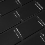
Essem Design by Bedow
Bedow worked with Essem Design, a Swedish manufacturer of ‘artisanal hallway interiors’ to develop a new brand identity treatment. This included logotype, advert, catalogue, product sheet and stationery design based around “Hej—Hej då”, hello and goodbye in Swedish, a reference, Bedow explain, to the most common phrase used in the hallway....

In Bed by Moffitt.Moffitt
In Bed is an online store that is a celebration of almost everything we love to do in bed. It has a generous yet tightly curated collection of homeware items that include handmade ceramic and wood saucers, bowls and mugs created by Japanese and American designers, as well as a range of high-quality linens. In Bed worked with Australian design studio Moffitt.Moffitt to...

Amo Store by Studio SP–GD
Amo Store is a soon to launch Melbourne based men and women’s shoe boutique that will retail a curated collection of familiar brands and exclusive independent labels as well as clothing and accessories ranges to match. The store recently commissioned Studio SP-GD to develop a ‘simplistic’ brand identity that would effortlessly extend across a variety of formats....

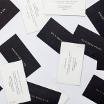
Harry Watts by Birch
Harry Watts is a British photographer who takes a systematic approach to location and explores the relationship between people and objects. His work has been exhibited nationally and internationally and was selected by Italian Vogue for solo exhibitions in London and Madrid. Harry’s brand identity, developed by London based studio Birch, is representative of his unique process of removing excess information through...
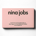
Nina Jobs by BVD
BVD have recently completed their brand identity work for Nina Jobs, a Swedish industrial designer working within the fields of art direction, product and furniture design for companies such as Ikea, Uniqlo and MoMa New York. Based around a responsive website that balances identity and content with large product images set against a white background, as well as a good...

Numbered by Martín Azúa by P.A.R
Numbered is a range of handcrafted home-ware products and individual commissions, created by Basque product, space and graphic designer Martín Azúa, that explore the relationship between functionality, emotion and conceptual thinking, and blur the line between tradition and innovation. A limited and controlled production context, personalisation and a connection to the local environment bring further value to each object and influence their...
Peter Ahrens by Studio Jubilee
Independent London-based design agency Studio Jubilee have recently updated their website and portfolio. Their brand identity work for South Australian photographer Peter Ahrens—which included a new logo-type, website and stationery set—really stood out for its use of a weighty fluorescent white material choice and tactile print process to enhance a reductionist single font approach. The project is accompanied by a great write-up, published...