
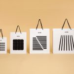
Filmore by Freytag Anderson
Filmore is a unisex skincare range and everyday routine. It is produced in Scotland for the national and international market using effective natural ingredients and Scottish water. Glasgow-based studio Freytag Anderson worked with Filmore on brand identity and packaging design. Referencing the International Code of Signals (ICS) and informed by their client’s love of Scandinavian design, the studio created a minimal graphic...

The Dayrooms by Two Times Elliott
The Dayrooms is a multi-label womenswear store, located in the London district of Notting Hill, created by Aytan Mehdiyeva and Zumrud Mammadova. The store gives a UK platform to emerging Australian designers and is an expression of Aytan and Zumrud’s shared passion for fashion and travel, and Aytan’s love of photography, textiles and Australian craftsmanship. This is reflected throughout The Dayroom’s graphic identity, developed by Two Times...

Lundén Architecture Company by Tsto
Lundén Architecture Company is a Helsinki-based design studio developing innovative structures, infrastructures and spaces. The studio, through their knowledge of strategic development, experimental building technology and urban design, drawn from their collaborations with experts from different fields, offer proposals that affect the future of the built environment. Projects have included a new school and community complex that inspires learning during...
Blå Bär by BVD
Blå Bär (Swedish for blueberries) sells a variety miscellaneous goods from Scandinavia from its store in Osaka, Japan. These include, but are not limited to, glass and kitchenware, soft furnishings, ornaments and jewellery. Many of these could be described as having something of a shared Scandinavian simplicity of form, lightness of colour, natural material quality and cheerful character in pattern...
Artek Helsinki by Tsto
Artek is a Finnish furniture and product design business and retailer with a flagship store in Helsinki. It was founded in 1935 by architect Alvar Aalto and wife Aino Aalto, the arts promoter Maire Gullichsen and art historian Nils-Gustav Hahl. Artek grew alongside and shared many of the qualities of the 20th century modernist movement, blending art and technology, and making the...
Blackhorse Lane Ateliers by StudioSmall
Blackhorse Lane Ateliers is a UK-based premium selvedge and organic raw denim jeans brand. It was founded in 2016 by Han Ates, who has over 25 years experience in the textiles industry, and is located in a renovated 1920s factory building with a distinctive profile in Walthamstow, North London. Blackhorse Lane Ateliers is committed to implementing a sustainable and ethical production model....
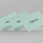
Trika by Bunch
Trika is an interior design company, working on both public and private spaces, with a showroom and studio in the Croatian capital of Zagreb. They represent furniture and equipment manufacturers such as Billiani, Enea and Federicia, amongst many others, whose brand names are described as being synonyms for quality, comfort and design. Graphic design studio Bunch worked with Trika to develop a new brand identity....

Raumindex by Moodley
Raumindex is an Austrian design, development and project management studio established in 2005 that creates integrated interior and exterior retail environments for national and international clients. Its philosophy is rooted in the shaping and arrangement of form, space and content to create functional and flexible environments to add value and elicit feelings. With a desire to appear more accessible, and with...

Run Mfg by Perky Bros
Run Mfg is an independent race design and production company, creating unique running events with a high-level of detail and creativity, founded by husband and wife team Nathan Barnhart and Elaine Lau working from their studio in Chicago. Nathan and Elaine commissioned graphic design studio Perky Bros to develop a brand identity that would link a variety of printed collateral,...
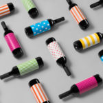
Vi Novell 2016 by Atipus
Vi Novell 2016 is a young wine from Catalonia with an intense ruby colour and a fresh and fruity flavour profile. It is the seventh in an ongoing series, and is dedicated to the party; the open-air dance, the joy and celebration of the beginning of the season, the first sip of wine, shared with friends, and the continued enjoyment of a long tradition...
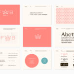
Fab Media by Bedow
Fab Media is one of Sweden’s leading media companies. It produces inspiring and entertaining content aimed at young women, and owns a variety of multi-media brands made up of websites, social media platforms and magazines. Fab Media’s specialisation, engaging exclusively women and the creation of modern cross-platform brand experiences, is expressed by their new visual identity, created by Stockholm-based graphic...
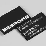
Bespoke by DIA
Bespoke is a New York-based boutique digital retouching company working within the fashion industry and moving into its tenth year of business. With a desire to appeal to an increasingly more commercial clientele while not undermining their roots Bespoke commissioned graphic design studio DIA to develop a new brand identity. With a strong favour for contrast; in colour, proportion and type, DIA establish a bold visual expression...