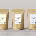
Tea & Glory by Socio Design
Tea & Glory are loose-leaf tea experts and are described as the antithesis of fast-paced coffee culture. In the same spirit of ancient tea drinking rituals, the brand is interested in the continued promotion of slow-living, a lifestyle that seeks to place more focus on the small details and experiences of everyday life. With a desire to better express this position Tea &...

Rimowa by Commission
Rimowa is a Cologne-based manufacturer of luxury luggage. It has a significant history, beginning in 1898 as a travel and leather goods maker known for its innovative approach, and growing to become an international brand with a line of polycarbonate and aluminium products with a distincive ribbed relief. Commission worked with Chief Executive Alexandre Arnault and Chief Brand Officer Hector Muelas to create...
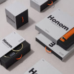
DOIY Honom by Folch
Honom is a new “male-oriented” range from Barcelona-based DOIY, a product design company creating objects that move between the practical, the ornamental and the more whimsical. Honom veers heavily towards the former with objects that include a wallet, multitool, bottle opener, keyring and bike bell. In their design, materials and build these find a balance between everyday utility and premium positioning....
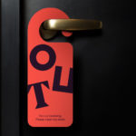
Assembly by Ragged Edge
Assembly is a new hotel from Criterion Capital located on London’s Charing Cross Road. It throws out expensive amenities to instead focus on delivering fun yet sophisticated rooms in a central location. These rooms are aimed at experience-hungry young travellers and competitively priced with interiors inspired by London fashion icons and furnished with best in class beds, showers, sound-proofing and wi-fi. Brand...

New Chapter by Paul Belford Ltd
New Chapter is a UK-based word therapy start-up that offers a unique approach to counselling. This involves participants being invited to express themselves through the written word. The synergy between personal development, a forward momentum and the written word as a mode to achieving this forms the basis of New Chapter’s clever logo design created by Paul Belford Ltd. This appears...
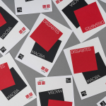
Dissabtes MACBA by Hey
Dissabtes MACBA (“MACBA’s Saturdays”) is a partnership between The Museum of Contemporary Art of Barcelona (MACBA); an iconic architectural symbol and one of the city’s leading cultural institutions, and the Japanese fashion retailer UNIQLO who recently arrived in Barcelona, and due to open its second store this year. The Dissabtes MACBA initiative offers free entry to the museum every Saturday evening, 4–8pm, and invites...
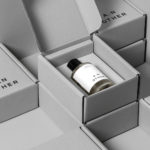
Osofor by Paul Belford Ltd.
Osofor will be a digital-first and lab-grown diamond jewellery business able to create stones of any shape and cut. It will offer a modern and sustainable luxury brand to those who desire the material qualities of diamonds without the environmental and sociological impact. Osofor intends to distinguish itself further by fusing enduring aesthetic desirability and artisanal practice with experimental materials, unexpected production processes,...
Maison De Greef 1848 by Base Design
Maison De Greef 1848 is a high-end luxury jewellery brand, expert watchmaker and retailer that opened its first shop in 1848 at 24 Rue au Beurr, Brussels. Shortly after De Greef became the official clockmaker for the Belgian National Railway Company and then the supplier of pocket watches for the Belgian Navy. The brand has built an enduring legacy and weathered many...
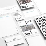
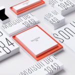
Mitsulift Elevators by Base Design
As the built environment expands, as it seeks new places to fill and accommodate a growing populace, time spent in and our reliance on modern conveyance systems develop in tandem. Reliability is central to this experience. Mitsulift is an elevator specialist tackling this need, balancing what is described as a Japanese technical expertise with exceptional Middle-Eastern service. Its graphic identity, however,...
A.N Other by Socio Design
A. N Other gives its perfumers the creative room to craft limited edition, luxury and high concentration fragrances free from the pressures of consumer trends, market segmentation and budgetary constraints. These are then sold direct-to-consumer through its website. A.N Other places greater value on the internal composition of each of its fragrances, and the inspirations and aspirations of its creators, than...
Rimowa by Commission
Rimowa, an abbreviation and then compound of founder Richard Morszeck Warenzeichen name, is a Cologne-based manufacturer of luxury luggage. It has a significant history, beginning in 1898 as a travel and leather goods maker known for its innovative approach, and growing to become an international brand with a distinctive line of polycarbonate and aluminium products. Rimowa’s first fully aluminium designs were created following a...

Tangent GC Hand Cream by Carl Nas Associates
Tangent GC began as a Scandinavian organic garment and shoe care company developing products that intended to ensure longevity, and entered the organic skincare market in 2016. The company’s graphic identity, a simple typographical expression, designed by Essen International, delivered a sense of informational immediacy through the absence of superfluous stylistic detail and colour, yet divide content and drew out a distinction in...