
The Practical Man by Garbett
The Practical Man is an online retail destination for men’s sports style and fitness, activewear and equipment, but also editorial content that covers reviews, fitness-focused travel guides and in-depth insight into new brands. It curates a catalogue of world-leading products that exist at the intersection of fashion and sports performance, designed by innovative and passionate brands with progressive approaches. Australian graphic design studio Garbett worked with The Practical Man...

Vitra by BVD
Vitra is a Swiss furniture manufacturer that holds the European license to many of Herman Miller’s ranges. It has a large and diverse catalogue of contemporary home and office furnishings, furniture for public spaces and timeless classics by notable designers such as Charles & Ray Eames, George Nelson and Verner Panton. After years of admiring Vitra’s range of furniture, Scandinavian graphic design studio BVD...

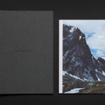
Pia Ulin Photography by The Studio
Pia Ulin is a Swedish photographer, working between New York and Stockholm, who has built a considerable reputation from her daylight-only approach. This is said to infuse her images, which cover interior, lifestyle and still life, with a warm and natural quality. As well as producing editorial photography for publications such as Dwell, Martha Stewart and Elle Decoration, Pia has also contributed...

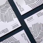
The Working Capitol by Foreign Policy
The Working Capitol is a co-working space located within a historic building situated in Singapore’s Chinatown. It is described as being less of a start-up incubator and more of a community of knowledgeable people working at the intersection creativity, technology and business. Its brand identity, designed by Foreign Policy, is based around the Euclidean Principle, a mathematical system of basic parts that...
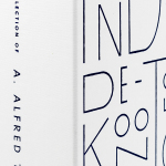
The Collection of A Alfred Taubman by Franklyn
The late A. Alfred Taubman was an American real estate billionaire, philanthropist and former owner and chairman of Sotheby’s, who had built a significant art collection, valued at around $500 million, that included works by Raphael, Kandinsky and Picasso, amongst many others. Following Taubman’s death this year, and with the hope of restoring his image after a price-fixing conviction in 2002, Sotheby’s held a...
Johnny Roxburgh by Bunch
Johnny Roxburgh is an entertainer and party designer working with the rich and famous nationally and internationally. He has over thirty years of experience and has held a royal warrant for the last nine. In the words of The Scotsman, Johnny is capable of turning the whims and fancies of the world’s wealthiest one percent into glittering realities. These have included, but are certainly not limited...

Twice Fashion by Socio Design
Twice Fashion is a Chinese luxury accessory brand established by Tina Tian and Dr Mirko Wormuth in 2007. Since then it has grown to become one of the country’s top accessory brands, with stores in Beijing, Tianjing and Chongqing. Twice Fashion is described by SocioDesign, the London based graphic design studio behind its rebrand, as having helped shaped China’s ‘fast’ fashion industry....
4B Arkitekter by Commando Group
4B Architects is an architecture studio with offices in Oslo, Norway, an experienced team and a holistic approach. It has a particular interest in low energy and sustainable projects, and has built a portfolio of restorations, public, cultural and commercial buildings, private housing and outdoor spaces. The studio’s team of founding partners (from its inception in 1971) and a generation of...
K. Apeland by Bielke&Yang, Norway
K. Apeland is a Norwegian independent civil engineering consultancy that specialises in construction technologies, and applies its experience to new builds, remodelling projects and renovation. It has a favour for steel-wood and concrete structures, which has won the consultancy a number of awards, and has a broad portfolio that covers public infrastructure, private offices and housing, as well as viewing platforms,...
Norwegian Presence by Bielke&Yang
Norwegian Presence was an exhibition of handcraft and design, past and present, from Norway. It was held at Fuorisalone, which makes up part of Milan Design Week, and moved on to The Gifts & Interior trade fair in Oslo and 100% Norway in London. The exhibition featured 51 different products from 46 designers, with the intention of showcasing a diversity of approaches, innovations,...
Maaemo by Bielke&Yang
Design studio Bielke&Yang have worked with Norwegian two Michelin starred restaurant Maaemo to develop a holistic brand identity solution informed by the philosophies and creative practices of its unique dining experience and culinary expertise. The studio’s brand identity design, which encompassed website, custom typography, colour, the tone and content of images, and the tactile finishes of welcome notes, magazines, business cards, folders...
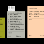
MOS Architects by Studio Lin
MOS is an American architectural practice that mixes playful experimentation with serious research. The practice, as it exists now, following two years of what seems to be an informal approach, was established in 2005, and has worked through a range of design experiments it describes as a make-believe of architectural fantasies, problems, and thoughts on what the practice would be building in the...