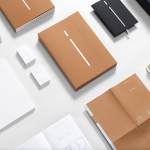
Meg’s Tailoring by Studio South
Meg’s is a tailoring service, established by Megan Kenny, that began as a single store on Garfield Street in 1995. Meg’s now has two locations in Auckland, New Zealand, provides a broad range of services; from hems to full garment design, and works on large projects with high-end designers and labels such as Hugo Boss, Prada and Gucci, and on smaller jobs from High Street drop-ins....
The International by Studio South
The International is a new apartment complex, located not far from Auckland’s Albert Park, with 88 luxury residencies. The building, a repurposed former office, is currently being transformed into an iconic structure with a contemporary exoskeleton of elongated beams. To promote the building and help sell apartments off-plan, the graphic designers at Studio South worked with the developer behind The International...
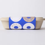
Happy Maple by Garbett
Happy Maple is a Adelaide-based bakery dedicated to producing small batch 100% vegan donuts, baked not fried, made from gluten, tree nut and peanut free recipes. Orders are by phone, e-mail or through their pop-up stores. There is no website, just a social media presence with lots of donut images, a personable approach to communication, and a cheerful brand identity created by...
Smithey Ironware Company by Stitch
Smithey is an ironworks producing kitchenware from its location in Charleston, South Carolina. Smithey’s first product, a 10 inch skillet, features a smooth, non-stick cooking surface, created using a handcrafted method of finishing and polishing. This process was developed in response to the rough, coarse and sandpaper-like finish that proliferates the ironware market, which creates an uneven surface temperature, makes it...
Linden Staub by Bibliothèque
Linden Stuab is a UK-based model agency challenging industry conventions with their mantra ‘Empowering Women’, and by acting as a mother agency to all of their models. The name Linden Staub, derived from the maiden names of the two founding partner’s mothers, is an expression of this, and alongside the agency’s strong human-focus, was the basis for their new brand identity, created...
Rattis Books by The Counter Press
Rattis Books is a new London-based independent publisher that celebrates the convergence of traditional and modern print processes and has a firm belief that the book is an art object. To help convey this, the publisher worked with design studio, private press and typography workshop The Counter Press to create their brand identity, and the design for their first book Tiro, a collection of football writings....
M11 studio by Inhouse
M11 studio is a luxe salon, located in the heart of the fashion, shopping and entertainment district of Newmarket, Auckland, that references the refinery of a Tom Ford fashion boutique. It has a well-proportioned, spacious, linear and light filled interior of large mirrors, strip and spot lighting, white and black walls, gold fixtures, concrete surfaces and robust furniture developed by...
Paco Rabanne by Zak Group
Paco Rabanne is Spanish designer and French fashion label established in 1966 with a catalogue of ready-to-wear garments, shoes, fragrances and accessories. Rather than an interest in the past, Paco Rabanne, who originally trained as an architect, has created strong silhouettes from new materials, and often rejected the spirit and art of the time. Paco Rabanne’s creative director Julien Dossena worked...
Arco by Raw Color
Arco is a family run contemporary furniture design and manufacturing company that currently rests in the hands of fourth generation family members, and has a respectable 110 year history. Arco has tables and chairs at the heart of its collection and specialises in woodwork, a reflection of its location in Winterswijk, an area of dense natural woodland in East Netherlands. Eindhoven-based graphic design studio Raw Color worked with Arco Creative...
Arde by IS Creative Studio
Arquitectura Diseño y Espacio, abbreviated to Arde, is a Peruvian architecture and design firm creating contemporary structures that have a strong sense of light and space, a preference for the geometric and often juxtapose exposed architectural surfaces with those that are natural and crafted. Lima-based IS Creative Studio recently worked with Arde on naming and visual identity that would link a variety of assets. These included stationery, business...
Learig by The District
Learig is a UK-based commercial and residential property developer managing projects end to end, from planning to design to build, and the financial considerations that link each of these stages. This end to end management, and Learig’s three tiers of expertise, is visually articulated by its new brand identity, designed by The District, through a logo of three stacked blogs which extend out...
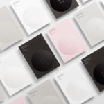
Erik Penser Bank by Bedow
Erik Penser Bank provides its clients with independent financial advice and a high-level of personal service. While large banks do provide similar services, Erik Penser Bank is Sweden’s only dedicated private banking business. Professionalism, experience and an individualised service practice are expressed by the bank’s new brand identity, created by Stockholm-based graphic design studio Bedow, through the personable and less corporate qualities of a monogram, which...