The Counter Press by The Counter Press
The Counter Press is a letterpress studio and workshop located in an old chocolate factory in the East End of London. They work exclusively with hand set wood and hot metal type on antique presses to create contemporary typographic design, artwork and limited edition prints. While taking on small outside projects, founders David Marshall and Elizabeth Ellis are keen to stress they are not...
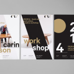
Carin Wilson by Studio Alexander
Carin Wilson is a renowned furniture maker, sculptor, design educator and leader of the New Zealand craft movement throughout the 1970s, 80s and 90s. As well as precisely crafted functional furniture, Carin also creates pieces that look to explore narrative through alternative form — check out his work Royal Pain in the Arse — and are influenced by his Maori heritage. Carin Wilson’s...
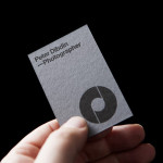
Peter Dibdin by O Street
Peter Dibdin is a photographer who brings creativity, technical knowledge, professionalism and a personal approach to both studio and location shoots for clients working within the commercial, private, arts and editorial sectors. Following a recent move to a studio in Edinburgh’s creative hub of Summerhall, Peter commissioned long-term collaborator O Street to refresh his brand identity in a way that would reflect his...
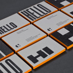
Rush Talent by Bunch
Design studio Bunch worked with Rush Talent, a London based public relations company, to develop a visual identity, this included monogram, logotype and stationery design. Rush Talent describes itself as at forefront of the factual and lifestyle television scene and represents emerging UK broadcasters working within the fields of fashion history, sports, science, architecture, food and art, and includes the likes of Amber...
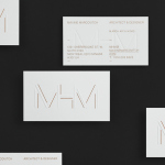
MHM Architects by 26 Lettres
MHM Architect is the studio of independent Canadian architect Maxine H. Marcovitch who, working with a team of professionals, trade and closely with clients, creates “beautiful, innovative, and unconventional architectural spaces.” The studio’s new brand identity, developed by 26 Lettres and which included a logotype, blind embossed business cards, portfolio with open stitch detail and website, delivers a familiar but appropriate...
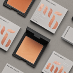
Maréna Beauté by We Are Bold
Maréna Beauté is a new Swedish cosmetics brand, founded in 2013 by make-up artist Diarry Maréna, that creates high quality products for people with dark skin types. Stockholm-based design studio We Are Bold were commissioned by Maréna to develop a brand identity solution for her range of foundations, powders and blushers—which included a monogram, logo-type and packaging design—that would appeal to a market currently...
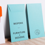
One To Be by Coast
One To Be is a Brussels based furniture design and manufacturing workshop that crafts custom wood pieces for residential refurbishments, bespoke kitchens, office and retail spaces, exhibitions, art installations and one-off pieces for private individuals. The workshop’s visual identity, a logo-centric solution executed across dyed uncoated paper choices by design agency Coast, is straightforward in its presentation of craft, functionality and...

Daniel Juncadella by Mucho
Following his recent promotion to official Mercedes driver for the DTM (Deutsche Tourenwagen Masters) and test driver for The F1 Mercedes team, Daniel Juncadella recently commissioned design agency Mucho to “improve his personal brand and the way he communicated with his growing fan base and the press”....
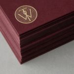
Willow Tree by Bunch
Willow Tree, one of London’s leading business consultancies, worked with graphic design studio Bunch to develop a new but traditional-looking visual identity with an attention to detail. Based around a WT monogram, created by typographer Spencer Charles, utilised as a mix of embosses, carved in seals and simulated watermark, and using purple cloth, black leather, cream paper and handmade coffee pottery, Bunch’s solution embraces a...
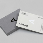
Ali Sharaf by Mash Creative
Ali Sharaf is a Bahrain-based commercial photographer who specialises in fashion, beauty and lifestyle images for the advertising and editorial markets. He describes himself as contemporary, upbeat, outspoken and edgy. Inspired by a shared interest in Swiss modernism and adopting a less is more approach, design studio Mash Creative developed a new brand identity for Ali that combines an iconic...
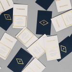
Tourean by Anagrama
Tourean is a British multinational venture capital firm that manages a variety of lifestyle subsidiaries within the music, design, events, social media and fashion industries. Their new visual identity, developed by design agency Anagrama and drawing inspiration from the Tourean name – a compounding of the words taurean and tour created to convey the values of strength, fortitude, courage and integrity as well as...
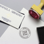
Rafaela Abrahão by BR/Bauen
Brazilian fashion blogger Rafaela Abrahao recently commissioned design agency BR/Bauen to develop a new visual identity that would extend across her website and stationery. Drawing on Rafaela’s favourite brands, Prada, Versace and Hermes, and an interest in English nobility for inspiration, BR/Bauen developed a solution that unites the fine illustrative detail and typographical flourish of a blackletter monogram executed with a contemporary and consistent...