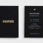
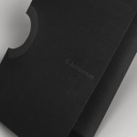
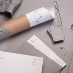
Highpark by Face
Highpark is a new residential project located in the middle of San Pedro Garza García and described by Face – the agency behind the development’s visual identity, print work and website – as ‘arguably one of Latin America’s most affluent municipalities’ and widely credited as an “architectural masterpiece”. Face go on to say that the “project needed to speak volumes about the...
Metronet by Work In Progress
Metronet is an Oslo-based consultancy that provides strategic SEO, PPC, e-commerce, social media, web analytic, design and development services to a wide range of international clients. The consultancy’s visual identity, developed by Work In Progress, mixes the established technological conventions of simple geometric forms, fine line weights, grids and a mono-spaced typeface with abstract interior artwork and a retrospective undertone to convey digital networks,...
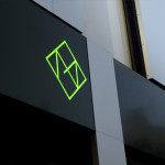
K2LD Architects by Studio Hi Ho
K2LD is a small Melbourne-based architecture and interior design firm with a project history that includes individual private homes, community precincts, multi-unit developments and large-scale commercial projects. The firm’s identity, an abstract, structural and modular amalgamation of initials (check the ideation animation here), uncoated materials and a monochromatic colour palette – developed by brand and communication studio Hi Ho – unapologetically embraces the established and reductionist cues of the industry....
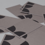
NB Flowers by Karoshi
NB Flowers is a florist – founded by Neil Birks and located at London’s New Covent Garden Market – that specialises in corporate and private events, delivering value through a combination of ‘beautiful flowers, creativity, and a personable service’. Multi-disciplinary design agency Karoshi were commissioned to ‘rebrand and reposition NB Flowers as one of London’s leading luxury event florists and capture the essence of the...
O Architecture by Heydays
O Architecture is a small, Lille-based multidisciplinary studio whose practices extend beyond traditional architectural services to include artistic installations, educational courses and editorial work. Their visual identity, ‘a solid circle with a disruption that creates a triangle reminiscent of an A’ – created by design agency Heydays – , unites the broad remit of the studio under a simple symbol with a revolving, holistic quality that...

The Beaufort by The Company You Keep
Design agency The Company You Keep (TCYK) have recently finished working with bartender Dave Kerr on the naming, branding, collateral design and signage for The Beaufort, a themed dive bar located on Melbourne’s Rathdowne St. The agency’s visual identity solution, a combination of a quirky, well rendered, bespoke logo-type – built from unusual but original uppercase characters inspired by iron dock...
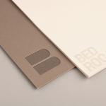
Bedroc by Perky Bros
Bedroc is a Tennessee-based consultancy firm that takes complex business issues and simplifies them with technology to reduce risk, optimise efficiency and creating revenue for its clients (ROC). The firm’s visual identity, created by multidisciplinary design agency Perky Bros, avoids the conventions of the industry and instead favours a direction that draws an analogy between bedrock and technology—the physical stability, sub-surface...
Townhouse by Koniak
Townhouse is a hotel designed and ‘curated’ by The Kastiel Family and located at the heart of the Tel Aviv. Based around tactile material and print finish, a mixed typographical approach in conjunction with a simple sans-serif logo-type and monogram, Townhouse’s visual identity, created by boutique design studio Koniak, frames the traditional crafted luxury of the hotel’s interior fixtures and fittings with a...
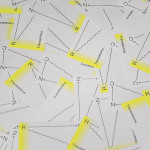
RNC Translations by Studio Constantine
Renata Noronha Cossio is a Brazilian-based provider of ‘sworn’ Portuguese, French and English translation services that cover official documents such as birth, marriage and academic certificates, passports and residential permits. Her visual identity, developed by creative design agency Studio Constantine, is a really interesting and unusual diagrammatic interpretation of a classic monogrammatic presentation of personal service. Its combination of fine line work,...
Krohn by Commando Group
Krohn is a young but experienced Oslo based furniture, interior and architecture design studio that develops holistic solutions that strengthen and add value to businesses through interior environments. Krohn’s visual identity, website and stationery—created by visual communications agency Commando Group—captures the multi-disciplinary nature of the studio and juxtaposes bold architectural structure and simple interior spaces with fine, high quality detailing, through an abstract,...
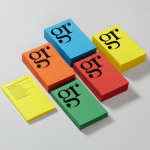
GR Communications by Ascend
GR Communications is a London based PR agency that is described as being made-up of a ‘close knit group of progressive and forward thinking experts’. Their visual identity, designed by independent brand, graphic and web design agency Ascend, captures the idea of unity, communication and creativity through a simple ligature detail, single quotation marks and a diverse, vibrant but complementary...
ITI Computers and Diventa by Bunch
ITI Computers is a Croatian-based software company that specialises in the development of IT solutions for the leisure, tourism and hospitality sectors. Bound by a consistent typographic and monogrammatic design solution but divided by an organic and systematic contrast of context, creative agency Bunch developed a new logo and print solution for ITI and its leading management product Diventa, which delivers an interesting richness...