Notebook Design
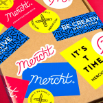
Mercht by Robot Food
Mercht is a UK based custom merchandise business, created by the team at Awesome Merchandise, that offers its customers a risk-free way to design, sell and ship customised t-shirts and wearable accessories, through an online showcase and print on demand service. It is a platform where, if designs sell well, both parties profit, with neither loosing if they do not. Leeds based graphic design...
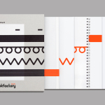
Bubu by Bob Design
Buchbinderei Burkhardt, now shortened to Bubu, is a family-owned binding specialist established in 1941. It is now run by third-generation family members and has locations in the Swiss cities of Zürich and Mönchaltorf. Bubu provides consultancy and prototyping services, curates an extensive binding library of over 2000 books, and offers a wide variety of soft and hardcover binding techniques. These include the familiar and utilitarian...
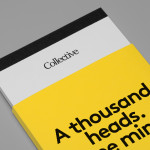
Collective by Hey
Collective is a new Istanbul based agency that is described loosely by Hey, the design studio behind its brand identity, as producing content, communication and design work. Its has an ideology, like the name suggests, based around a collaborative approach, developing projects with an extended network of people with a variety of skills. Hey recently created an visual identity treatment for...
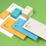
Dosatres by Comite Studio
Dosatres is a Spanish company that connects and manages a wide network of creative and strategic business centres that help brands to discover the best way to grow and communicate. Created by design studio Comite and based around the name ‘two to three’ — informed by the company’s ability to broaden communicative opportunities and paths to growth, and the concept of moving from two to three-dimensional...
Bølgeblikk Arkitekter by Tank
In response to a change in leadership and the acquisition of new staff, Norwegian architectural firm Ottar commissioned Tromsø and Oslo-based design studio Tank to develop a new name and brand identity—which would go on to include a logo, stationery set and responsive website—that would better reflect the quality, professionalism and scale of the firm’s work within the health and education sector, whilst...
Mellbye by Heydays
Mellbye is a Norwegian architecture firm founded in 1954 with a “mindset anchored in modernism”. Design studio Heydays created a new brand identity for the firm based around a geometric M symbol built from the initials of their two main services, architecture and interiors. Executed as a combination of blind deboss and die cut detail across a earthy and urban...
Frederik Laux Photography by LSDK
Frederik Laux is an award winning German portrait, fashion, lifestyle and editorial photographer with a client list that includes Alliance and Mercedes-benz. His new visual identity, developed by Stuttgart based design agency LSDK, takes a competently spaced but generic condensed, sans-serif logotype and executes it as a redacted three-line mark die cut by hand across a print solution that mixes...
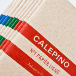
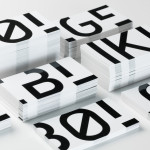
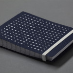
Calepino by Studio Birdsall
Calepino is a french manufacturer and brand of “traditional yet technical notebooks with an authentic vintage spirit” made from 100% recycled, locally sourced paper, covered with a cardboard from a factory with a heritage dating back to 1927 and assembled by hand. Calepino’s brand identity and print, recently designed by Florida based Studio Birdsall, juxtaposes the earthy craft textures of an...
Bedre Kommunikasjon by Work In Progress
Bedre Kommunikasjon is a oslo-based consulting firm, run by communication specialist Nils M. Apeland, that offers personal, professional and independent advice to business, drawn from 20 years of analysis, strategy, promotion, media relations and crisis management experience. Multidisciplinary design agency Work In Progress recently worked with Nils to develop a new visual identity solution which included a logo, business card and stationery design...
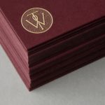
Willow Tree by Bunch
Willow Tree, one of London’s leading business consultancies, worked with graphic design studio Bunch to develop a new but traditional-looking visual identity with an attention to detail. Based around a WT monogram, created by typographer Spencer Charles, utilised as a mix of embosses, carved in seals and simulated watermark, and using purple cloth, black leather, cream paper and handmade coffee pottery, Bunch’s solution embraces a...
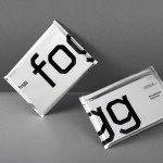
Fogg by Bunch & Kurppa Hosk
By purchasing overcapacity from international telecom networks, Fogg Mobile provides a fixed cost mobile data traffic service for people who want to avoid unexpected roaming bills when travelling abroad. Through the animate and evolving qualities of computer generated imagery and a combination of unbleached paper, stitching, flat coated colour and silver polypropylene, Fogg’s visual identity, created by Kurppa Hosk and developed by Bunch, delivers...
Townhouse by Koniak
Townhouse is a hotel designed and ‘curated’ by The Kastiel Family and located at the heart of the Tel Aviv. Based around tactile material and print finish, a mixed typographical approach in conjunction with a simple sans-serif logo-type and monogram, Townhouse’s visual identity, created by boutique design studio Koniak, frames the traditional crafted luxury of the hotel’s interior fixtures and fittings with a...