Stereoscope by Olssøn Barbieri
Oslo-based multi-disciplinary design studio Olssøn Barbieri has created the brand identity for Los Angeles-based speciality coffee roastery Stereoscope, working across its packaging design and printed materials with a typography-led approach that celebrates tactility. According to Olssøn Barbieri, Stereoscope is underpinned by a philosophy that sees coffee as a living organism rather than a commodity, and which takes its responsibility to...
Ortto by Christopher Doyle & Co.
All systems grow. What a fun line. Setting up and positioning Ortto, formerly Autopilot, as the leading marketing automation solution for business. The name is great, a wonderful move forward for the company, and sufficiently taking something technical and inhuman-sounding and giving it a somewhat anthropomorphised quality, easy to remember and providing room for growth into other technologies and services....
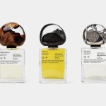
.Oddity Fragrance by .Oddity Studio
In July 2019 New York-based Stefan Sagmeister and Jessica Walsh announced that they would be splitting their shared practice after nearly a decade of innovative and boundary-pushing work together. In the amicable separation, &Walsh took over the commercial projects while Sagmeister announced he would exclusively be working on ‘self-generated design’ under Sagmeister Inc. Having made his millions, Sagmeister’s days are...
Tugg by Kurppa Hosk
The hamburger is an American icon. It conjures associations with all-American diners and drive-thrus, backyard cookouts and family gatherings; American values, such as entrepreneurship, as well as less positive attributes of Western countries, like obesity. The burger’s visual identity is inseparable from its history and has been solidified time and time again as the big fast food franchises conquered the...
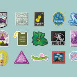
Seedsman by Here Design
Water masquerading as an edgelord-baiting energy drink (Blackletter fonts, skulls, and a name straight out of the heavy rock canon); running shoes aping a chesty cough remedy; olive oil bottles that owe more to the science lab than the Mediterranean. Packaging at the moment, it seems, is frequently playing fancy dress. That’s no bad thing, of course: brands borrowing aesthetics...
BrewBird by Mucho
Global strategy, branding, packaging, and graphic design studio Mucho created this colourful new identity for coffee tech startup BrewBird, working with Scottish artist Craig Black. Mucho was appointed to create a new brand identity and ‘memorable’ packaging system to help BrewBird communicate its story around uniting cutting-edge tech, taste, and ‘the artisanal craft of coffee roasters’. According to Mucho, drip...
Forskningsrådet by ANTI
2022 was, let’s say, an interesting year for Forskningsrådet (The Norwegian Research Council). The public institution, which provides public funding for research and innovation across a wide range of fields, usually operates without controversy or intense public scrutiny. This changed in September 2021 when Norway held its national elections and got itself a change of government. And along with that,...

Eager by Ragged Edge
The visual ‘territories’ of design and the strategic routes of marketing and advertising run in cycles, parallel to consumer culture. Ideas that fall by the wayside one decade are rediscovered, remixed or recycled in another. Challenger brands grow, take on the established and are either acquired, expire or, sometimes, find a sweet spot for growth that allows them to remain true...
Tembo by Perky Bros
When I first caught Perky Bros’ latest project I misread it as ‘Tempo’, the speed at which music is played. Timing is everything, or so it is said. For real estate company Tembo this notion takes the form of patience; the time to grow gently and judiciously. Property development, momentarily paused during the pandemic, seems to have recovered and is again...
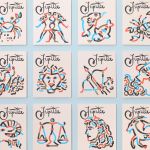
Jupiter by Triboro
Triboro worked on its first restaurant branding project over a decade ago, at a time when the folklore was that if you were a restaurant serving traditional food the visual language should evoke the region and time period of the cuisine. This was intuitive and, as Triboro founder David Heasty recounts, led to some well-crafted and beautiful results but often leaned...

The Wool Pot by Seachange Studio
More plants, less plastic. A noble mission. Over the last decade, revelation has followed revelation with regards to the environmental impact of what seemed like the most innocuous of objects. Now it’s the turn of the humble flower pot. Yep, that. Stacked and sitting empty in the shed, or at the bottom of the garden. It turns out that these...
HUB Residential by DNCO
Property development continues to boom in London. It’s difficult to see how any of this is really benefitting those most in need, or whether housing is even being designed to be resided in at this point, acting as a ‘store of value’ for those much wealthier individuals. Recently developed areas appear like ghost towns at night. Having just moved, and...