Logo
Antora Energy by Buddy Buddy, 2023
The sun has been depicted in many ways and across millennia, and has been a motif mined thoroughly by designers since the dawn of corporate identity design. It’s difficult to imagine where a designer might take it today in order to achieve both similicity and distinctiveness. Drawing on the strategic positioning ‘building blocks for a lower carbon future’ Buddy Buddy...
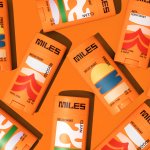
Miles by Buddy Buddy
Deodorant isn’t traditionally a hotbed of innovation: for the most part, ‘women’s’ products don an unremarkable raft of white packaging (freshness!); blue, pragmatic type; and vague, rarely-kept promises about lasting for 72-hours. For the men, packs are sombre shades of black, dark blue, or grey (manly!) and just as drearily practical as the women’s. Deodorant, for the most part, has...
Logo
Nationwide by New Commercial Arts, 2023
The world’s largest building society gets a new logo and corporate identity designed by New Commercial Arts. It’s the first significant rebrand for the bank in thirty years, and part of a drive to modernise it. Reduced to the absolute bare essentials, the logo favour usability–scaling far better than the previous mark–over the down-to-earth homeliness of what came before. The...
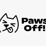
Paws Off! by Seachange
Anyone who’s ever had a dog, or just interacted with one, has likely spotted that over and above pretty much anything, food is the centre of their universe. Unfortunately for us, though, it’s not just dog-safe food that they’ll do whatever it takes to get their paws on: human food, it seems, often has the most appeal. But just as...
Marshmallow by Ragged Edge
A marshmallow is sweet, soft, pliable. Yet they are also resilient and surprisingly strong – who among us hasn’t enjoyed watching them perform surprisingly well under a hydraulic press compared to substances that much more obviously scream ‘structural integrity’? Perhaps this soft-yet-strong dynamic is why the name works for an insurance company. Or perhaps, more simply, the name works because...
Frydate by Skinn
Beyond its eye-wateringly strong beers, decadent chocolates, and waffles; Belgium is famous for serving up one beloved belt-buster that’s easy to eat, and deceptively hard to get right: chips. A new Belgian homemade burger and snacks offer, Frydate, positions itself far beyond a humble chippie and into the realm of ‘Belgian frymanship’-led ‘friterie concept’. To help it achieve its ‘insatiable...
Logo
ERM by Pentagram, 2023
Inspired by energy-generating turbines and creating two circles from displaced radial lines, ERM’s new logo is said to express transformation from both macro and micro planetary perspectives. Circles and contrasting line weights do indeed give these impressions. If you spend much time in the field of historical logo research (not sure there’s many), the work of Wim Crouwel and Ben...
smlXL by DIA
As the adage goes, ‘Give a man a fish, you feed him for a day; teach him to fish, and you feed him for a lifetime’. With this vivid paradigm of self-sufficiency in mind, we can esteem the advent of creative coding in branding, allowing design agencies to hand brands over to clients as generative tools capable of generating limitless...
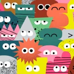
Monkey Baa Theatre Co. by Universal Favourite
Theatre is an artform that relies not only on its visual and verbal performance elements, but the text from which all the rest of the more showy aspects are born. An obvious point, but one that often makes me wonder: why do so many theatre companies have such terrible names? Maybe it’s a sort of in-joke, maybe I’m just missing...
Upgrade to
BP&O Plus
Read more
Logo
Fresh & Dry by Paul Belford Ltd, 2023
Talc free & paraben free, phthalate, preservative & cruelty free. Fresh & Dry ticks all the boxes and positions itself against the giants of the baby care industry. With all those ‘ands’ it’s no surprise that Paul Belford Ltd decided to make the most of the ampersand, working as both an integrated and independent element with curves that suggest care...
BP&O Voices
Rich Baird on Design History:
AGIP by Unimark International
The history of Unimark International’s 1971 logo for Italian oil company AGIP....