Logo
MoN – Museum of Narratives by Pentagram, 2026
Pentagram developed the strategic idea of ‘dimensional time’ for Japan’s Museum of Narratives as a way to express that while time might be experienced as linear, ideas, traditions and culture don’t behave that way and further, they recur, get reinterpreted, loop back to find new meaning in a different age. Pentagram’s logo, a spiral monogram, is perhaps the most literal...
Who knew a spiral could do so much? Pentagram did, in this joyful Tokyo museum identity
The Museum of Narratives (also known as MoN Takanawa) is located in Tokyo’s Takanawa Gateway City, and opened a couple of months ago in March 2026. It’s something of an experimental museum with a cross-disciplinary programme spanning visual art, installations, and performances themed around everything from society to art to science, manga, and anime; merging traditional Japanese culture with hyper-modern,...
Logo
Ela Vinhos by Pedro Vareta Studio, 2026
Pedro Vareta Studio are so pleased with their logotype for Ela Vinhos they made a cute little gif to show us how each letter is informed by the contours of a red wine bottle. It’s wholly unnecessary, it’s totally felt, it doesn’t need an explanation. The full logotype is gorge, full of character, even the abbreviated ‘E’ symbol, used on...
Upgrade to
BP&O Plus
Read more
BP&O Voices
Packaging:
Daylight Savings
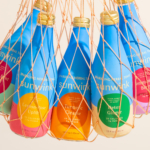
Packaging expert Lisa Cain shares her opinion on ready-to-drink sparkling tonic brand Sunwink....
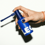
Creative Spark’s bold, no nonsense identity for hair loss brand Leo
Leo is billed as a “hair rejuvenation brand”, founded by duo Jason Saks (who carries the rather sweet, and quite funny job title of Director of Hair Loss) and his son Joe, with the broad aim to make hair loss feel “less isolating and less complicated”. According to Manchester-based design agency Creative Spark, which has created the superb new identity,...
Logo
Ideogram by How&How, 2026
Ideogram is one of the many new AI image generation tools developed for the design industry, promising post-image generation editing functionalities; essentially a prompt-based Photoshop alternative. This integration of AI into human-led creative workflow is beautifully expressed through Ideogram’s logo, a representation of the mind and a negative space ‘I’. This is also furthered in the balance of the organic...
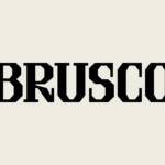
Another Collective’s identity for smash burger brand Brusco deftly reinvents classic burger joint design tropes
Food trends are a funny old thing aren’t they. And just as design trends are never just about ‘aesthetics’ – the ‘what something looks like’ divorced from the world around it, food trends aren’t just about ‘edible stuff’, or ‘what things taste like’. Such movements both hold up a mirror to, predict, and feed back to us (literally, in the...
Logo
The Stack Group by Fourth Canvas, 2026
The ‘Stack’ Group, such an invitation for a logo designer. Why complicate things? It’s a group, so duplication, and an S expertly linking the stack. Simple. Works well at different sizes and feels full corporate, straight from the modernist playbook kinda thing. There’s a lovely flow between the blocks, and a good balance of positive and negative space. The case...
BP&O Voices
Packaging:
Now You See It
Packaging expert Lisa Cain shares her opinion on Studio Bland’s work for Australian butter brand Bu Deli....
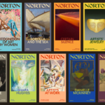
Koto breathes new life into Floridian arts institution The Norton
The Norton Museum of Art began life in 1941 in West Palm Beach, Florida, and in the near-century since, its whole raison d’être has been based around its role as a place where “art and life meet as a part of everyday art”. As such, it acts as more than a look-don’t-touch-style gallery space: the garden, gallery and restaurant are...
Logo
Smart Stream by Pony, 2026
Pony repositioned Smartstream, moving it from a traditional fintech provider and towards a contemporary data and AI business, reframing its narrative around intelligence, scale, and forward momentum. This reframing can be seen in the logo, with positive space framing the negative and creating an ‘S’. Today, what the logo can do in motion is also important. Here, it splits apart...