
Iona Brown by Sam Flaherty
Iona Brown is a London based contemporary jewellery designer who favours classic simplicity, understated detail, precise finishes and minimalist lines, shapes and materials. Graphic designer and art director Sam Flaherty recently worked with Iona to develop a new visual identity for her expanding collection. Built around a customised logotype and a simple print and packaging treatment that uses few but good quality and contrasting...
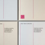
Rush Talent by Bunch
Design studio Bunch worked with Rush Talent, a London based public relations company, to develop a visual identity, this included monogram, logotype and stationery design. Rush Talent describes itself as at forefront of the factual and lifestyle television scene and represents emerging UK broadcasters working within the fields of fashion history, sports, science, architecture, food and art, and includes the likes of Amber...
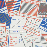
Lucky 21 by Blok
Lucky 21 is a film production company, located in the US city of Dallas, who bring a “contagious energy and tireless drive” to the industry and have a production team and director roster that includes the talents of Jeff Bednarz, The Chartrands, and Tom Ryan, some of whom have worked for big brands such as TGI Fridays, AIG and Home Depot. Lucky...
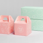
Milk Lab by Studio fnt
Milk Lab is a 100% pure milk dessert, flake and roll cake restaurant located in the South Korean city of Busan. The restaurant’s visual identity, designed by Studio fnt, conveys some of the chill and smoothness of its desserts through the rounded terminals of a slab serif logotype, its container, similarly styled monolinear icons, icy photography and a milky pastel colour palette, and...
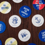
Seafarers & Ostro by Inhouse
Seafarers is a recently rejuvenated seven floor habour front building located in Auckland’s Britomart precinct that will house, over two floors, Michelin starred chef Josh Emett’s flagship restaurant, due to open in stages throughout 2014, as well as brasserie and bar Ostro. The brand identity for the building, restaurant and brasserie, developed by Inhouse, draws on the rich history of the space—once known as...
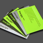
Limelight Sports by Studio Blackburn
Limelight Sports is a London based agency that specialises in grass roots sports consultation, organises high profile events and campaigns such as ‘SwimBritain’, ‘Nike She Runs 10km’ and the London Duathlon, and creates programmes designed to engage with a mass audience by utilising mobile and location based technologies and social networking platforms to connect competitors and spectators during live events. Design agency Studio Blackburn...
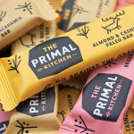
The Primal Kitchen by Midday
The Primal Kitchen is a UK based health food brand founded by nutritionist Suzie Walker with the intention of making the paleo lifestyle, a modern nutritional plan based on the presumed diet of Paleolithic humans, easier and more accessible. The Primal Kitchen commissioned design studio Midday to create a visual identity for the brand which would extend across the packaging for its cold pressed...
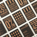
Miinus by Bond
Miinus is kitchen created by Finnish furniture manufacture Puustelli. As the name suggests, Miinus was developed around the philosophy of reduction, the process of removing superfluous elements to leave only the minimum, most functional aspects intact. Helsinki based design studio Bond where commissioned by Puustelli to develop a brand identity for the kitchen that would extend across stationery, print, retail and exhibition spaces. By utilising...
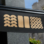
Los Italianos by Huaman
Los Italianos is a traditional Italian food producer and retailer with three locations across Barcelona but with its roots in the Piemonte region of Italy and a significant history that dates back to 1939. Los Italianos recently commissioned Spanish design studio Huaman to develop a new brand identity that would better position them within the gourmet category, introduce an elegance and modernity...

Hamptons House by Moffitt.Moffitt
Hamptons House is a Sydney based curator and retailer of furniture and homeware collections that celebrate the unexpected and draw influence from renowned New York holiday destination The Hamptons. Design studio Moffitt.Moffitt were recently engaged by the retailer to develop a new visual identity — which went on to include logo and logotype design, illustration, shopping bags, packaging, swing tags, stationery and membership key — that...

In Bed by Moffitt.Moffitt
In Bed is an online store that is a celebration of almost everything we love to do in bed. It has a generous yet tightly curated collection of homeware items that include handmade ceramic and wood saucers, bowls and mugs created by Japanese and American designers, as well as a range of high-quality linens. In Bed worked with Australian design studio Moffitt.Moffitt to...
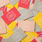
Simone Handbag Museum by Charlie Smith Design
Simone Handbag Museum is dedicated to the history of handbags with ‘international significance’ and provides its visitors with a curated, contemporary and historical collection to explore over two floors at the centre of the South Korean city of Seoul. London based Charlie Smith Design were recently commissioned to develop a brand identity for the museum that would resonate with and unite its diverse collection across...