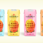
The Coconut Collective by Marx Design
The Coconut Collective is a new Australian brand of organic, flavoured, coconut waters drawn from Sri Lanka’s king rather than green coconut, a first for the market. Soulfresh, the company behind the brand, describe the water from the king coconut as having a ‘cleaner taste profile’, one that should appeal to a broader consumer base. The Coconut Collective’s brand identity and...
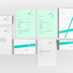
Frederik Laux Photography by LSDK
Frederik Laux is an award winning German portrait, fashion, lifestyle and editorial photographer with a client list that includes Alliance and Mercedes-benz. His new visual identity, developed by Stuttgart based design agency LSDK, takes a competently spaced but generic condensed, sans-serif logotype and executes it as a redacted three-line mark die cut by hand across a print solution that mixes...
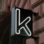
Kontoret by Werklig
Created by consultant Ray Lindberg with the intention of setting new standards for flexible work environments, Kontoret provides low-cost office space by the hour, with wireless internet, printers and coffee, to freelancers, chief executives, local businesses and international travellers in the centre of Helsinki. Inspired by the “essence and basic needs of office work and the aesthetics of the classic office...

One To Be by Coast
One To Be is a Brussels based furniture design and manufacturing workshop that crafts custom wood pieces for residential refurbishments, bespoke kitchens, office and retail spaces, exhibitions, art installations and one-off pieces for private individuals. The workshop’s visual identity, a logo-centric solution executed across dyed uncoated paper choices by design agency Coast, is straightforward in its presentation of craft, functionality and...
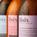
Fisix by Mucho
Fisix is a line of cosmetic products that includes shower gels, shampoos and hydrating skin balms, developed by four marathon running friends who ‘couldn’t find a range that met their needs as sportsmen’, branded and packaged by multidisciplinary design agency Mucho....
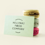
Helsinki Food Company designed by Werklig
The Helsinki Food Company provides design and production services – including consultation, styling, photography and recipe development – to regional broadcast, print and event sectors. Created by visual communications agency Werklig, their visual identity – an economical single colour print treatment of a logo-type constructed from a single consistent line weight and culinary-related letter-forms across a variety of tactile and dyed craft substrates – sets...

Surname & Surname by NB Studio
Surname & Surname is a new consumer focused brand communications agency formed by London-based PR specialist Blue Rubicon. Their visual identity, recently created by NB Studio, utilises a simple but well executed typographical solution to deliver an alternating union of language which conveys professionalism, communicative creativity at its most elemental, and a thoughtful, evolving brand personality....
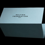
Delfina Foundation by Spin
“Delfina Foundation is an independent, non-profit foundation dedicated to facilitating artistic exchange and developing creative practice through residencies, partnerships and public programming, with a special focus on international collaborations with the greater Middle East & North Africa”. The foundation’s visual identity, developed by London-based design agency Spin, mixes a bold typographic solution and underline detail, a modern take on a...
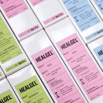
Healgel by Pentagram
HealGel is a range of high quality skin care products, originally created to aid the repair of post-operative scarring, developed by actress Natascha McElhone – a dermatological biochemist – and a team of cosmetic surgeons. Taking its cues from what looks like medical forms and stat charts, international design agency Pentagram, led by Domenic Lippa, developed a new packaging treatment that...
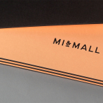
Mi&Mall by Atipo
Mi&Mall is an online shopping destination and resource that brings together and supports small to medium designer brands for people interested in fashion, trends and exclusive collections. Based around a simple logo-type, ampersand, a pale colour palette and a tactile print and material choice, Mi&Mall’s visual identity, created by Spanish multidisciplinary design studio Atipo, mixes high fashion and boutique craft...
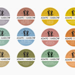
Adams & Harlow by Designers Anonymous
Adams & Harlow is a brand of Lincolnshire made pork pie that has a rich heritage dating back to 1910 and continues to bake on its original premises under the management of the founder’s granddaughters. The brand’s new packaging and identity, created by London based Designers Anonymous draw together the personalities and history that underpin the brand with a quirky but traditional illustrative and typographic...
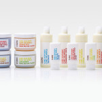
Cure Life Products by Mucho
Cure is a Californian based handcrafted body care company that formulates products to alleviate daily stresses and donates 20% of all purchases to global charities. The company’s branding and packaging was managed by multidisciplinary design studio Dowling Duncan, now Mucho, and based around a simple logo-type solution and a clean, bright typographical labeling system....