Sport

Atlético Dallas by Moniker and ModestWorks
Dallas connotes many things: cowboys! (the gun-slingin’, yeehawin’ type ones on horseback); cowboys! (the cheerleading ones of ‘that show on Netflix’ fame); cowboys! (the American football team). In short, for people like me who’ve never been to Dallas, nor indeed any of Texas, and who know next to nothing about sport, Dallas = cowboys, and perhaps little else. But even...
Veikkausliiga by Bond
How do you bring the fans, teams, and stadiums of the northernmost league together under a shared identity that captures the energy and passion that defines it? For Bond (Saaristo, Cable Factory & Northstar Film Alliance), the answer was in plain sight… the scarf – strewn across the terraces, held high, no matter the team or the weather. Veikkausliiga is...
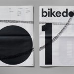
Bikedot by Studio Sutherl&
The concept of a brand today rarely has a sense of physicality. The hand (or indeed roller), the mark-maker, usually feels totally absent. It makes sense really, considering our primary interaction with a brand is often online; but when a project comes along that’s so obviously delighting in the possibilities of print processes, inks and paper it feels like a...

Wisl by andstudio
Shaking off a hangover on a crisp Sunday morning kick-about with the boys; dunking a perfect basket on a court raked with the long shadows of a high-summer sunset; obliterating Janet from HR in a ‘friendly’ after-work squash game/grudge-match. These vignettes, I am assured by those who participate in such wholesome activities, capture both the hazy idyll and everyday reality...
Skateyogi by Order
The skateboarding learning curve is really defined by the individual. There are lessons (passed down or shared online), but much of it is practice (and patience). Further, and perhaps more importantly, skateboarding is expressive, it’s fused with personal style. Timeless tricks are given an individual twist that keep it evolving and competitive. Iconic skateboarding brands have grown out of the...
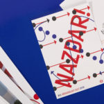
XVIth All Sokol Slet 2018 by Studio Najbrt
Slet is a mass gymnastics event and union of schools that has its roots in the latter half of 19th century Prague with the intention of providing physical, moral and intellectual training for the nation. Slet takes its name from the Czech word for flocking of birds. This can be understood in the sight of a stadium field filled with participants...
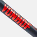
VonHof Cycles by Franklyn
VonHof crafts bicycles in small batches by hand for mountain, road and cyclocross categories from its location in Hoboken, New Jersey. Keeping true to the process of crafting bikes, one that produces a range that is uniquely poised, handsome and of exceptional quality, New York graphic design studio Franklyn took a boutique approach to VonHof’s brand identity. This included wordmark and a...

The Practical Man by Garbett
The Practical Man is an online retail destination for men’s sports style and fitness, activewear and equipment, but also editorial content that covers reviews, fitness-focused travel guides and in-depth insight into new brands. It curates a catalogue of world-leading products that exist at the intersection of fashion and sports performance, designed by innovative and passionate brands with progressive approaches. Australian graphic design studio Garbett worked with The Practical Man...
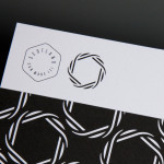
Scotland Can Make It! by Graphical House
Scotland Can Make It! is a limited edition collection of souvenirs, created by leading Scottish designers and artists in collaboration with manufacturers from across the country, for the Glasgow 2014 Commonwealth Games. The souvenirs are described by Graphical House, the design studio behind the collection’s brand identity and website, as being part of a programme of events that celebrate ‘Scotland’s cultural heritage, creative...
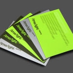
Limelight Sports by Studio Blackburn
Limelight Sports is a London based agency that specialises in grass roots sports consultation, organises high profile events and campaigns such as ‘SwimBritain’, ‘Nike She Runs 10km’ and the London Duathlon, and creates programmes designed to engage with a mass audience by utilising mobile and location based technologies and social networking platforms to connect competitors and spectators during live events. Design agency Studio Blackburn...
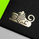
Anthem by Anagrama
Anthem will be a scouting and transfer business within the professional football market working predominantly across Spain, Switzerland and Mexico. Anthem will also be responsible for organising and promoting a variety of sporting events. Design agency Anagrama were recently commissioned to develop a new brand identity for the company—which included a logo, logotype and stationery set—that would communicate the prestige,...

Daniel Juncadella by Mucho
Following his recent promotion to official Mercedes driver for the DTM (Deutsche Tourenwagen Masters) and test driver for The F1 Mercedes team, Daniel Juncadella recently commissioned design agency Mucho to “improve his personal brand and the way he communicated with his growing fan base and the press”....