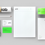
Griab by Kollor
Griab is a Swedish engineering firm, founded in 1957 and located in Helsingborg, Sweden, that specialises in delivering a holistic design and build service that includes land planning, wastewater management, architecture and construction. Developed by multidisciplinary design agency Kollor, Griab’s visual identity, “inspired by the the straight lines and shapes commonly seen in architecture” and created to help reinforce the firm’s environmental...
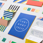
Torikorttelit by Kokoro & Moi
Torikorttelit is the old town district of Finland’s capital Helsinki. Its new visual identity, designed by Kokoro & Moi and based around bright colours, simple geometric patterns, a stacked typographic serif logo framed by a circle and paired with a modernist inspired secondary typeface neatly reflects the historic setting at the heart of a modern metropolis....
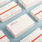
Bedre Kommunikasjon by Work In Progress
Bedre Kommunikasjon is a oslo-based consulting firm, run by communication specialist Nils M. Apeland, that offers personal, professional and independent advice to business, drawn from 20 years of analysis, strategy, promotion, media relations and crisis management experience. Multidisciplinary design agency Work In Progress recently worked with Nils to develop a new visual identity solution which included a logo, business card and stationery design...
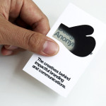
Designers Anonymous by Designers Anonymous
Designers Anonymous is London-based multidisciplinary design agency with global clients from a variety of sectors. The agency has appeared on BP&O on a number of occasions, with highlights including their packaging work for Zest and Patchett’s, and their identity work for Fuller’s hospitality brands The Parcel Yard, The Tokenhouse and Brewer St. Following the launch of their new website this...

Fika by Designers Anonymous
Fika is a bar and kitchen located on London’s Brick Lane with a rustic menu prepared on site and to order, all of which can be taken away. Created by Designers Anonymous, Fika’s visual identity, which extends on-line, in-print and as signage, is an illustrative and photographic mix of characters, cartoons and quirky compounded imagery bound by a consistent logo,...
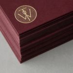
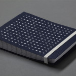
Willow Tree by Bunch
Willow Tree, one of London’s leading business consultancies, worked with graphic design studio Bunch to develop a new but traditional-looking visual identity with an attention to detail. Based around a WT monogram, created by typographer Spencer Charles, utilised as a mix of embosses, carved in seals and simulated watermark, and using purple cloth, black leather, cream paper and handmade coffee pottery, Bunch’s solution embraces a...
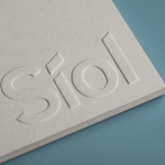
Síol Studio designed by Mucho
San Francisco-based architecture studio Síol recently commissioned multidisciplinary design agency Mucho to develop a new visual identity solution that would embody “their philosophy of conceptual, clean architecture for both interior and exterior design.” Based around a customised sans-serif logotype executed as a blind deboss, the identity conveys the familiar architectural themes of light and shadow formed within three-dimensional space and a practical, corporate efficiency....
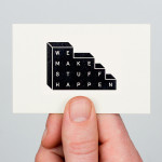
We Make Stuff Happen by Maddison Graphic
We Make Stuff Happen is a London and Brighton-based creative marketing and production company that specialises in exhibitions and events with past campaigns that have included covering an entire building in clothes, placing a car in a block of ice and putting an open air cinema on top of a skyscraper. Their visual identity, created by Maddison Graphic, features a stacked uppercase...
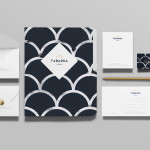
Tabarka Studio by Anagrama
Tabarka Studio specialises in ‘detail-oriented’ and handcrafted tiles made from terracotta, a ‘clay-based ceramic earthenware that becomes porous when fired creating a worn-out, antique finish’. Anagrama, the design agency responsible for the studio’s visual identity and collateral, describe their approach as embracing an ‘archaic timelessness’ that reflects the products through the use of a blue and white scale pattern, tiled icon...
Mark Cappellino by Perky Bros
Mark Cappellino is described by Perky Bros, the Tennessee-based studio behind his new logo and stationery, as a leadership consultant who travels the worldwide helping individuals and teams better communicate through stronger relationships. Their design solution, “based on the behavioural beliefs that shape his practice”, “plays on the typographic device called the em dash, meaning an interruption of thought” and...
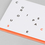
Curious Space by Mash Creative & May Ninth
Curious Space is a London-based scenographers—a specialist scene setter—that creates “unique and inspiring spaces for museums, galleries and more”. Their visual identity, developed by Mash Creative and May Ninth, ‘splits apart to create a physical space that intrigues whilst the type can sit either horizontally or vertically in numerous layouts within the dotted grid”, establishing a flexible and unusual yet structured...
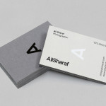
Ali Sharaf by Mash Creative
Ali Sharaf is a Bahrain-based commercial photographer who specialises in fashion, beauty and lifestyle images for the advertising and editorial markets. He describes himself as contemporary, upbeat, outspoken and edgy. Inspired by a shared interest in Swiss modernism and adopting a less is more approach, design studio Mash Creative developed a new brand identity for Ali that combines an iconic...