Tote Bag Design
Diggin’ it
Just when you thought we were approaching a post-pet-parent era, a brand comes along and proves very much otherwise. Thankfully, though, while pet parenting seems to be alive and well; fingers crossed we’ve left behind the whole rather icky “fur baby” days of things like dog bandanas that read, “My Mom is Sooooo Obsessed with Me”; or dog nail varnish;...
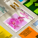
The Huntington by Base Design
There’s a particular kind of challenge that crops up again and again in cultural branding – not obscurity exactly, but partial recognition. The sort where an institution is famous for one thing, quietly exceptional at several others, and yet rarely understood as a coherent whole. The Huntington, a century-old cultural and research institution in Southern California, sits squarely in that...
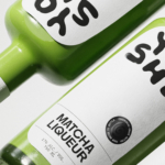
Yoshi by Saint-Urbain
Early days for sure, but this is hands down the best brand identity design I’ve seen this year – kudos to Saint-Urbain for once again putting a project out into the world that’s not only an absolute joy to look at, but which shows a razor-sharp nous for branding that’s both searingly zeitgeist and resolutely, timelessly future-facing. Said project is...
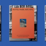
Hotel Park Ave NYC by Colt
Located on the corner of Park Avenue South and East 30th Street in Manhattan’s Midtown, Hotel Park Ave is the artist formerly known as the Mondrian Park Avenue. Its change in name is thanks to its change in owner: international hospitality company Lore Group announced its acquisition of the site and mooted its subsequent rebrand late last year, and to...
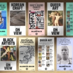
Philadelphia Art Museum by Gretel
Creating museum and gallery identities must be both a dream brief and an intimidating prospect for brand designers; a poisoned chalice of sorts. We hear the same challenges time and again when agencies discuss such projects: creating a brand that’s both strong and ownable but which lets the artefacts/art take centre stage; an identity that takes an institution into the...
Society De La Rassi by Blurr Bureau
Ideas around the ‘new codes of luxury’ have come up a lot lately; an updated, contemporary take on what makes something look special, valuable, covetable, and ultimately, expensive. The long and short of it is that it’s out with the old – lavish foils, gold everywhere, bling and ornamentation and ostentation – and in with a quieter, more subtle aesthetic...
Pinky Swear by The Working Assembly
I could be totally wrong, but it really does look like New York-based branding agency The Working Assembly had a lot of fun working on the branding for Pinky Swear. A restaurant and cocktail lounge on Chrystie St on Manhattan’s Lower East Side, Pinky Swear opened earlier this year as a fascinating concept unlike anything we’ve really encountered before: yes,...
ITO Gin by Analogue
ITO Gin is first and foremost, brilliantly eyecatching – huge fluorescent letters, the epitome of ‘make it big’ when it comes to a brand name; deep black bottles – behind this bold exterior lies a narrative woven across cultures, histories, and generations. The brand was born of a collaboration between Komaki Distillery in Japan and UK-based gin brand Kokoro. However,...
Windham Campbell Prizes by Pentagram
Back in 2013, Michael Bierut’s team at Pentagram (Twelve Labs, Becan & Natural History Museum) created the identity for Yale University’s inaugural Windham Campbell Prizes, a major literary award that honours outstanding achievement in the fields of fiction, non-fiction and drama. Bestowed by the estate of the writer Donald Windham and his companion Sandy M. Campbell, the awards are administered...
Teller by Werklig
The social and cultural activity of sharing stories has been, and continues to be, an essential part of human experience. Storytelling contributes to the cohesion of, and sometimes control over, individuals and groups, preserving and passing on knowledge, and instilling moral values. Many of us live by the values and knowledge established over thousands of years through stories. With improvisation...
Siuru by Bond
Estonia’s Siuru plays with important questions, subverting and, at the same time, fulfilling expectations. Is it an art museum? A library? A cinema? Or a cultural institution? For a Bond (Veikkausliiga, Saaristo, Cable Factory) the design studio in charge of developing a brand identity for Siuru, this raised the concern, how do you brand something that seeks not to be characterised...
Ding by Wildish & Co.
When I left the UK and landed in the Czech Republic – my home between 2010 and 2018 – I found a notable difference in advertising and branding between the two countries. Specifically, I saw an abundance of brand mascots. Now, of course, mascots were also used in the UK and have a global historical precedent, but I was struck...