The Best of BP&O — Packaging of 2017
Opinion by Richard Baird Posted 18 December 2017

2017’s package design highlights included Commission’s work for Old Spike, B&B Studio’s packaging for Brewdog’s Lone Wolf and Kontrapunkt’s refinement of Carlsberg’s Black Gold. However, there were five projects that stood out, and have made it into BP&O’s Best Of Series. These typically balance a strong and appropriate concept with a compelling graphic and material response. Between them, these play with image, colour, texture, layout, form, type and print finish in a distinctive and memorable manner, and hint at an interesting story, convey something of the personal or provincial, and make the most of association. These are BP&O’s favourites, and are presented in no particular order.
Packaging Shortlist 2017
Talor&Jørgen Coffee by Bielke & Yang, Norway
Agder Bryggeri by Frank, Norway
Volcano At Home by Commission, United Kingdom
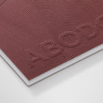
Chaos by Socio Design, United Kingdom
Port of Mokha by Manual, United States
Old Spike by Commission Studio, United Kingdom
Lone Wolf by B&B Studio, United Kingdom
Summerhill Market by Blok, Canada
Carlsberg Black Gold by Kontrapunk, Denmark
Pepe Raventós Natural Wines by Mucho, Spain


Talor&Jørgen Coffee by Bielke & Yang
Talor&Jørgen is a Norwegian speciality coffee roastery and coffee subscription service that delivers small boxes of freshly roasted beans, sourced from across the globe and changing seasonally, to subscribers, and is tailored to their drinking habits rather than to a schedule. Their product naming convention focuses on bringing to the forefront flavour notes rather than bean provenance, variety and preparation (although this is online and on pack) with the intention of making speciality coffee far more accessible and addressing a divide that exists within the Norwegian market.
Talor&Jørgen’s packaging design, developed by Bielke & Yang, expresses the accessible intentions of brand, the freshness of its coffee and plays with storytelling in the distinctive pairing of a small robust structural choice that holds 250g, and the tone and changing content of Janne Iivonen’s illustrative work.
In Short – Three of the five projects featured in this post are coffee subscription services. Bielke&Yang’s work for Talor&Jørgen stands out for its use of the sequential nature of subscription coffee, changing illustration to build a richer sense of character, convey an ongoing story, and works as a canvas to connect subscriber with the personalities behind the brand.
See more of this project here

Chaos by Socio Design
Inspired by fashion’s current fascination with customisation, technology and a “sense of light-hearted fun”, creative duo and stylists Charlotte Stockdale and Katie Lyall created Chaos, a UK luxury lifestyle brand producing limited edition and personalised tech and travel accessories.
Through form and finish, materiality and graphic design, Chaos products—which include phone cases and charms, zips and luggage tags—express the brand’s take on practicality and stylistic desirability, the meeting of technology and fashion, utility and individuality. These are high quality, with a price tag to match (between £76-214), and a favourite with actors Cara Delevingne and Margot Robbie.
Socio Design were commissioned by the team at Chaos to develop packaging design for their collection of phone cases and luggage tags, gold-plated charms and zips. Using contrasting colour and high quality production, playing with a tension between the modern and traditional, the digital world and the analogue, packaging reflects the brand’s playful and “anarchic” approach, and commitment to challenging contemporary luxury standards.
In Short – Having got our hands on these, the design craft at play here is impressive. It has to be as it is incredibly simple. This made it into BP&O’s Top 5 because of its intelligible, universal and distinctive expression of value through the form and material language of a hollowed out book. Often it is optimistic to think packaging has a second life, however, it is easy to imagine someone having second thoughts about throwing this away and happily repurposing it to hide other valuables.
See more of this project here

Volcano At Home by Commission
Volcano At Home is an ethically traded coffee range, roasted in small batches by a dedicated team, and sold in 100% compostable Nespresso-compatible pods. The range has been created for the retail, subscription and wholesale markets and is available in three varieties, Bold Morning Shot, Balanced All Day and Reserve Rich And Sweet. Volcano At Home is the latest venture of London-based independent coffee roasters Volcano Coffee Works and features a distinctive packaging design, developed by Commission, that draws on the science, craft and character of the brand and its products.
In Short – There is not a singular concept at play here, but a smart meeting of a series of interesting visual and material gestures. They make the most of name and association using colour, give a distinctive visual volume and presence through design craft, form and colour contrast to something small and compact, and draws interest from a material and graphic juxtaposition of utility and quirky personality.
See more of this project here

Port of Mokha by Manual
Port of Mokha is a coffee, sourced from Yemen, that is said to be the rarest, most expensive and best tasting in the world. As a brand it is critically acclaimed—winning awards and receiving the highest ratings in blind cuppings—and mindful, helping to support local communities.
Port of Mokha’s story begins with the return and daring escape of Yemeni founder and San Francisco-based Mokhtar Alkhanshali from war-torn Yemen on a fishing boat with coffee samples, which made international news in 2015. This story forms part of Port of Mokha’s unique mythology and visual identity, alongside geographical allusions and material value across the limited edition Yemen Trilogy Box Set, created by Manual.
In Short – There is a clear design craft and material expense at play in the choice of substrates, form and construction, fitting of its high price point. However, in the intersection of the graphic and the material, the hint of a story to be discovered through a simple motif and rippled relief, Manual’s work delivers a residual impression, a call to find out more, beyond its initial impact. This is followed up with plenty of insight online.
See more of this project here

Agder Bryggeri by Frank
Agder Bryggeri is a well-regarded and historical name amongst breweries throughout Norway. It was first established in 1900 but was closed down in 1904 due to operational problems. In 2017 the brewery was resurrected as part of Norsk Bryggerier’s commitment to local beer brands, and is now sold throughout the Agder counties of southern Norway.
As part of this resurrection Frank worked to deliver brand strategy, concept, visual identity and packaging design for Agder Bryggeri. Taking inspiration from the “de hvite byene” or “white towns”, and the sailing heritage of the region, the studio established a sea-breezy, minimal and provincial expression using the letter-craft and windswept character and flourishes of a distinctive logotype, blue and green ink, white background and plenty of space.
In Short – Frank’s approach is a great example of a confluence of small ideas that build to a distinctive visual whole with a strong sense of place through both the literal and the implied. It is rich in its references and allusions, yet remains simple and concise in their resolution.
See more of this project here