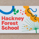
Hackney Forest School by Spy
Forest School is a scheme set-up by Hackney Council, London that seeks to connect children living within the local built-up area with the thrill of the rural outdoors. The scheme reaches out to schools and parents, offering programmes that cover all areas of the curriculum and aims to engage and develop a child’s understanding of sustainability. London-based design studio Spy was...

Heyday by Collins
Heyday is a range of 150 moderately-priced high-quality own-brand consumer tech products from American retailer Target and their first foray into the electronics and tech accessories sector. The range includes battery packs and chargers, cables, covers and wireless speakers amongst many other products. These share a form language that balances an everyday simplicity, robustness and utility with novelty and cheerfulness by...
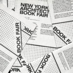
New York Architecture Book Fair by Pentagram
Storefront for Art and Architecture is an independent not-for-profit art and architecture organisation, located in New York’s Soho, dedicated to advancing architecture, art and design. To further this remit the organisation developed the New York Architecture Book Fair, an event and platform that brings together authors, designers, publishers, critics and readers to consider, through a programme of discussion, installation and pop-ups,...
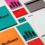
Brilliant by The Studio
Swedish employee engagement consultancy Netsurvey and Bright, experts in customer surveys, have been merged and rebranded as Brilliant by The Studio. This merger and rebranding intended to create a new platform capable of encapsulating the skills and corporate cultures of both companies and develop a visual expression that people from each could identify with and stand behind. In the same spirit as The Studio’s...
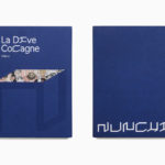
Nunchi by Bedow
Nunchi is an Italian startup and the vision of Cedric Naudon, a self-confessed gastronome. This follows his ambitious project to create an entirely new creative neighbourhood of restaurants, fashion boutiques and design stores in Le Marais, Paris. Nunchi intends to frame and connect all of Cedric Naudon’s gastronomic projects. The first of which is a reimagining of Edouard Nignon’s classic cookbook L’Heptameron des Gourmets,...

Unfolded by Commission
Unfolded is a design and print festival that celebrates the creative work happening across Europe in the disciplines of design, printing and brand communication. This was held by and at The Gmund Paper Factory in Germany on the 9th November 2018. The event created a space for sharing ideas and fostering dialogue between creative individuals, providers of printing services, brand...
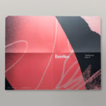
Everlea by Studio Brave
Everlea is a new property development described as a private sanctuary of townhouses located in the Melbourne suburb of Keysborough, an expanding community marked by its space and natural surroundings of native trees, shrubs, parkland and a landscaped network of safe pedestrianised streets. Developed by SB&G, working in collaboration with Bruce Henderson Architects, landscape architects Tract and Kathy Demos, Everlea “offers a pairing of design expertise guided by...
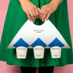
Tea & Glory by Socio Design
Tea & Glory are loose-leaf tea experts and are described as the antithesis of fast-paced coffee culture. In the same spirit of ancient tea drinking rituals, the brand is interested in the continued promotion of slow-living, a lifestyle that seeks to place more focus on the small details and experiences of everyday life. With a desire to better express this position Tea &...
Teatulia by Here Design
Teatulia is a Bangladeshi single origin tea brand that recently moved into the UK market, opening a flagship store, tea shop and cocktail bar in London’s Covent Garden. It is a social enterprise creating jobs in a remote region of Bangladesh and has, so far, transformed 3,000 acres of barren land into an organic tea garden. Drawing on Teatulia’s single-source positioning—common...
Anton&Anton Kioski by Bond
Anton&Anton (A&A) is an alternative to and antithesis of the large supermarket chains. Staff are described as relaxed, smiley and proud. Their ranges (mostly) organic, some homecooked and also available online for home delivery. With a desire to express an approachable, playful yet credible positioning, and a need to develop a cohesive set of packaging and communications assets A&A worked...
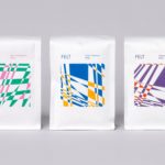
Felt Coffee by Studio fnt
Felt is a coffee shop in Seoul with their own brand of speciality coffee which has been sourced by way of direct trade and roasted in Gyeonggi-do, a populous (relevant later) province of South Korea. They opened their first store in September 2015 and a second in October 2018. The team at Felt see every part of the coffee experience;...
246 Queen by Studio South
246 Queen has a long and storied history. Opened in 1964 on Auckland’s Queen Street, it heralded a new era of modern architectural vision, exclusive boutique-based experience and an urban post-war retail sophistication. The building played host to fashion shows, designer concessions, furniture showrooms and contemporary dining. However, the architectural ideas drawn up by the original architects Rigby Mullan (Alan...