Smack Lobster Roll by & Smith
Opinion by Richard Baird Posted 28 May 2015
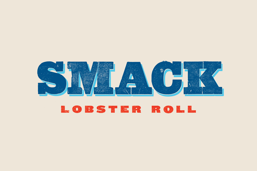
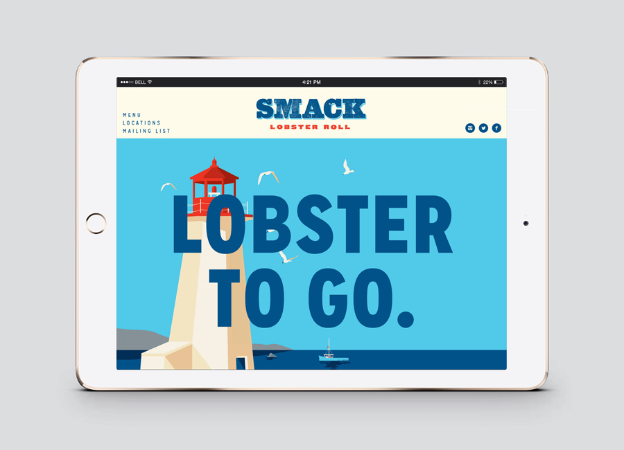
Smack Lobster Roll is a takeaway business, located on Mayfair’s 26 Binney Street, serving freshly cooked lobster in brioche rolls, as well as a variety of other fillings. In conjunction with a name change, formerly Smack Deli, and to coincide with the opening of a second site on Dean Street in Soho, British graphic design studio & Smith worked with Smack to clarify brand position and develop a new brand identity treatment. This went on to include logotype, illustration, stationery, business cards, packaging, menu design, signage and web design.
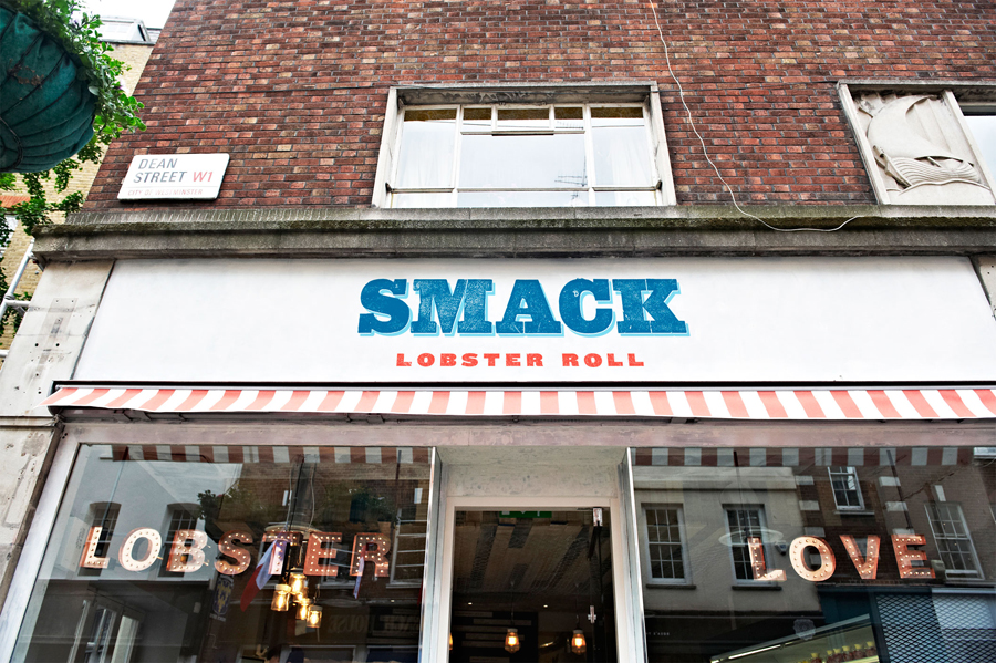
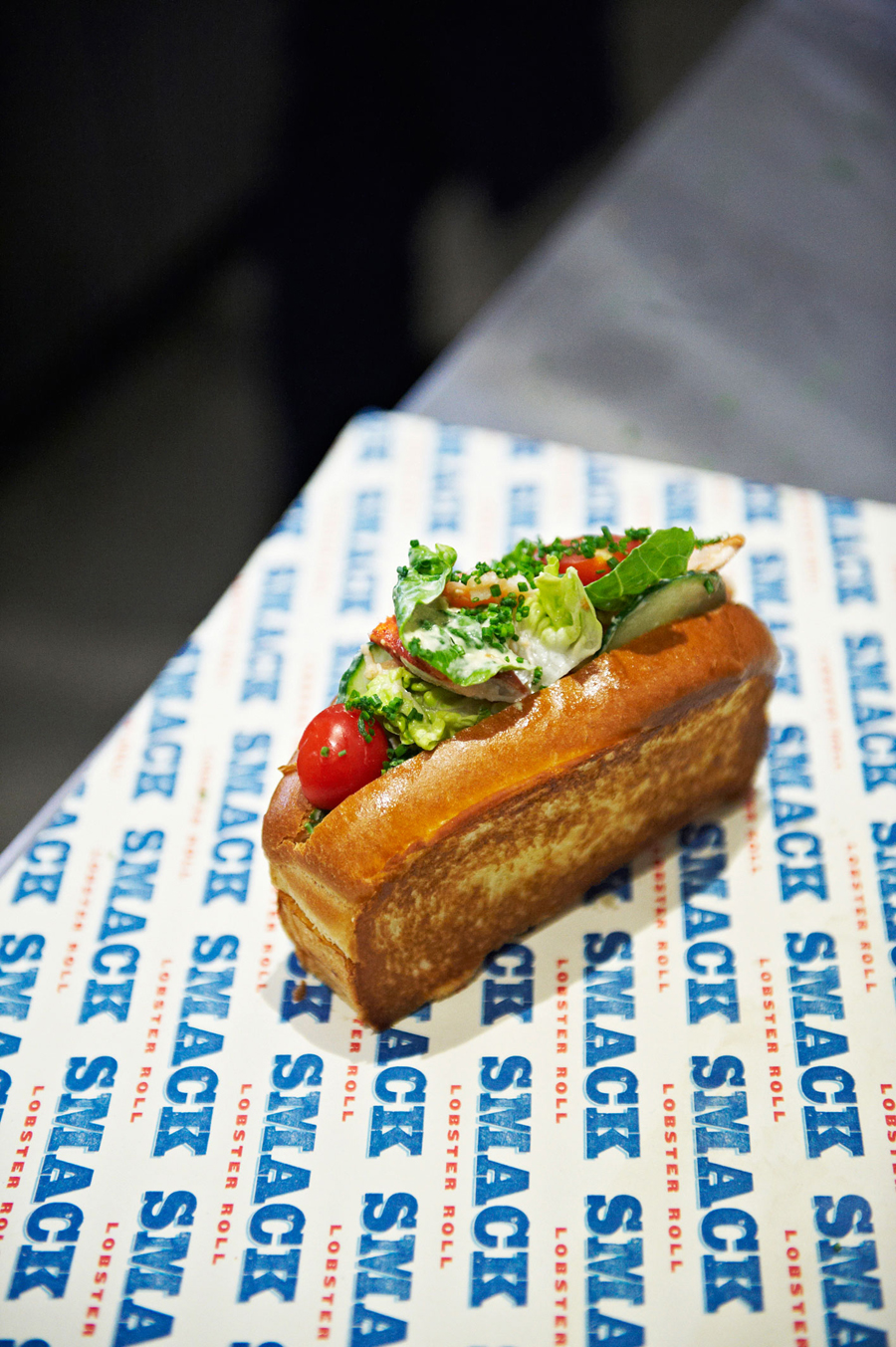
Based around a logotype that draws its inspiration from the typography seen on the sides of smacks—traditional fishing boats used for lobster fishing— a contemporary interpretation of travel posters of the past, executed across bags, trays, business cards and wraps, alongside a material rich interior design by DesignLSM, & Smith’s approach effectively plays with seaside nostalgia, a touch of fish n’ chip-shop convention and ingredient provenance.

There is a quality in the extent of the work undertaken not often found in takeaways but well-suited to the concept of a luxury ingredient on the go. While the robust slab-serifs and extended characters of the logotype, and its rough ink finish are aesthetically well-resolved and conceptually well-founded—a familiar mix of tradition, quality and locality—it is the illustrations that really set tone and secure a unique point of interest, alongside interior.

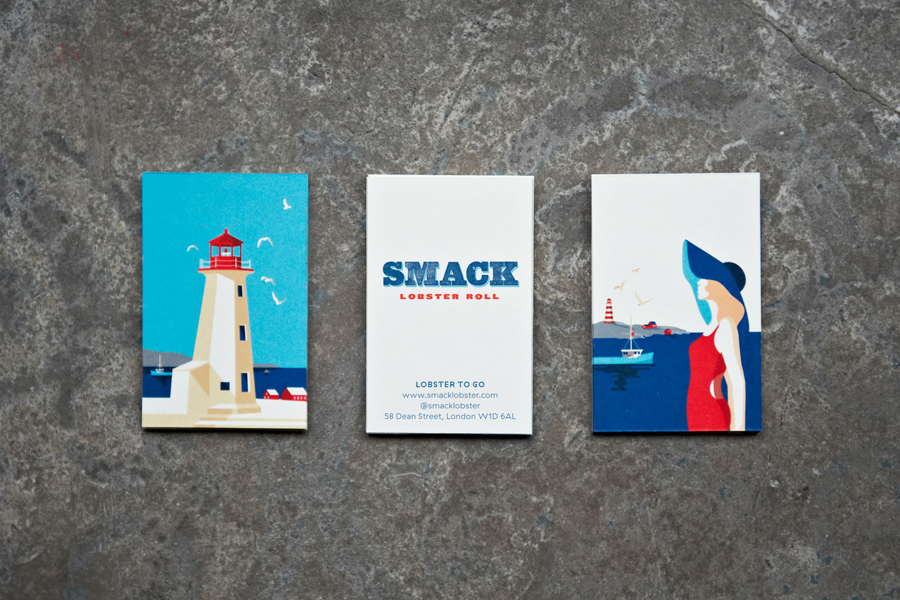
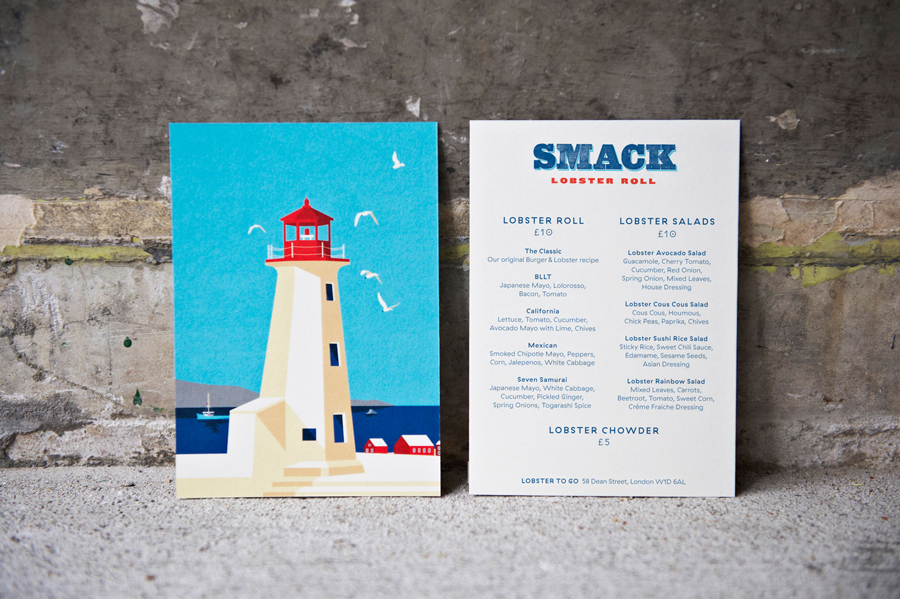
Drawn in-house and referencing Nova Scotia, source of the lobster, the illustrative work is simple but compelling. A good use of light and shadow—delivering depth and detail to basic shapes, a good use of large areas of flat, bright and sunbleached colour, simple compositions, movement in the birds and forms and direction of the woman, bring the coast to central London, secure impact and visual interest, and is clear in its retrospective reference point.
These draw on the nostalgia of childhood seaside holidays, romanticises the past, stimulates the imagination and neatly introduces an element of provenance to the identity. A variety of crops in print make good use of the proportions of each canvas and, with just a couple of panels, avoids repetition.
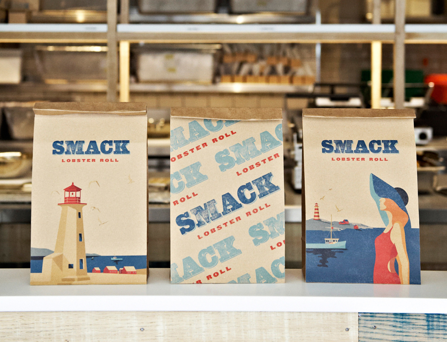
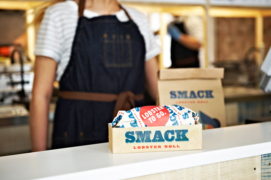
Like type, packaging draws on takeaway and fish n’ chip shop convention through structural and material choices, but benefit from the detail of the illustrations and the contrast their quality offers within the practical context of material. The bright saturated tones of the illustrations across uncoated unbleached bags appear deeper, crafty and earthy in tone while a big red “Lobster To Go” sticker distills down and leverages the unfamiliarity of the proposition and calls it out with an iconic image.
Alongside the weathered woods, large typographic illuminated signage, and the red and white stripes of the awning, & Smith’s brand identity treatment takes a unique seaside component and mixes it with a provenance, quality and a polished but traditional takeaway aesthetic vernacular that is distinctive, rich in detail and well-suited to the very modern experience of delivering a luxury seafood ingredient on the go. More from & Smith on BP&O.
Design: & Smith. Interior Design: DesignLSM. Opinion: Richard Baird
