BP&O Collections — Brochures No.3
Opinion by Richard Baird Posted 27 July 2015
The third collection of brochures, lookbooks, prospectuses, reports, book covers and magazine spreads published on BP&O. These mix layout, material choice and print finish, and between them effectively utilise colour, type, image, texture and paper contrast to communicate and compel, as well as contributing to a distinctive brand identity treatment. This selection features uncoated and coated papers, surface embosses, foils, metallic inks, dyed and unbleached boards, a variety of binding processes, and work by graphic design studios Pentagram, Inhouse, Maud and Believe In, amongst many others.
This post was published as a quick way to browse through BP&O’s content and gain access to older but equally interesting projects through different themes, and expands upon previous posts under the category The Best of BP&O. If you liked this check out The Best of BP&O – Brochures No. 1 & Brochures No.2, or subscribed to this series here.
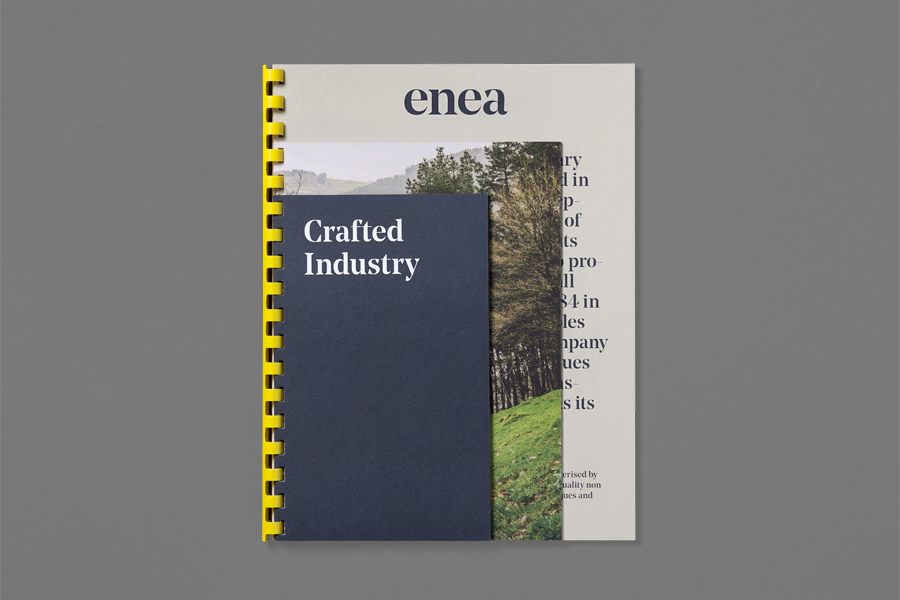
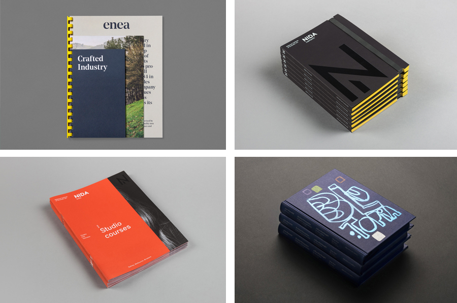
Enea designed by Clase bcn
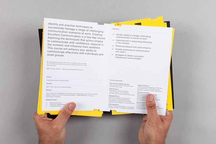
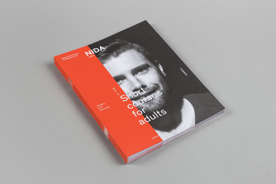
NIDA designed by Maud
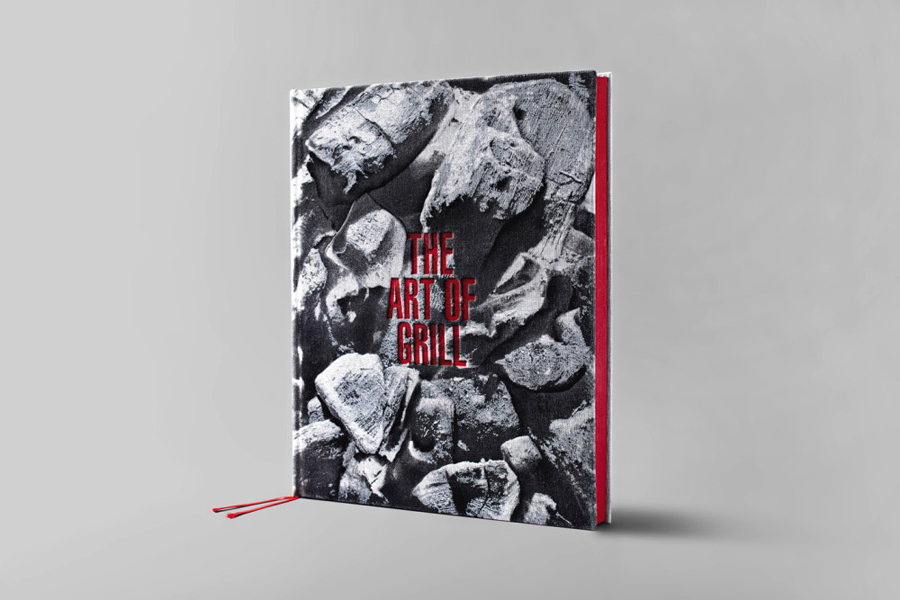
The Art Of Grill designed by David Barath
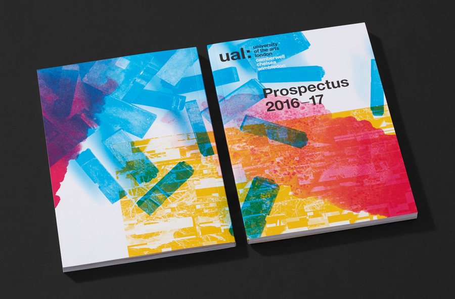
UAL designed by SPY
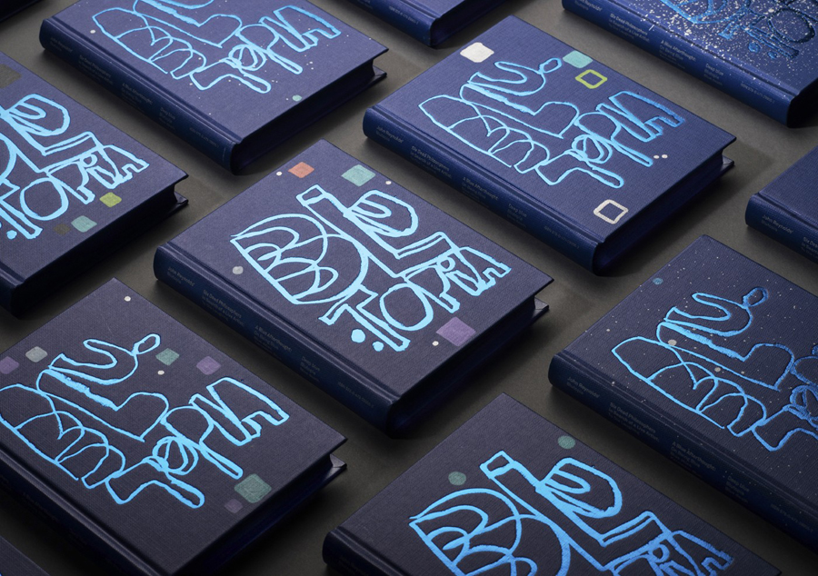
Blutopia designed by Inhouse
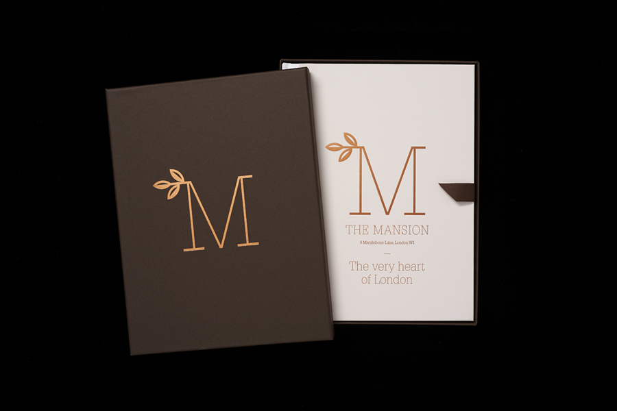
The Mansion on Marylebone Lane designed by Pentagram
Zuzunaga designed by Folch
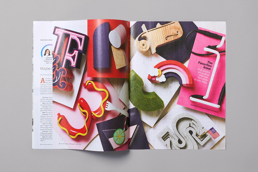
The Washington Post designed by Snask
Life or Death designed by DIA
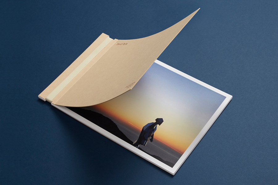
David Ryle designed by S–T
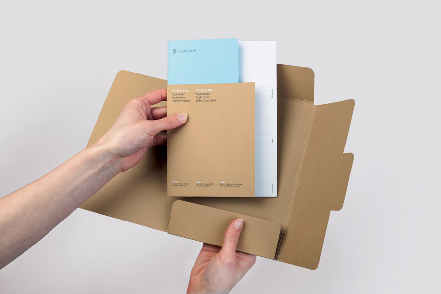
FS Silas designed by Believe In
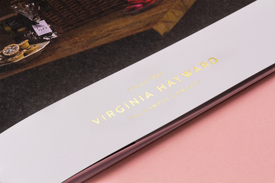
Virginia Hayward designed by Salad
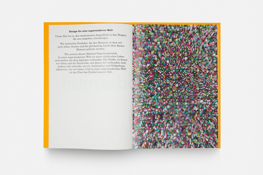
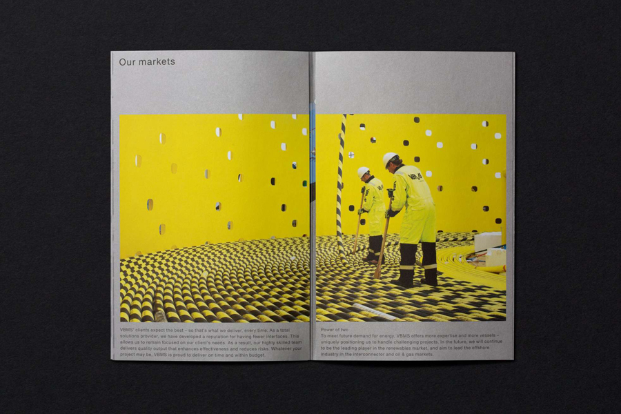
VBMS designed by Dumbar
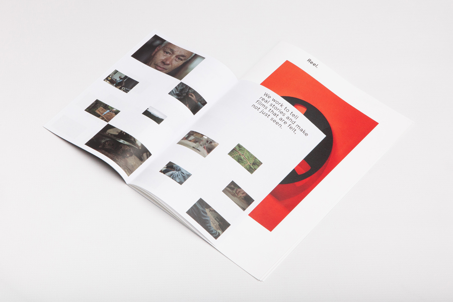
Reel designed by Richards Partners
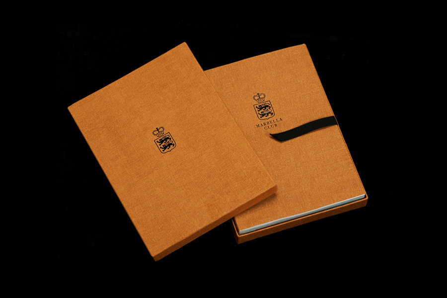
Marbella Club designed by Pentagram
NIDA designed by Maud
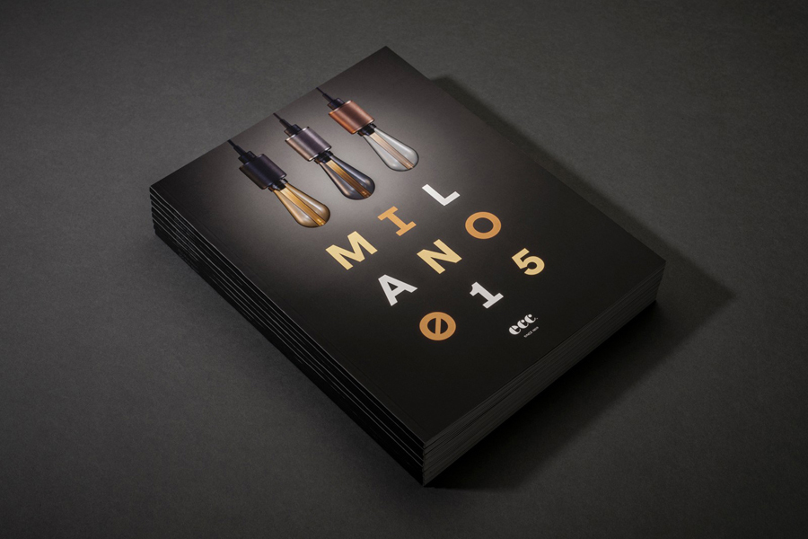
ECC Milano 2015 designed by Inhouse
