Pressbyrån by Bold
Opinion by Richard Baird Posted 27 August 2015
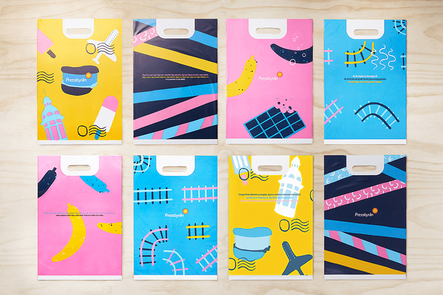
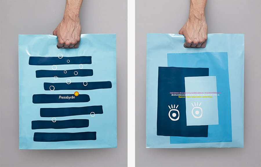
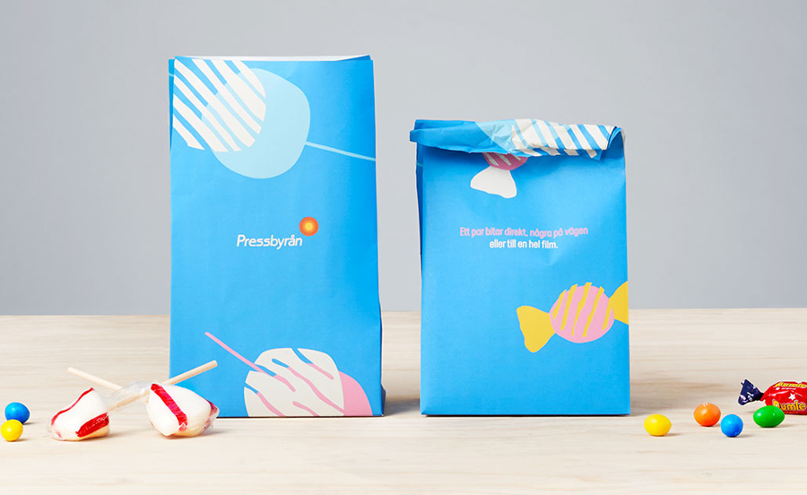
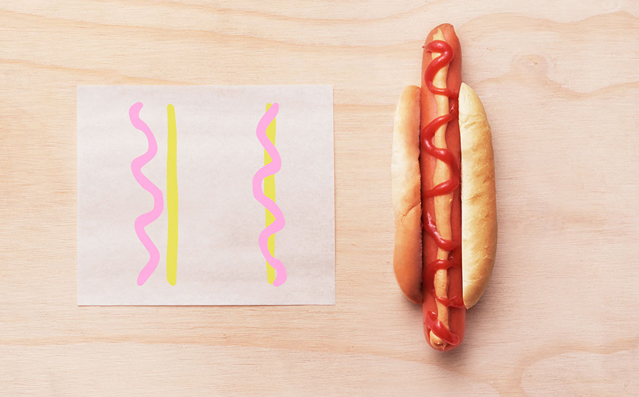
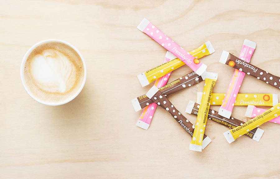
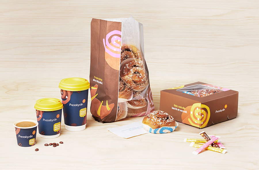
Pressbyrån is a Swedish convenience store with over 300 locations nationwide, and one of the country’s most recognised brands. It retails fresh pastry, sweets, coffee and hotdogs, alongside groceries, public transport tickets, magazines and papers, amongst a few other things. Stockholm based graphic design studio Bold worked with the store to create new packaging for its range of consumable products with the intention of distinguishing and uniting a variety of categories.
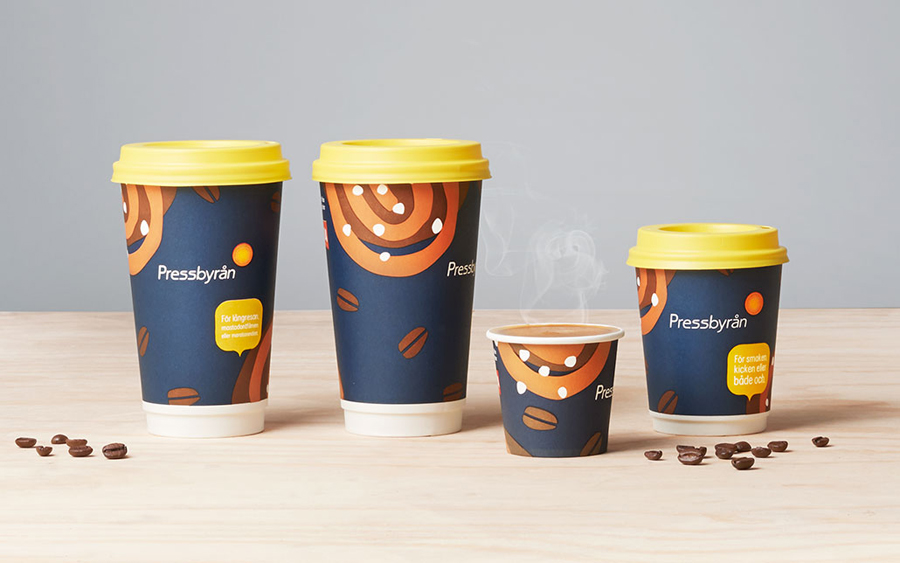
Bold collaborated with Belgian designer Tim Colmant to create a series of illustrations that would work as both individual panels and as continuous patterns. These mix a variety of the store’s products (cinnamon buns, ice cream and fruit etc) with a travel component (rail tracks, postal frank and plane). Although not explicitly stated in Bold’s case study, it would be fair to assume that these are a reflection of Pressbyrån’s locations, one of which is at Stockholm Arlanda Airport, and the rest typically situated close to bus terminals, underground and railway stations.
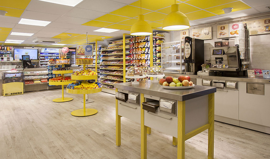
The colour palette and hand drawn illustrative style introduces a bright and convivial quality to what is a business of everyday convenience, and a distinctive and cohesive visual character onto the streets of Sweden. It develops identity beyond what is a simple, conventional and unremarkable logo, offering contrast to this and the store’s interior with an intentionally loose, simplistic but compelling illustrative style.
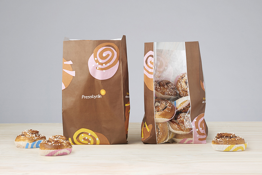
The consideration given to food and drink combinations, and the relationships formed between image and product—a coffee cup with a cinnamon roll and soft drink cups with a stack of magazines—and the use of travel iconography, give an aesthetic impact a subtle communicative quality, a simple prompt to consider other complimentary products but also serving as a reminder of the store’s locations. More from Bold on BP&O.
Design: Bold. Illustration: Tim Colmant. Project Partner: Åkestam Holst. Opinion: Richard Baird

