The Doctor’s Studio by A Friend Of Mine
Opinion by Richard Baird Posted 7 September 2015
The Doctor’s Studio provides non-invasive dermatological treatments and skin care procedures from its clinic in the Australian city of Melbourne. It has a philosophy that avoids feeding on insecurities and intends to facilitate positive change and foster a sense of well-being.
The Doctor’s Studio worked with graphic design studio A Friend Of Mine to develop an interior and brand identity concept that would avoid the negative stereotypes of the industry. This extended to furnishing, signage, illustration, business cards and web design, working in collaboration with architects Russell and George, Kelly Thompson of UNA and illustrator Stuart McLachlan.
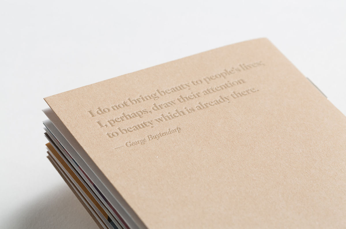
Rather than the sharp precision associated with, and typically leveraged by cosmetic surgeries, often characterised by clinical type, cool colour palettes, reduction, restraint and carefully composed (sometimes overexposed photography), A Friend Of Mine embrace an accessible softness in type, a distinctive, colourful and retrospective illustrative approach and the flourish and craft of ornament in the form of Australian art within the clinic’s interior.
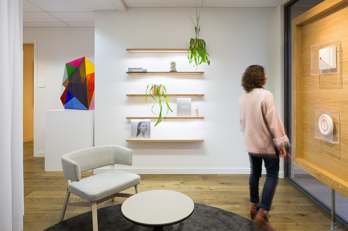
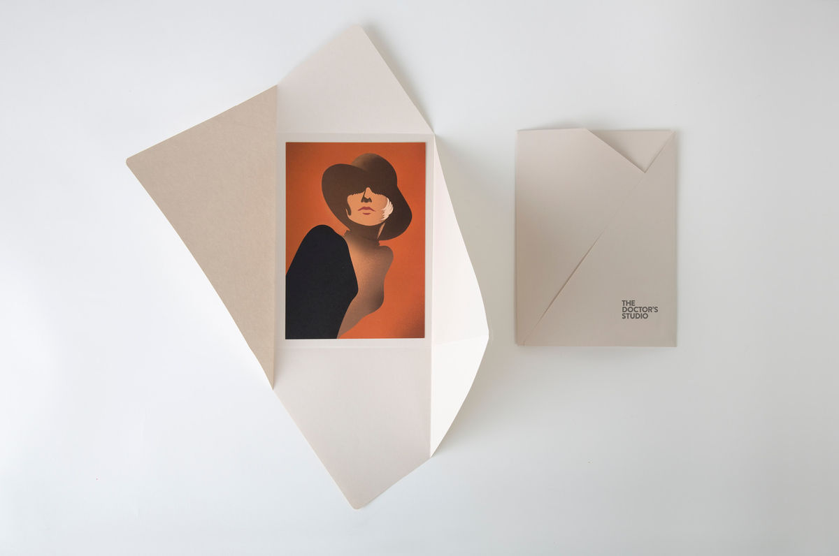
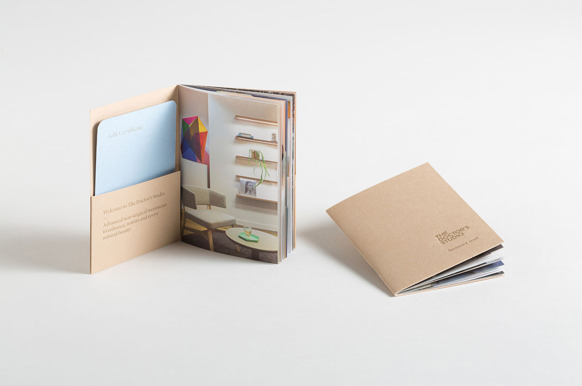
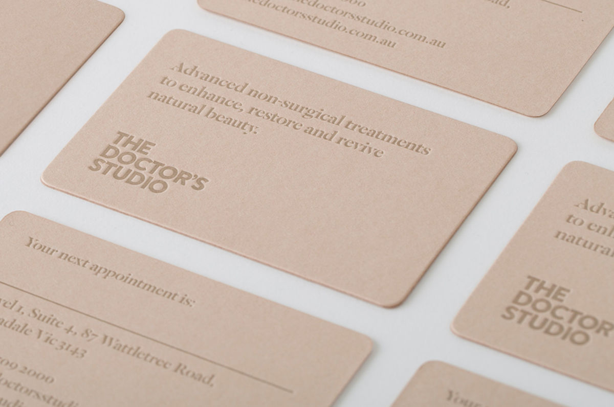
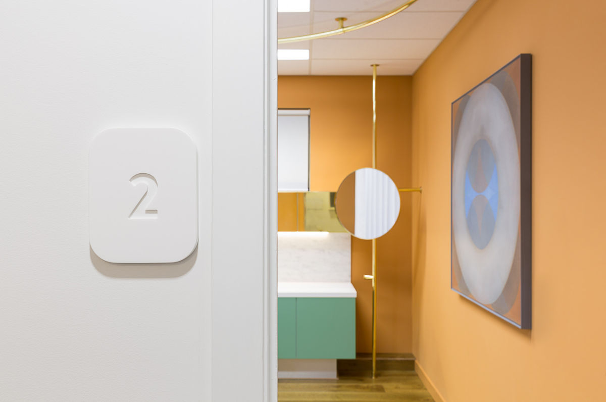
Softness links interior experience and brand identity. This can be seen within the rounded corners and grey colour of an uppercase geometric logotype, the light and shade of white signage across white walls (a particular highlight), the rounded corners and skin tone of the business cards, and an interior of modern upholstered furniture, light woods and white walls. This continues with the recurrence of circles in the choice of mirrors, rugs, tables and within some of the artwork.

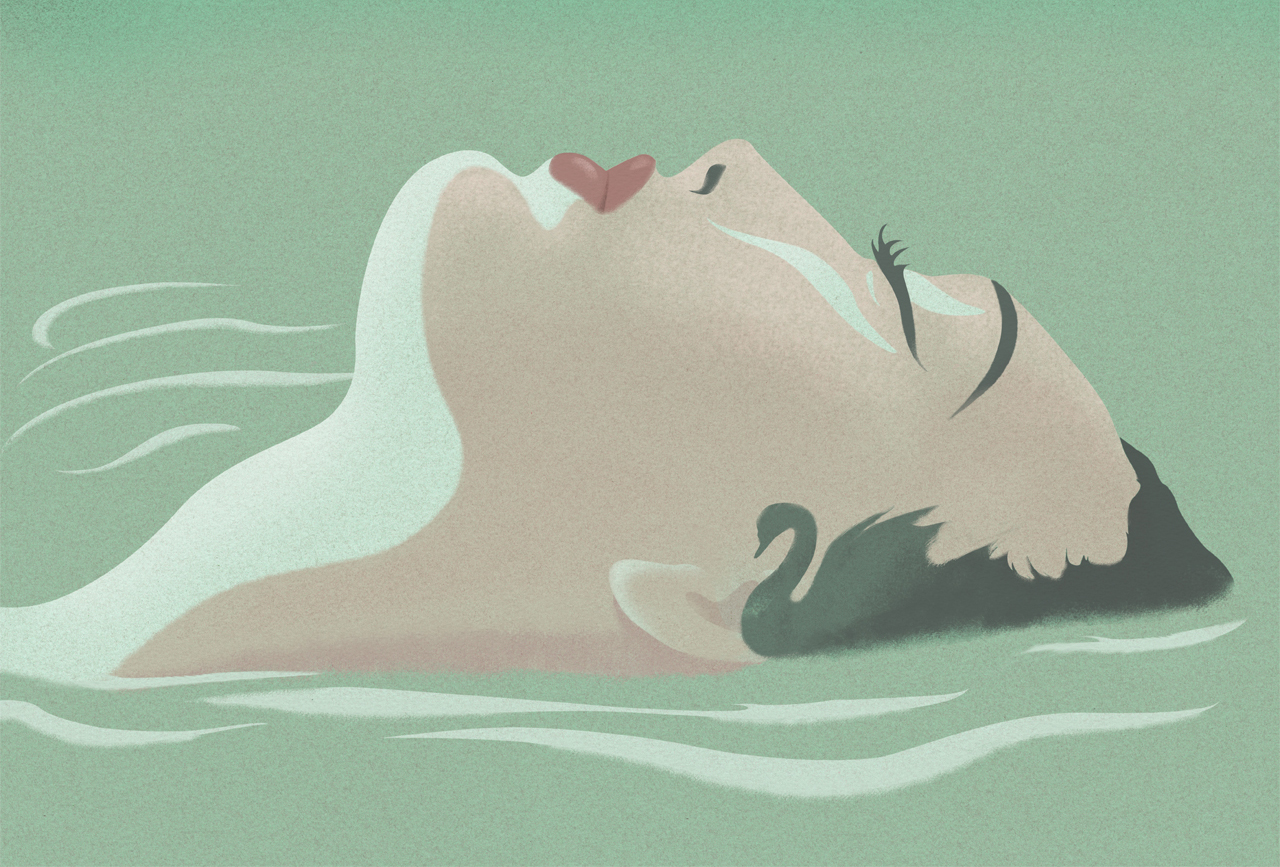
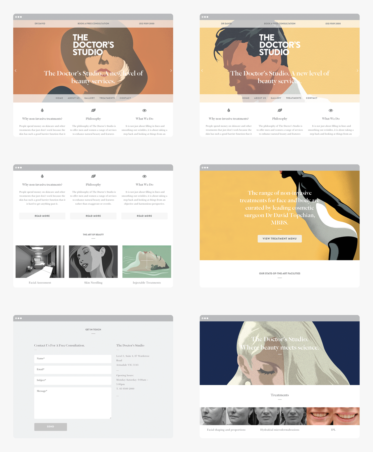
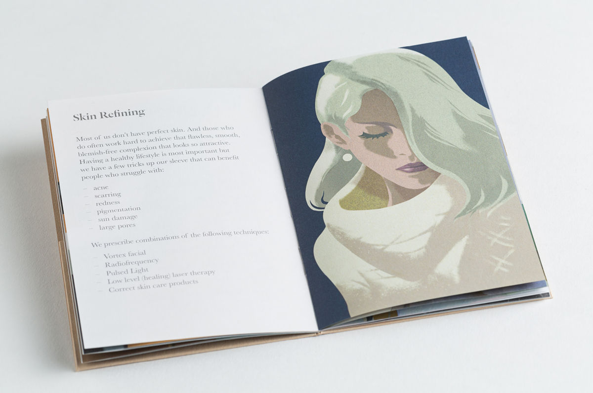
Stuart McLachlan’s illustrations introduce colour and a thoroughly unique quality, within this new context, to the surgery’s website and mailers, just as the changing artwork and sculptures bring to interior.
While there is a particular “aesthetic standard” set by these, the vintage reference—effectively delivered through colour, texture, clothing and pose—work well to sidestep any question of post-production photo enhancement that proliferates the industry. Instead, images favour the themes of timelessness and natural beauty, rather than significant and unnatural alteration, silver screen glamour and takes advantage of the continued romanticisation of the past.
These are quick to establish The Doctor’s Studio as something different, are unexpected, a highlight of the project, and form, alongside type, a pleasant continuity between print communication and website.

Commercial Type’s Dala Floda offers significant contrast to Brandon Grotesque. Its sharp terminals and serifs, cuts and absent strokes have a more surgical and fashionable quality to them. This sharpness is also reflected in the diagonal cuts of the postcard envelopes, and a brightly coloured glass sculpture in the waiting room. This is an unusual departure from many of the other assets but one that is thoroughly current but for the most part subtle. More from A Friend Of Mine on BP&O.
Design: A Friend Of Mine
Architects: Russell and George
Advisor: Kelly Thompson of UNA
Illustration: Stuart McLachlan
Opinion: Richard Baird
Fonts Used: Dala Floda & Brandon Grotesque
