Equals Consulting by Spin
Opinion by Richard Baird Posted 10 March 2016
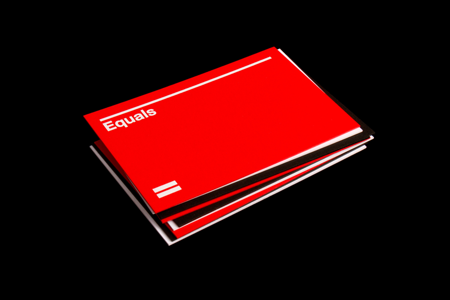
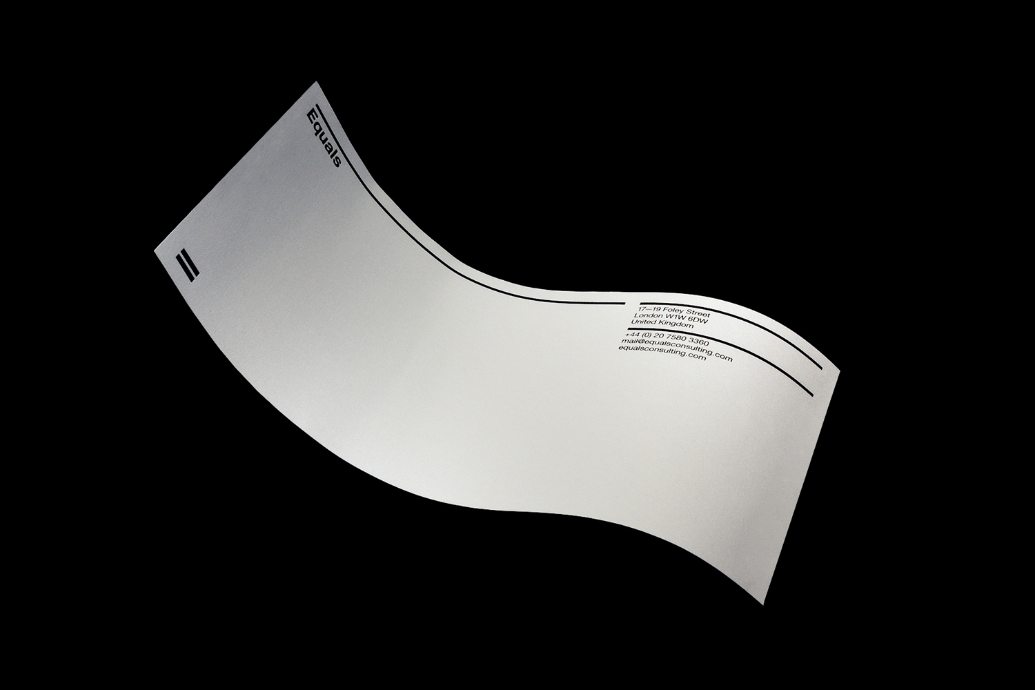
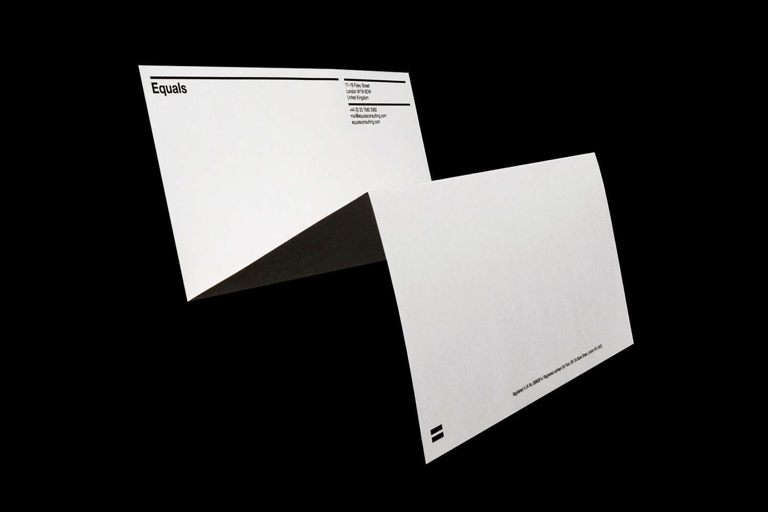
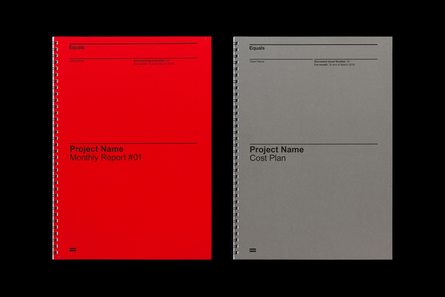
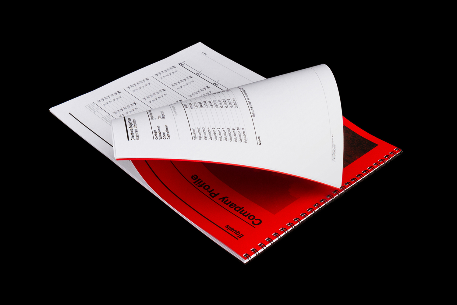
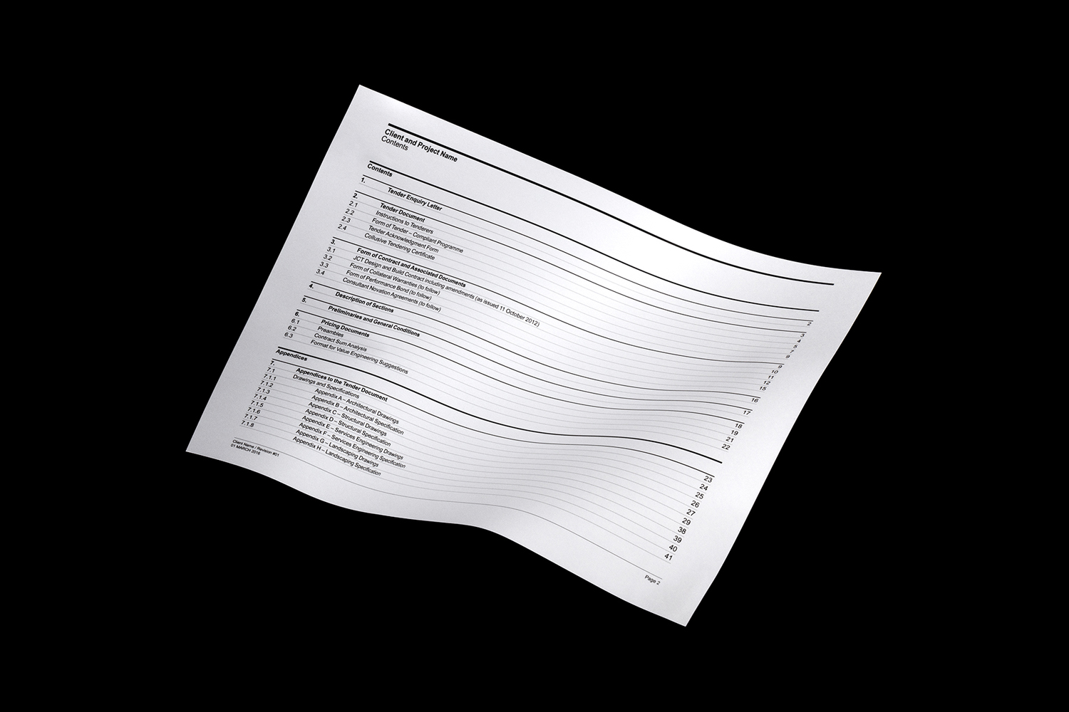
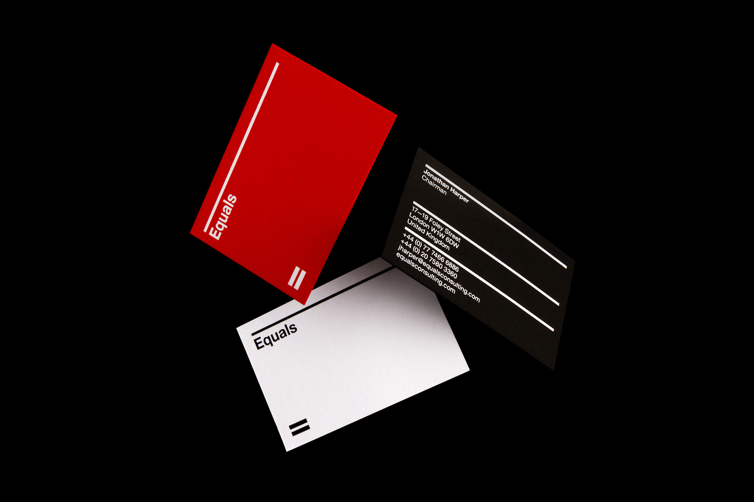
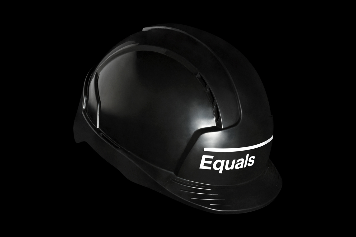
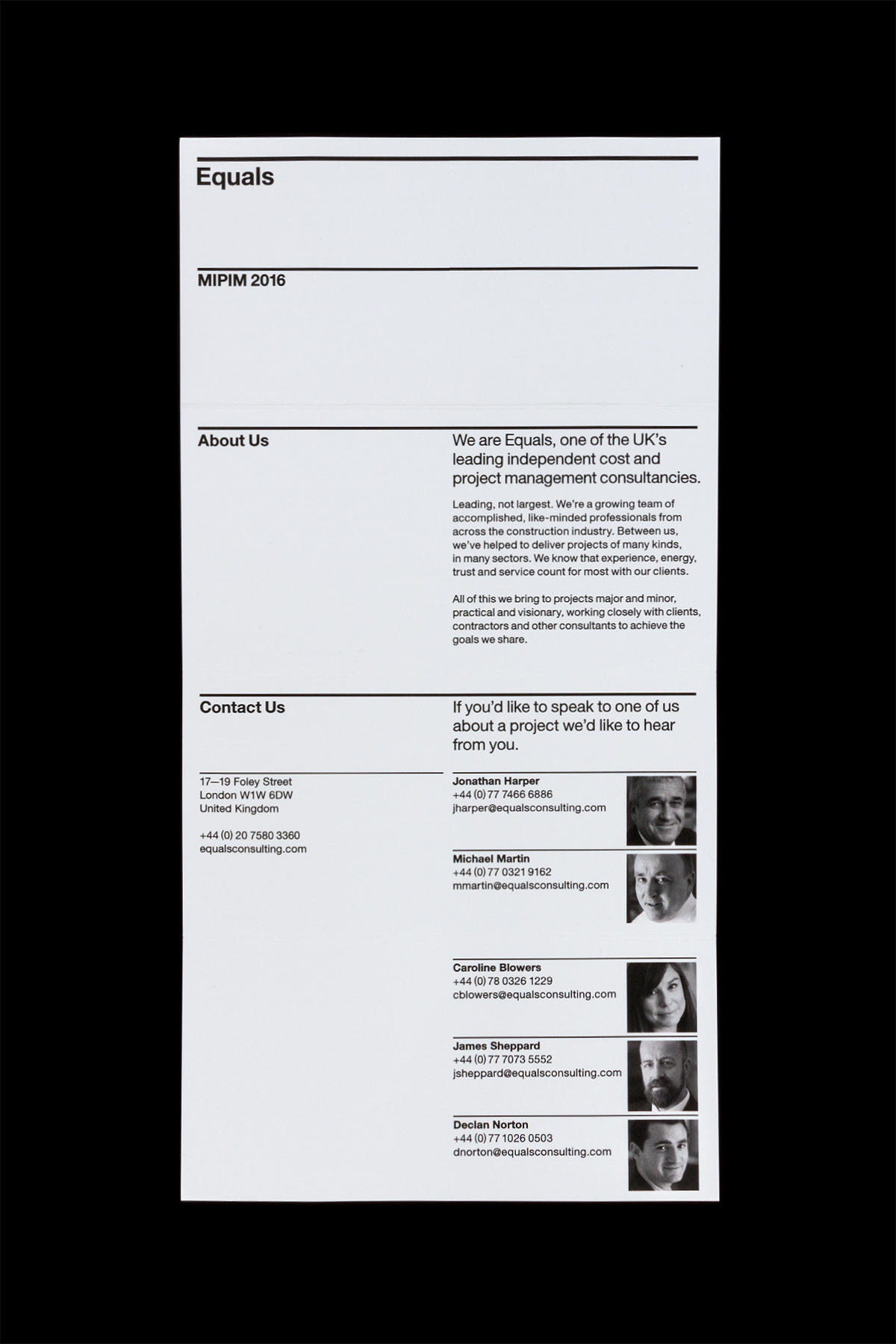
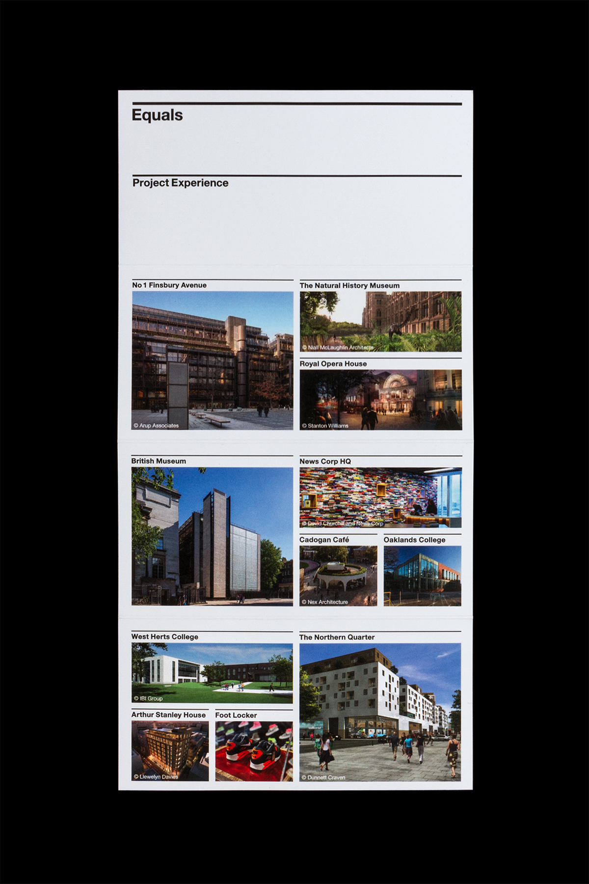
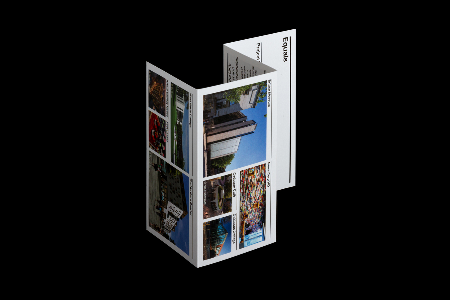
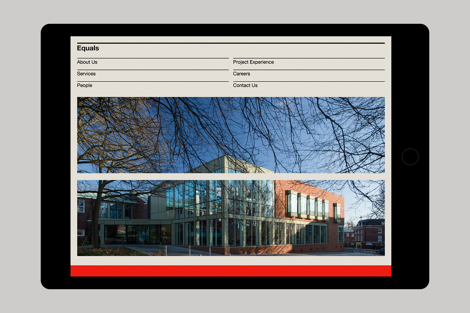
Equals is a UK independent cost and project management consultancy. Although not the largest, it is described as being an industry leader with a wide variety of clients. Equals recently worked with London based graphic design studio Spin to develop a new visual language that would be confident, bold and cohesive. This extended across stationery, business cards, book and manual templates, technical documents, signage, web design and implementation.
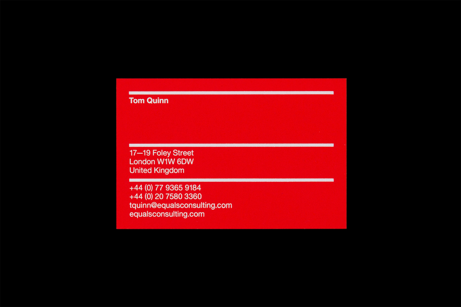
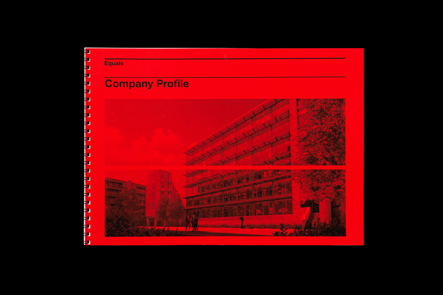
Equals’ new visual identity, while simple, is identifiable, measured and consistent. A bright red, dyde uncoated boards and a white foil finish provide a vibrancy and high quality in print where type favours a practicality in its various weights and a familiar corporate quality in its letter shapes. This is well-suited to a company working business to business, in the fields of costing and management, and implimented with a good eye for letter and line spacing, with a pleasant continuity in the weighting of logotype and dividing lines.
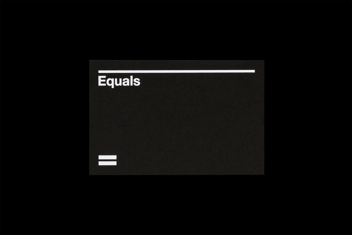
The mark functions as a simple expression of the name and makes the most of association. Although ubiquitous, it is expanded upon in a number of different ways in print and online, developing into a more unique system. Underlines, dividing lines and containers for images, drawing on the shared weight and parallel lines of mark, find a balance between functionality, flexibility and moments of distinction, although online, this echos some of Spin’s early work, particularly for Biber. More from Spin on BP&O.
Design: Spin. Opinion: Richard Baird. Fonts Used: Helvetica Neue.
