Marquez Quevedo by La Tortillería
Opinion by Richard Baird Posted 15 March 2016

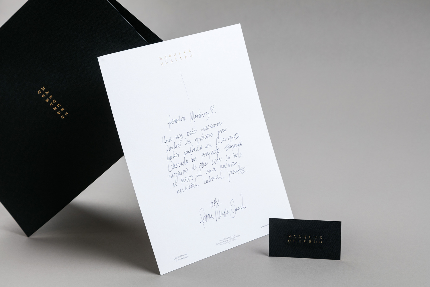
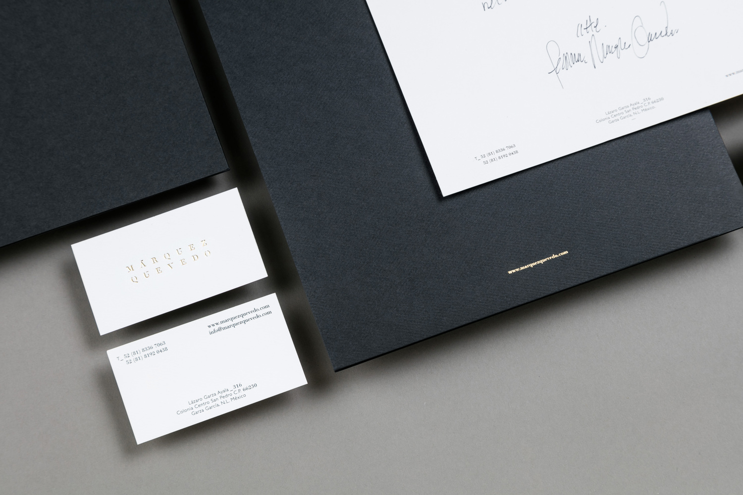
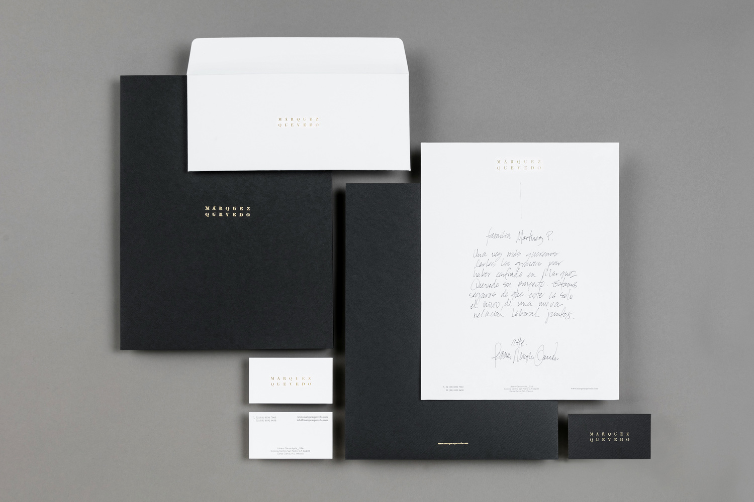
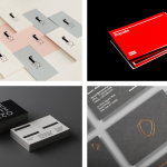
Márquez Quevedo is a San Pedro based architectural practice that balances space, proportion, materials, form and colour to compose creative spaces filled with movement. Drawing on what is described as the practice’s sophisticated style and vision Mexican graphic design studio La Tortillería developed a new brand identity for Márquez Quevedo with a sense of space, structure and materiality, both in image and physical texture, that links business cards, stationery and website.
Although there is not much to the project asset wise, there is a pleasant tension created between classic detailing and modernity throughout, where often you see a significant and consistent favour for the latter. Face’s work for DNA development plays with something similar.
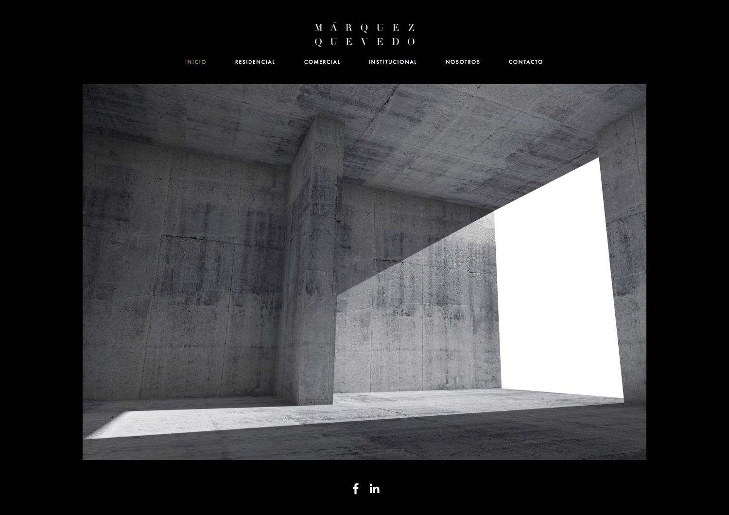
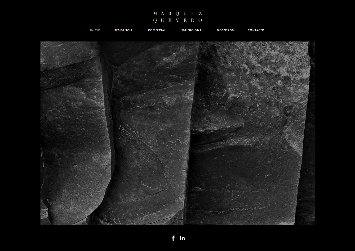
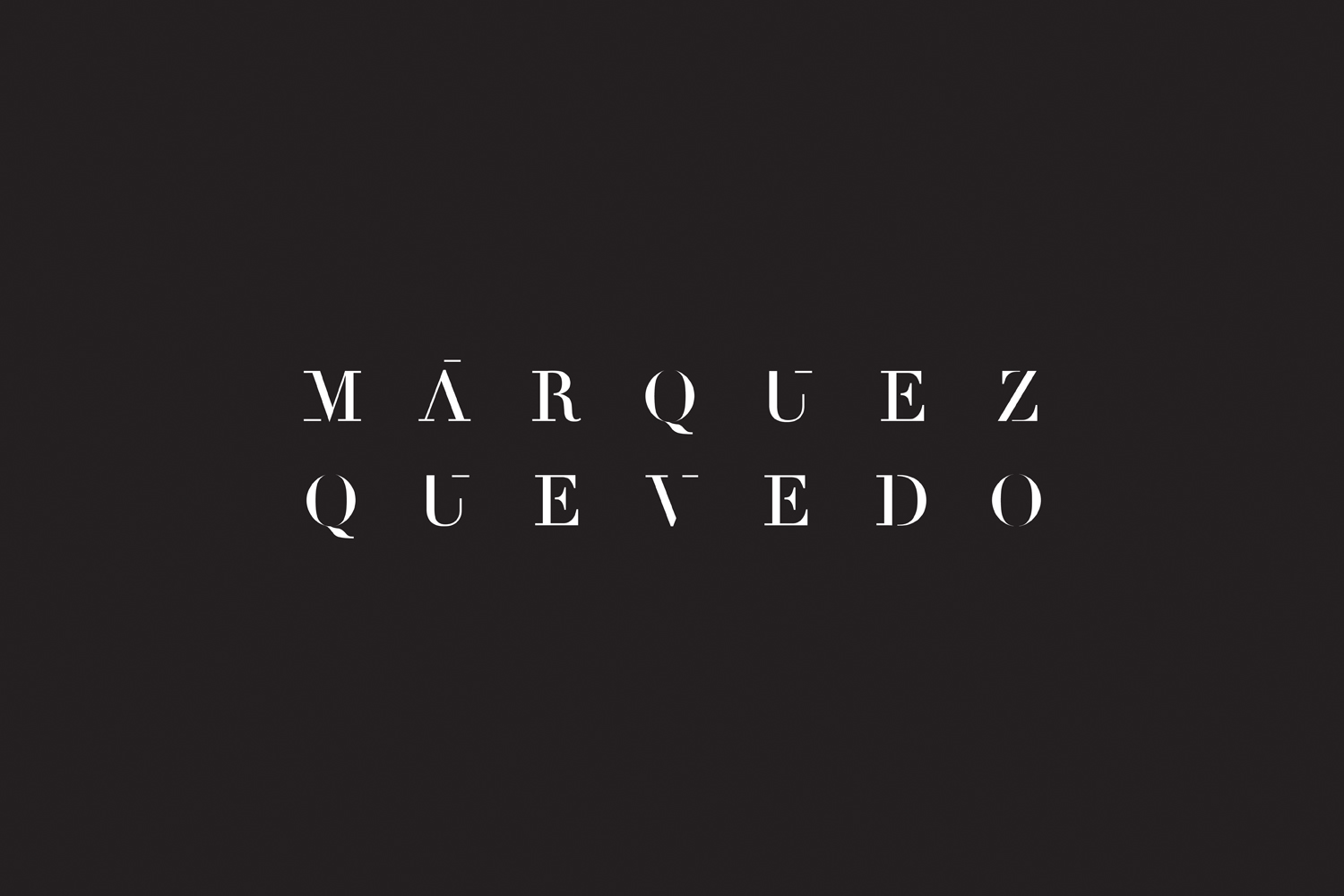
This is evident within a logotype that balances serif flourish and moments of reduction which draws the eye to the structural qualities of the letterforms, and emphasised by typesetting and the choice of image online. These move between material close-ups, organic in nature, and bold geometric surfaces and interior spaces, which is a particular highlight.
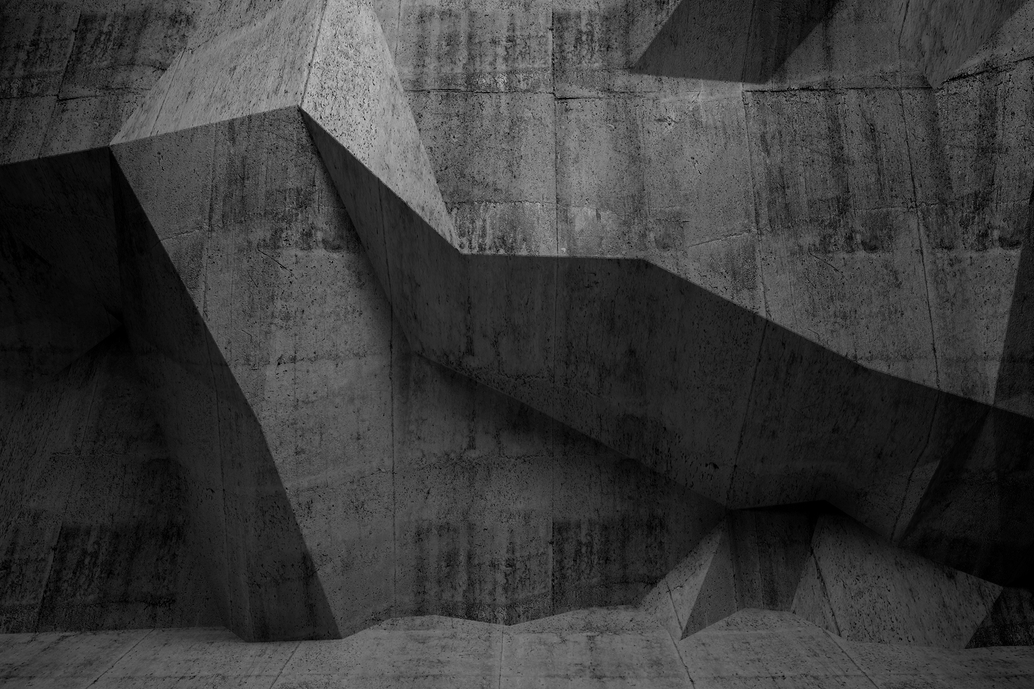
Although there is a disparity between front page imagery and portfolio, the communicative value and aesthetic impact is compelling, and presumably sets the tone for future work.
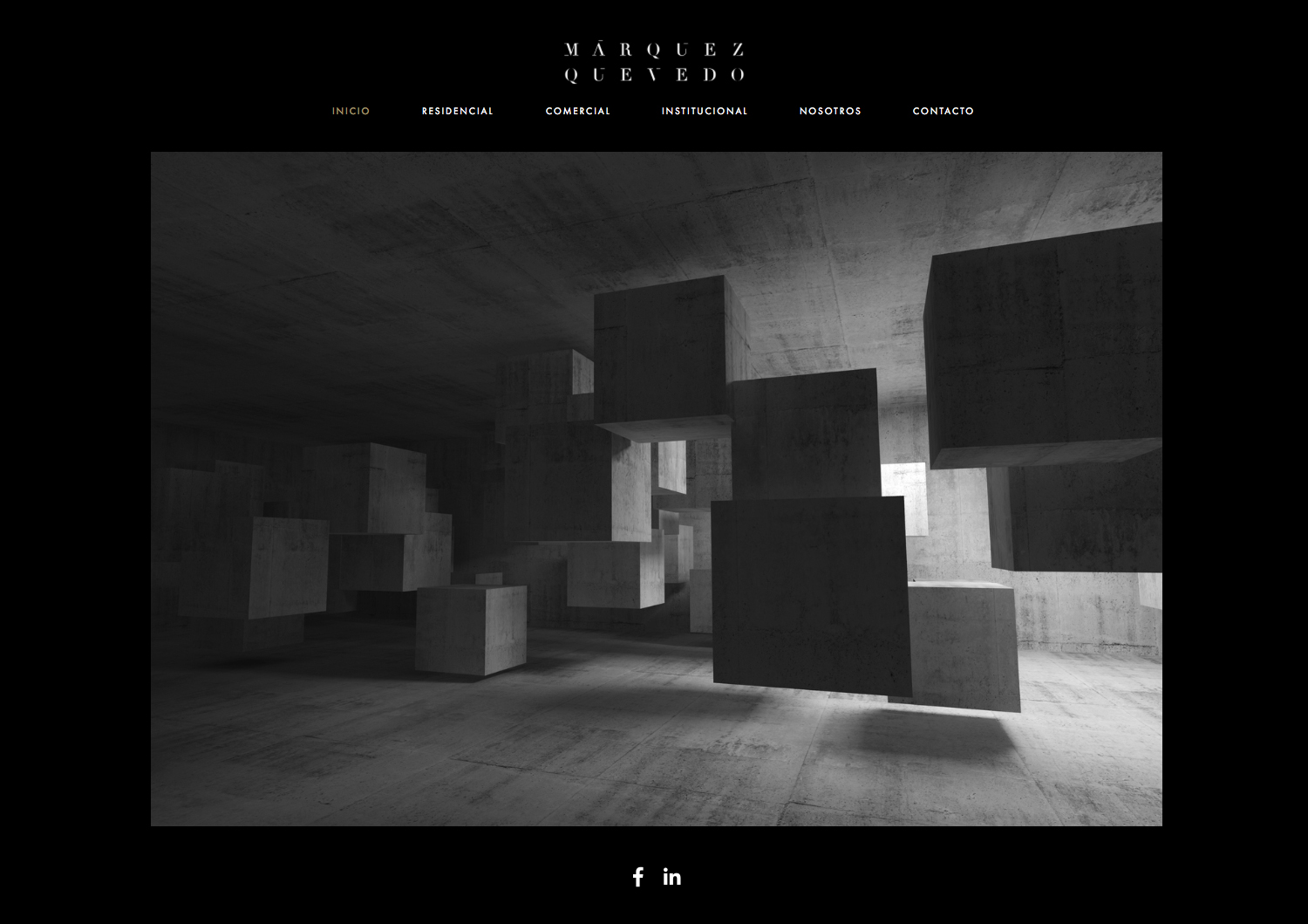
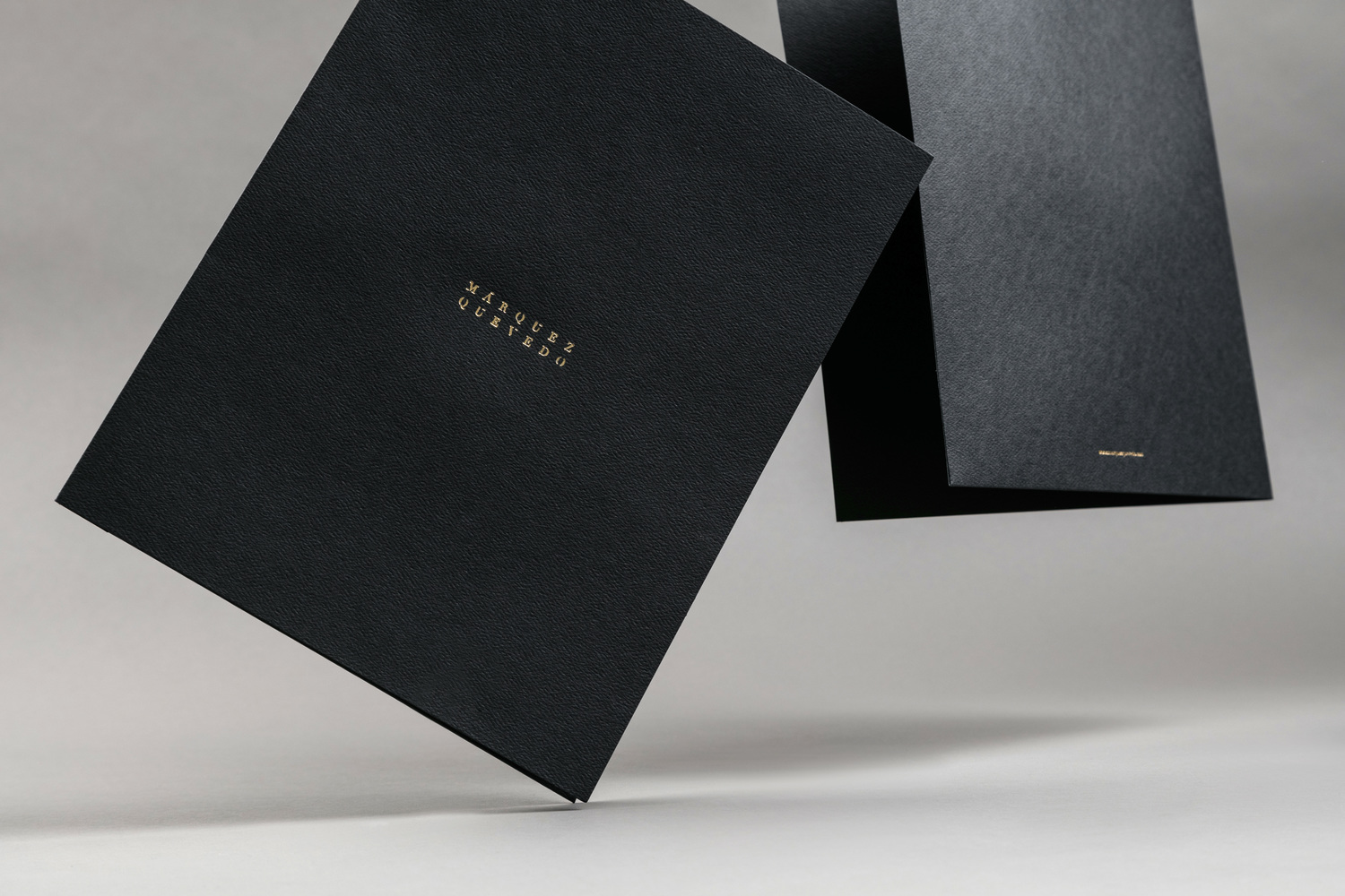
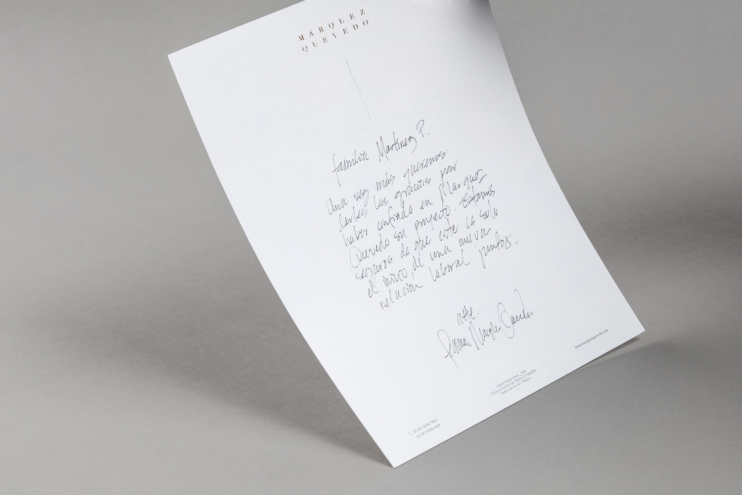
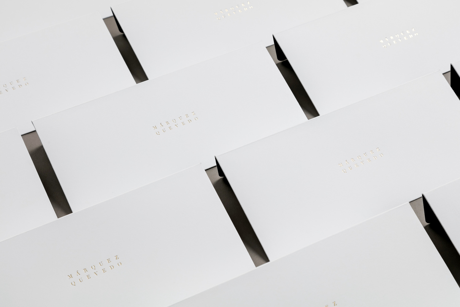
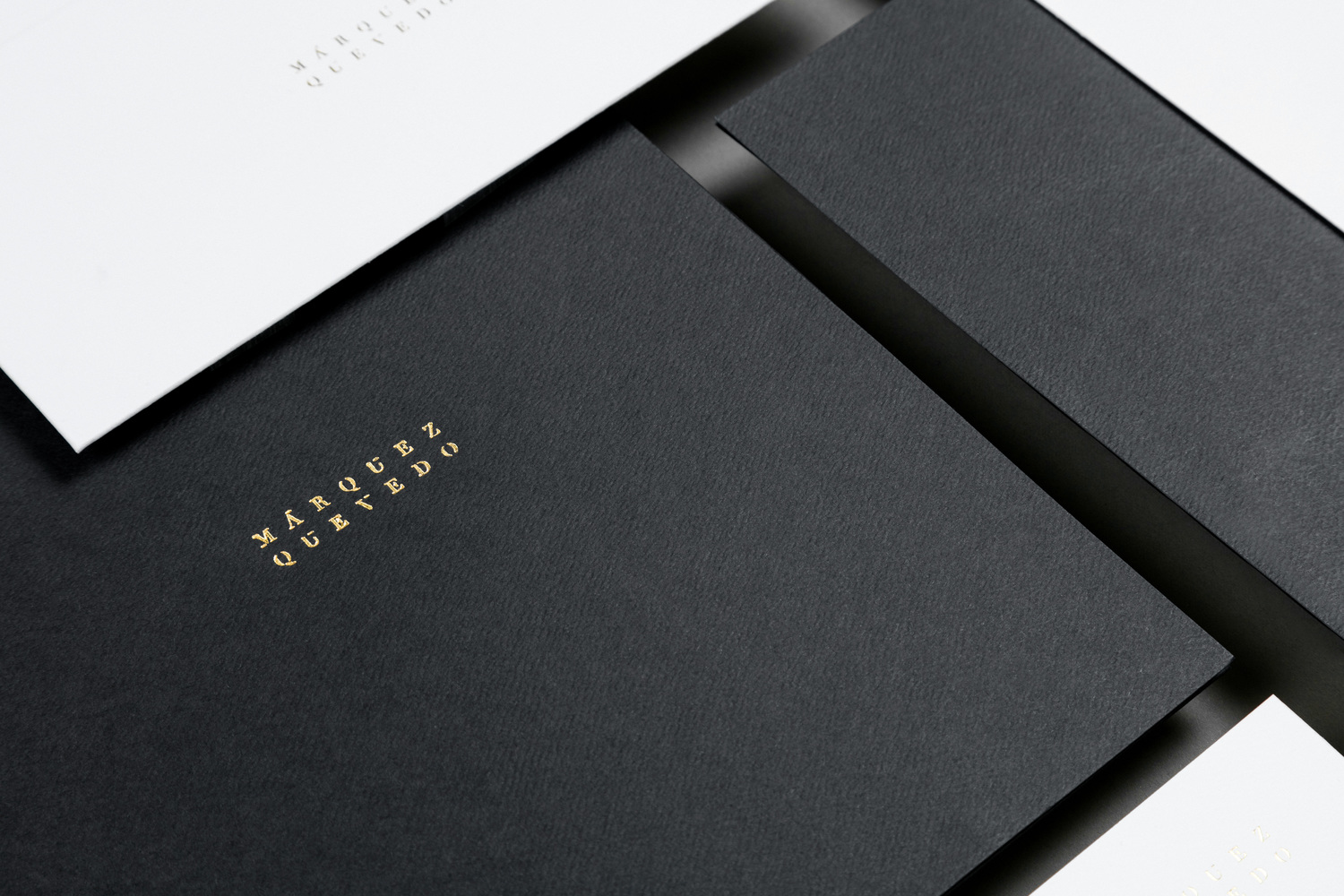
The contrast established by logotype and image online also plays out across the stationery. A simple black and white colour palette sits alongside gold foil finishes, grid-based layouts next to centre-aligned text, serif logotype by sans-serif contact information and areas of unprinted space emphasising a couple of different surface textures. These lean more towards what might be associated with interior finishing.
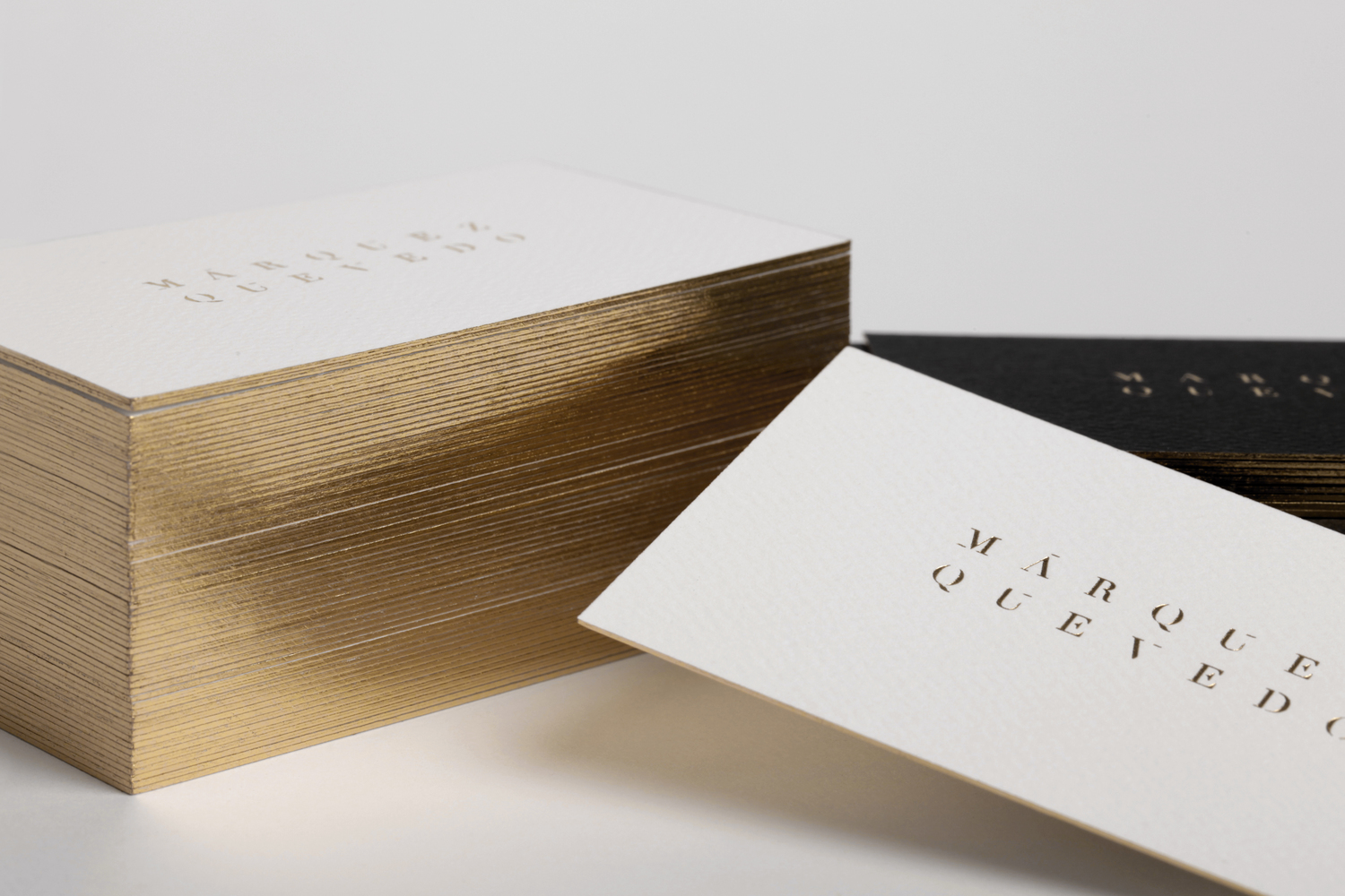
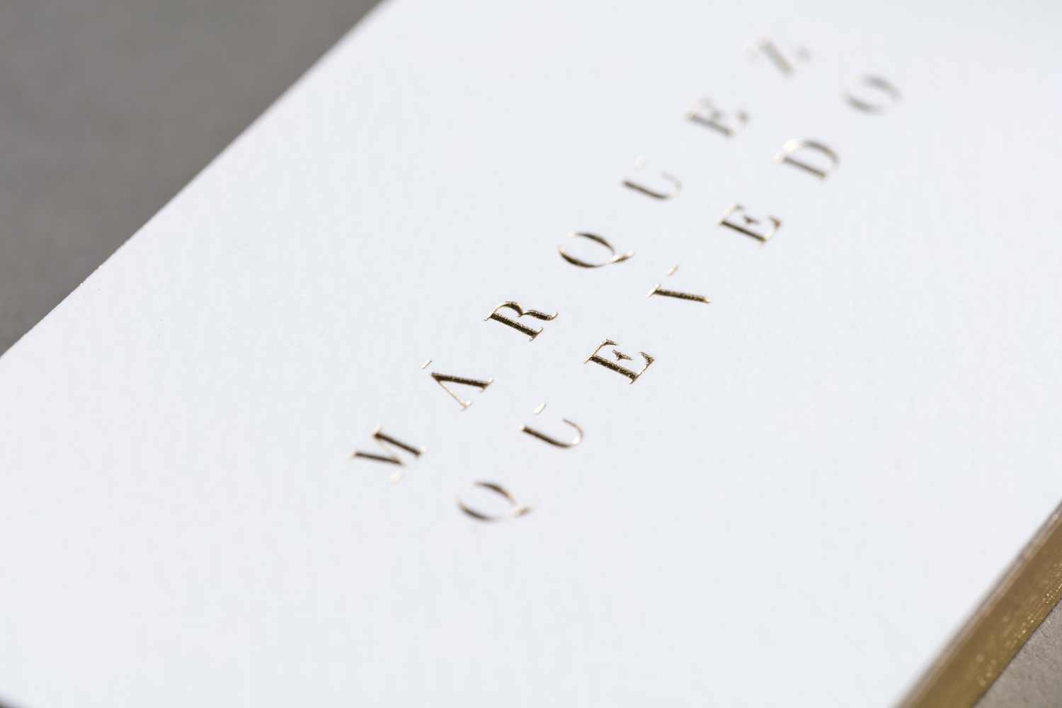
The result conforms to some key architectural brand identity conventions. In particular, light and shade, which is present in colour palette and the way the logotype has been built, materiality in the choice of uncoated boards and in the close-up photography on the home page, and a sense of space and structure in layout and typesetting.
It comfortably and cohesively walks the line between tradition and modernity, without contradiction, and although it perhaps lacks something of a distinctive and studio specific expression—the movement said to exist within Márquez Quevedo’s spaces seems to have been overlooked—it is reassuring in its familiarity and of good quality in its implementation. More from La Tortilleria on BP&O.
Design: La Tortillería. Opinion: Richard Baird. Fonts Used: Proxima Nova.
