BP&O Collections — Retail
Opinion by Richard Baird Posted 2 August 2017
A continually updated collection of some of the best brand identity design work for retailers, reviewed and published on BP&O. This post features work by Two Times Elliott, BVD and Blok, and includes simple wordmark and stationery sets, and extends to those that included signage, packaging and brochures.
Projects move between the reductive and eye-catching in form, type and colour, and those that look to communicate a story using language and image. Be sure to click the images to read more about the project, the intentions of each design, and how these work alongside other assets.
This post was published as a quick way to browse through BP&O’s content and get access to older but equally interesting projects through different themes, and expands on previous posts under the category The Best of BP&O. This series can be subscribed to here.
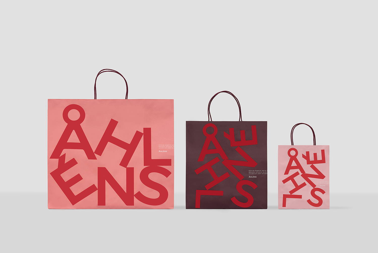
Åhléns by Happy FB, Sweden
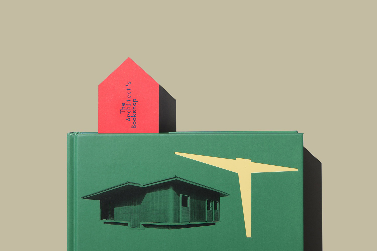
The Architect’s Bookshop by Garbett, Australia
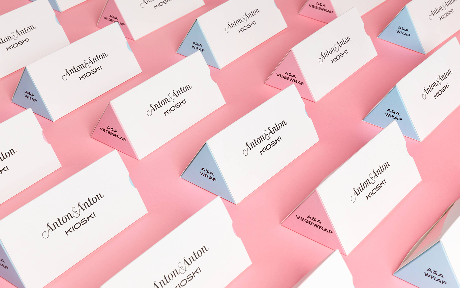
Anton&Anton Kioski by Bond, Finland
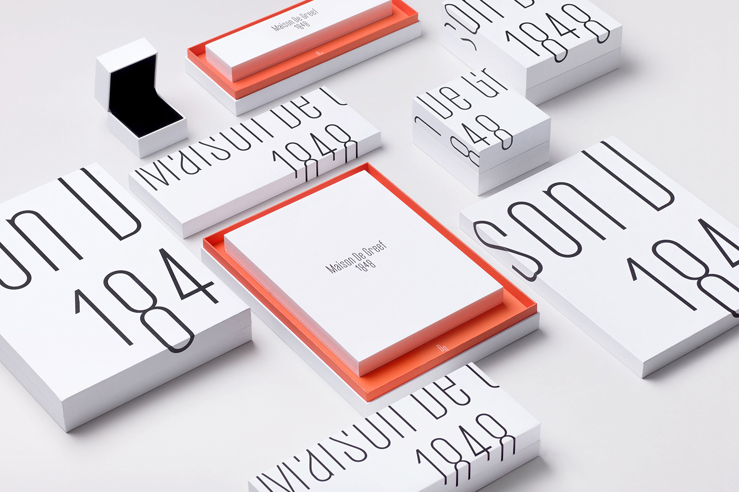
Maison De Greef 1848 by Base Design, Belgium
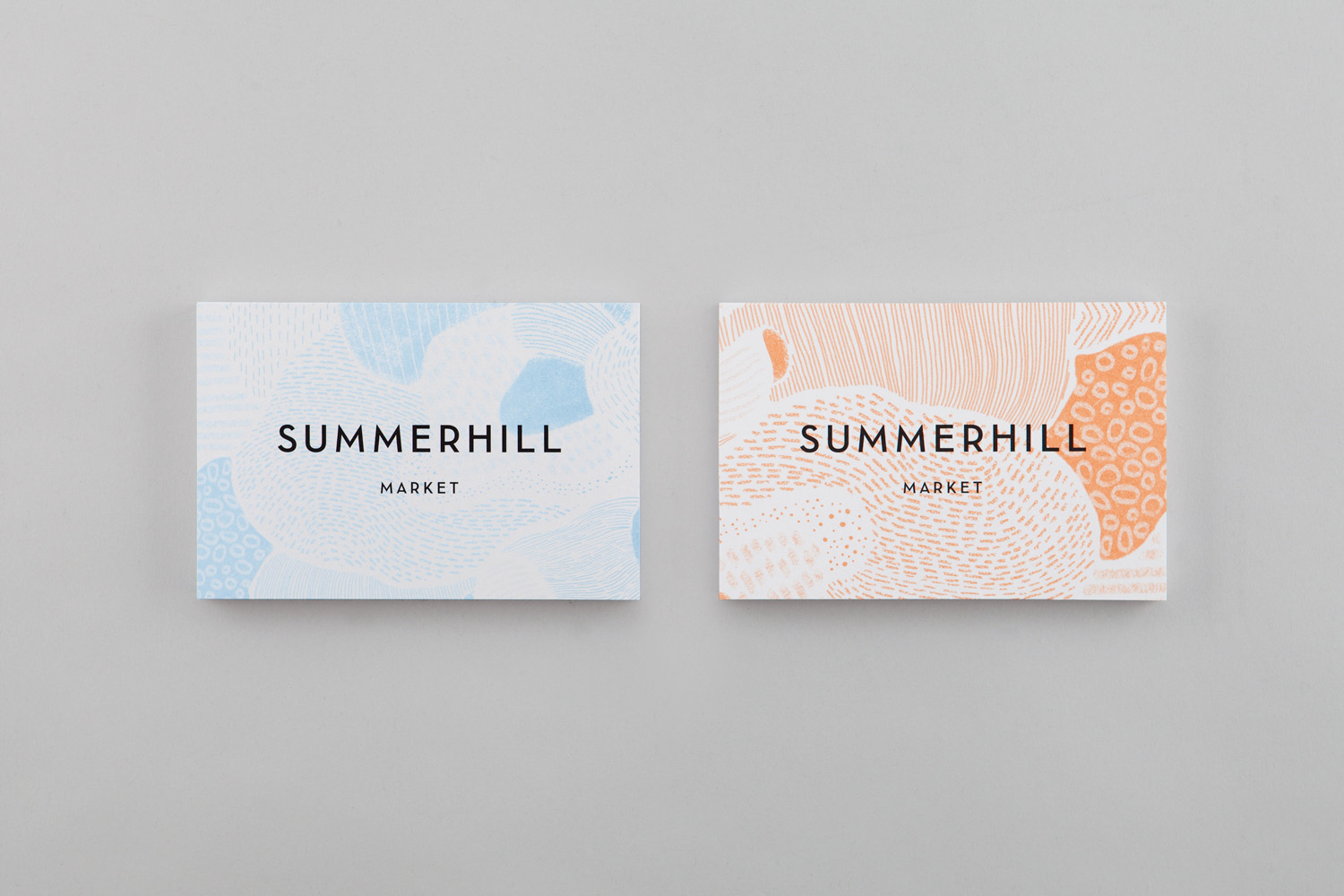
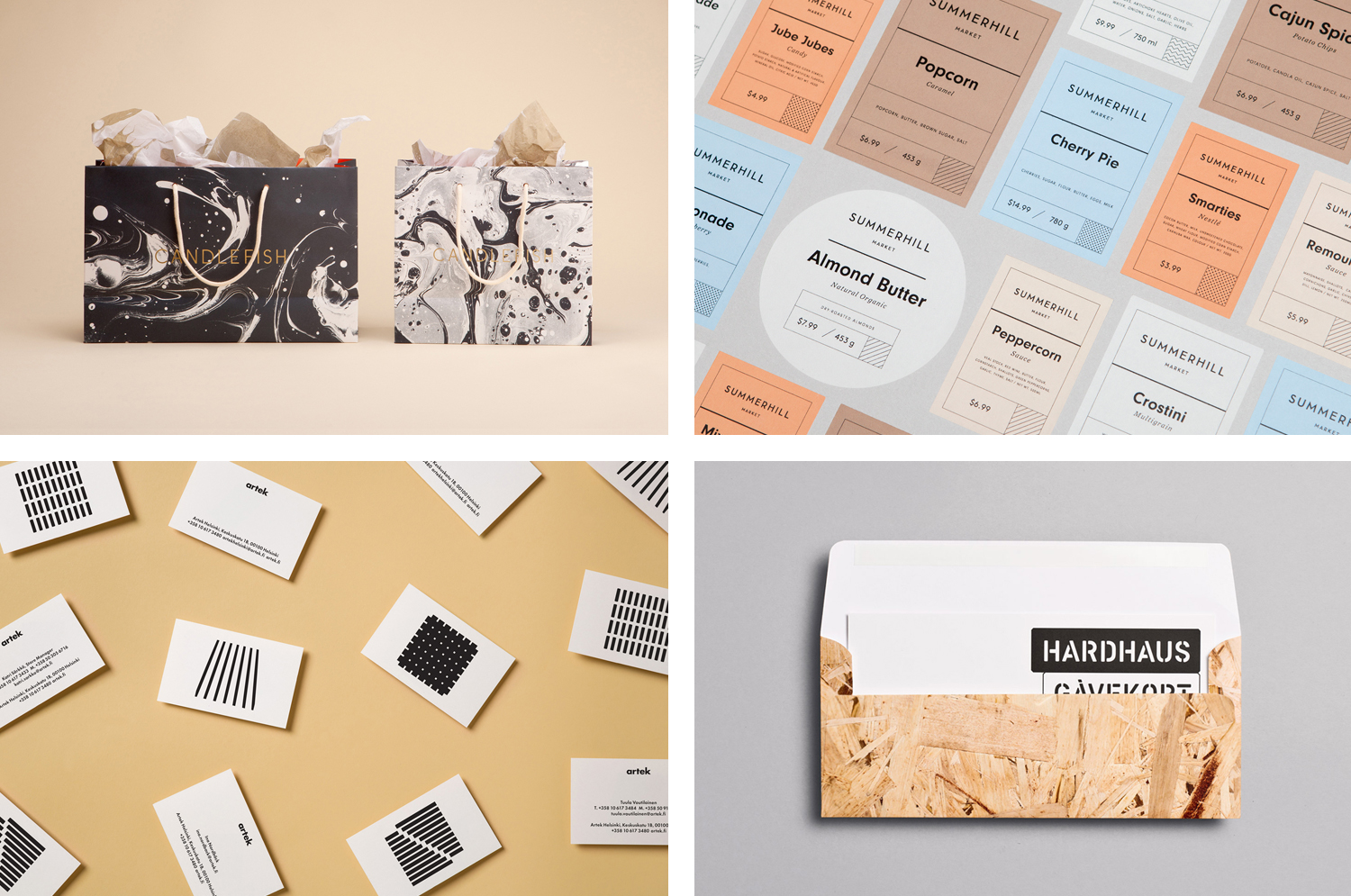
Summerhill Market by Blok, Canada
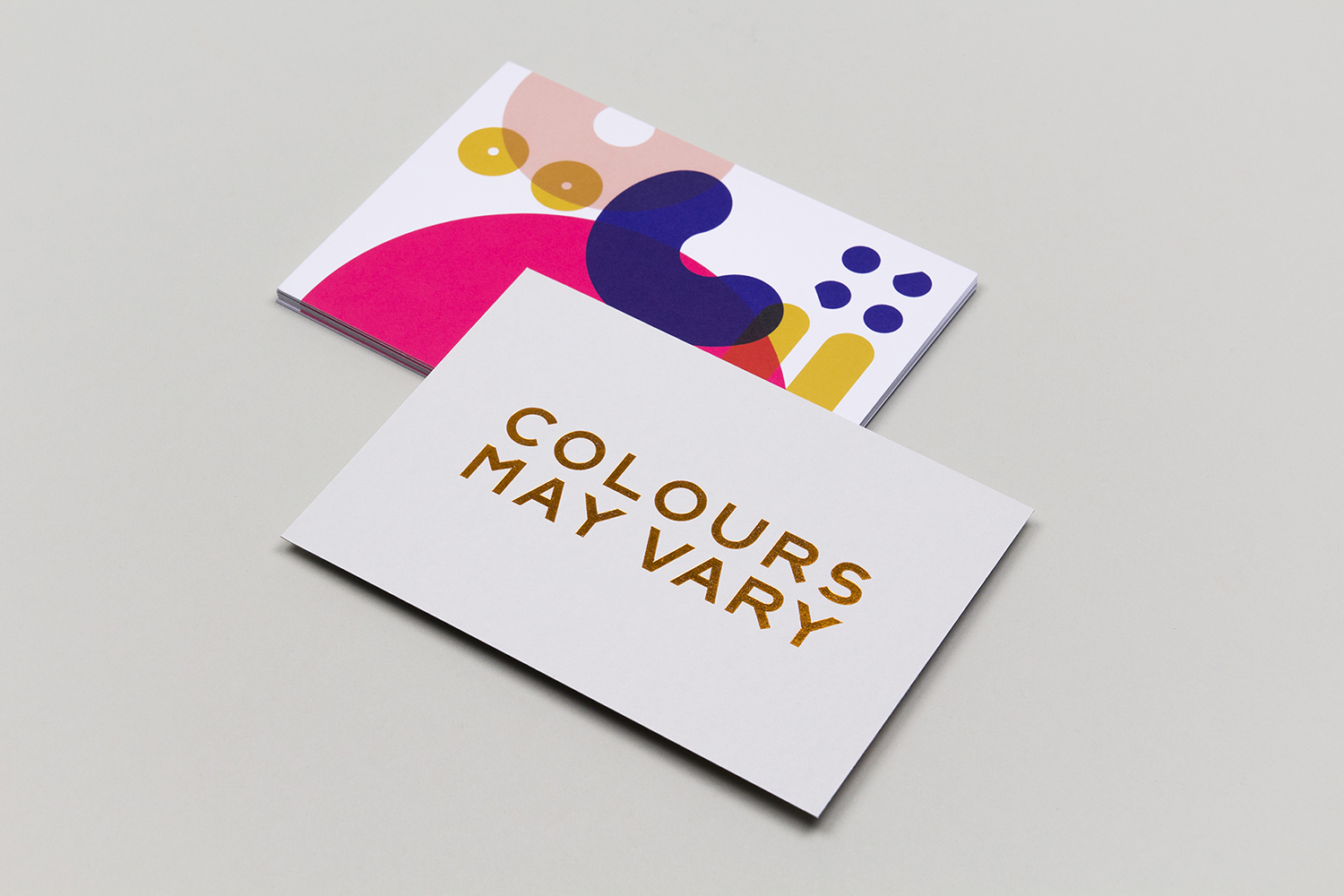
Colours May Vary by Build, United Kingdom
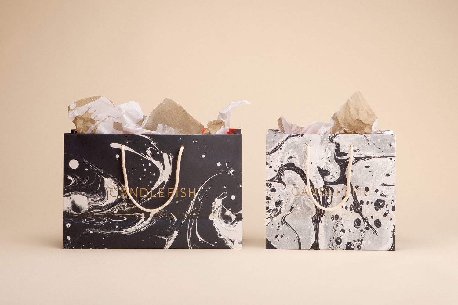
Candlefish by Fuzzco, United States
Blå Bär by BVD, Sweden
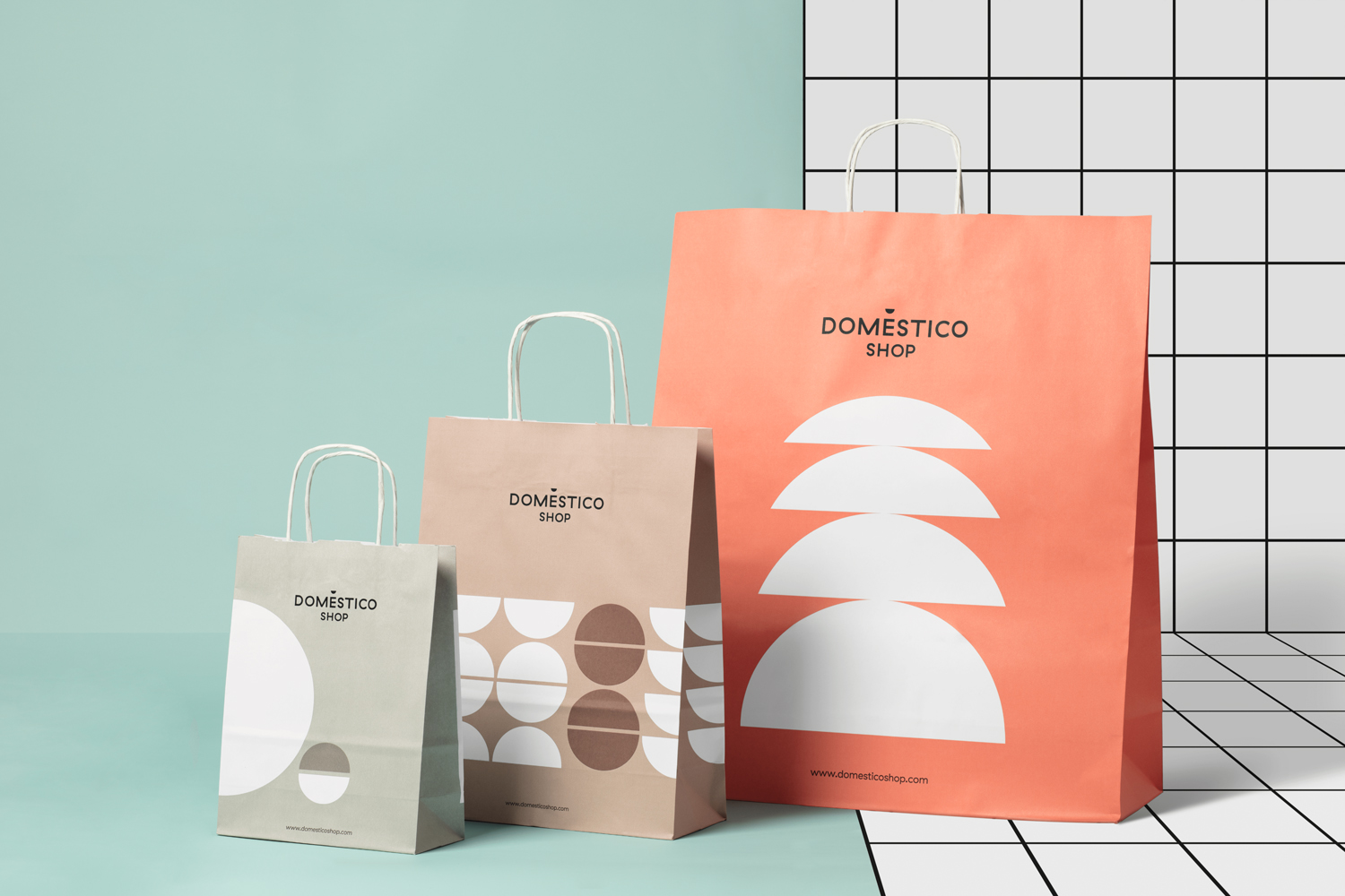
DomésticoShop & DomésticoMarket by Mucho, Spain
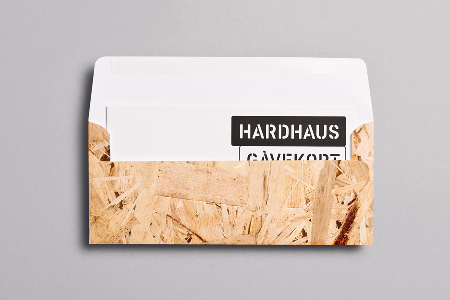
Hardhaus by Heydays, Norway
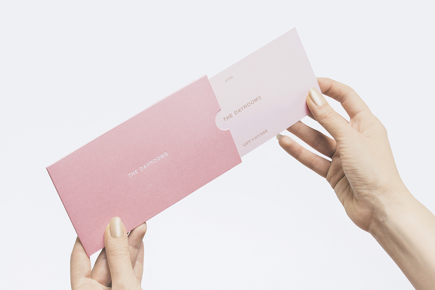
The Dayrooms by Two Times Elliott, United Kingdom
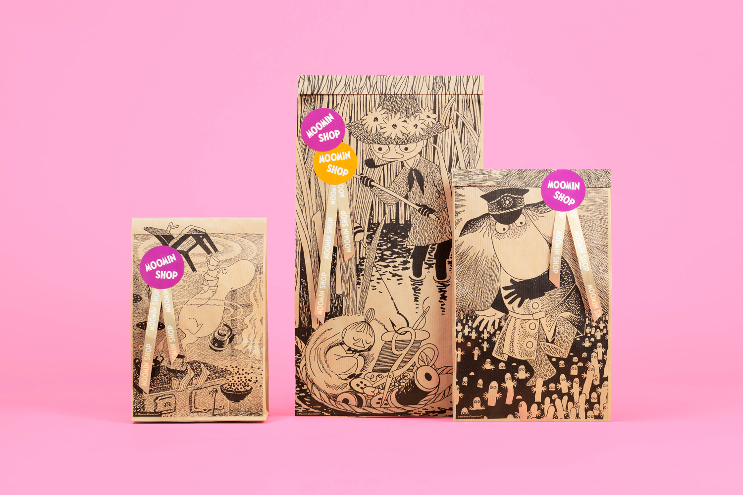
Moomin Shop by Bond, Finland
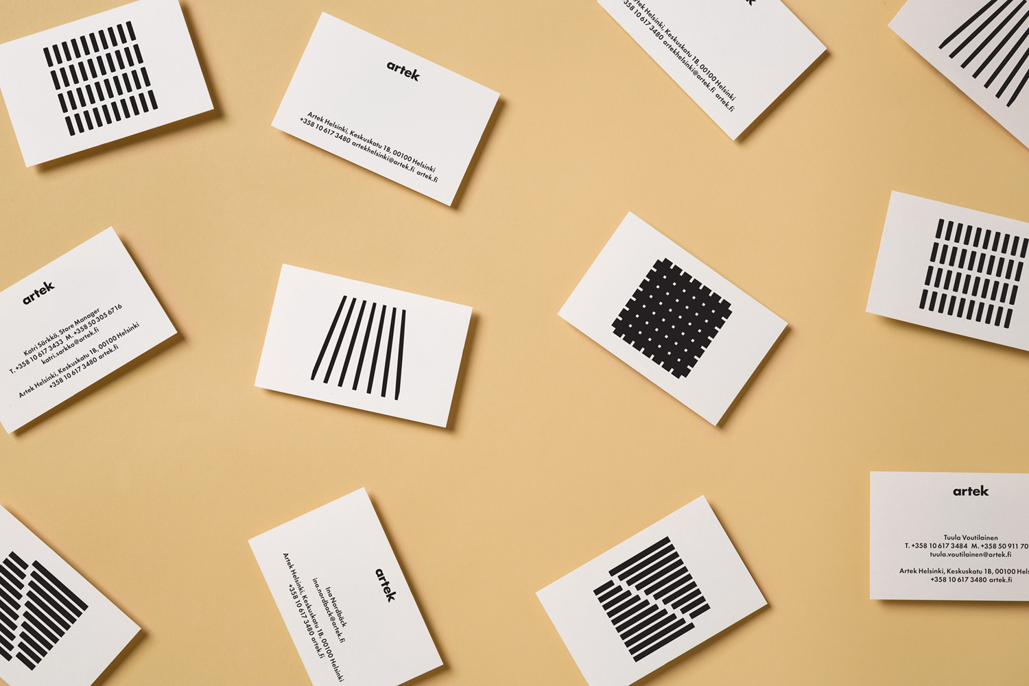
Artek Helsinki by Tsto, Finland
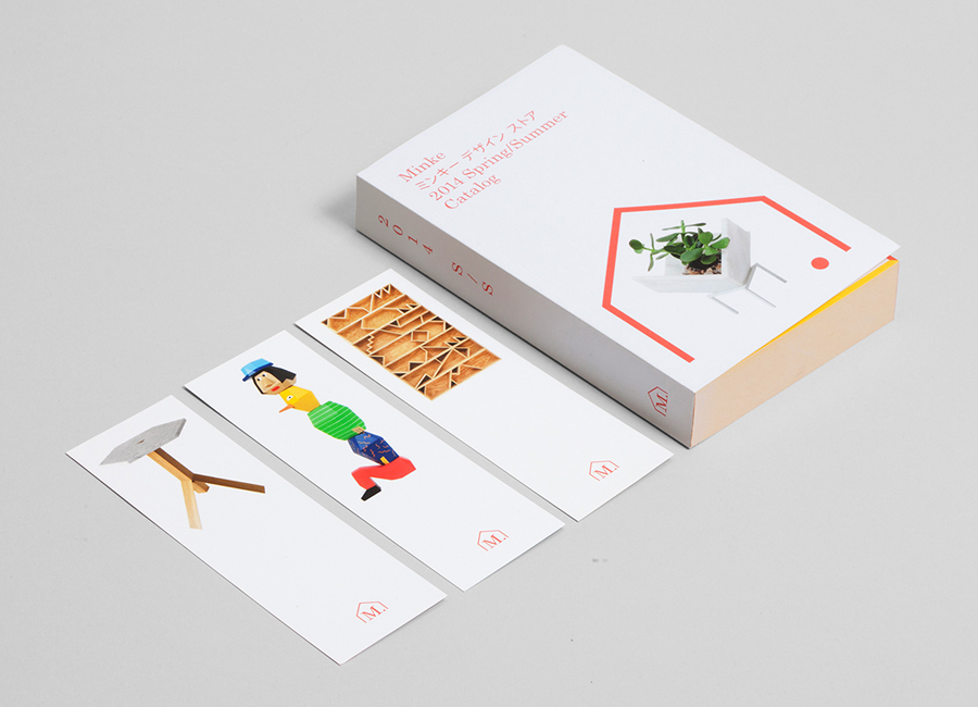
Minke Design Store by Studio Lin, United States
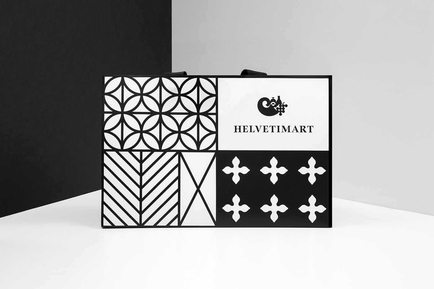
Helvetimart by Anagrama, Mexico
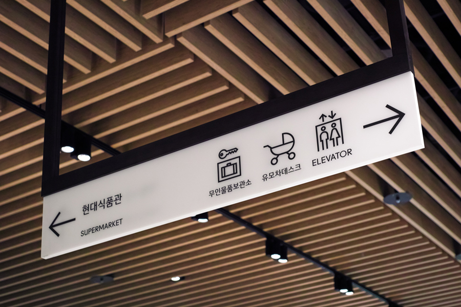
The Hyundai Department Store by Studio fnt, South Korea
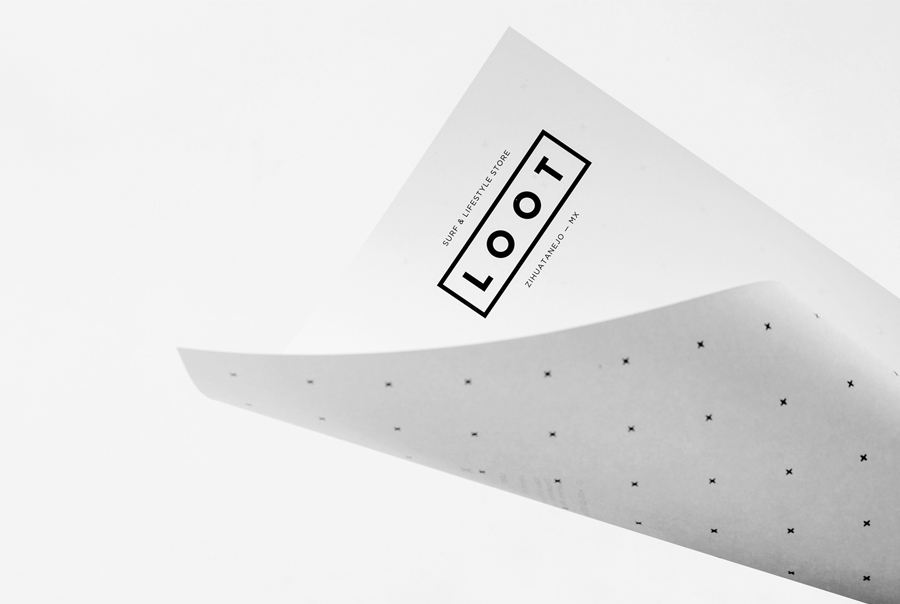
Loot by Savvy, Mexico
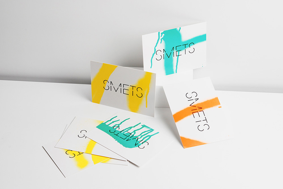
Smets by Coast, Belgium
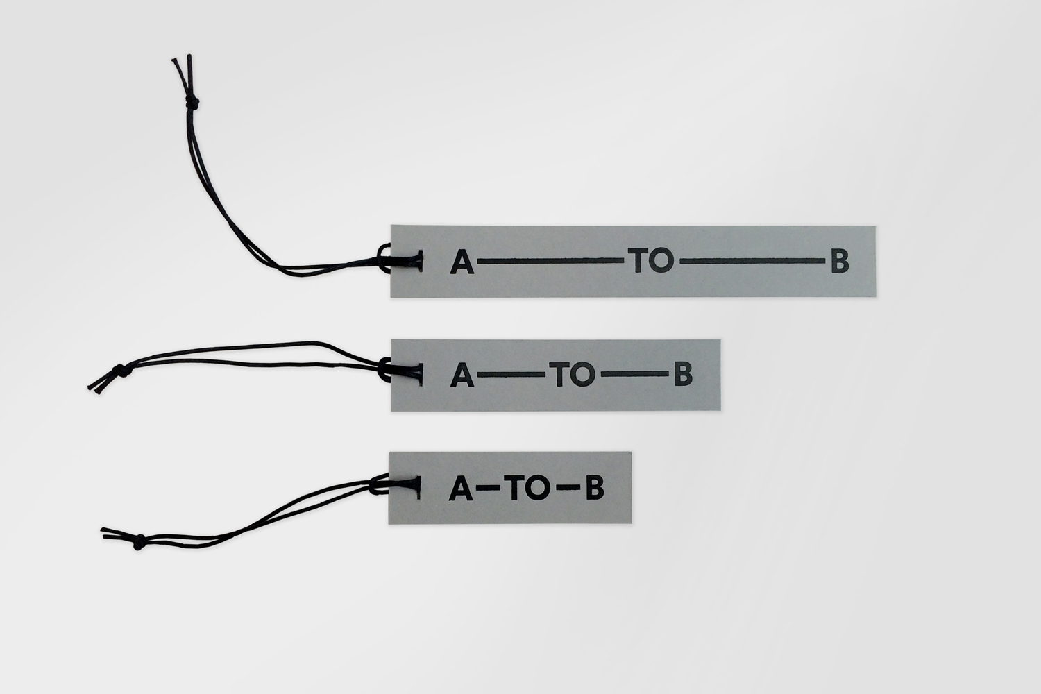
A–TO–B by Stockholm Design Lab, Sweden
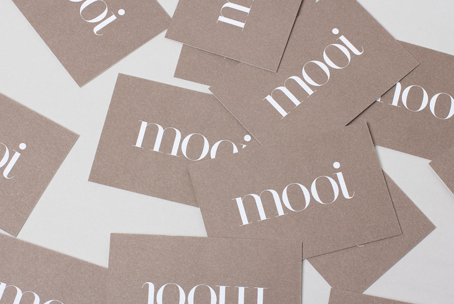
Mooi by Morse Studio, United Kingdom
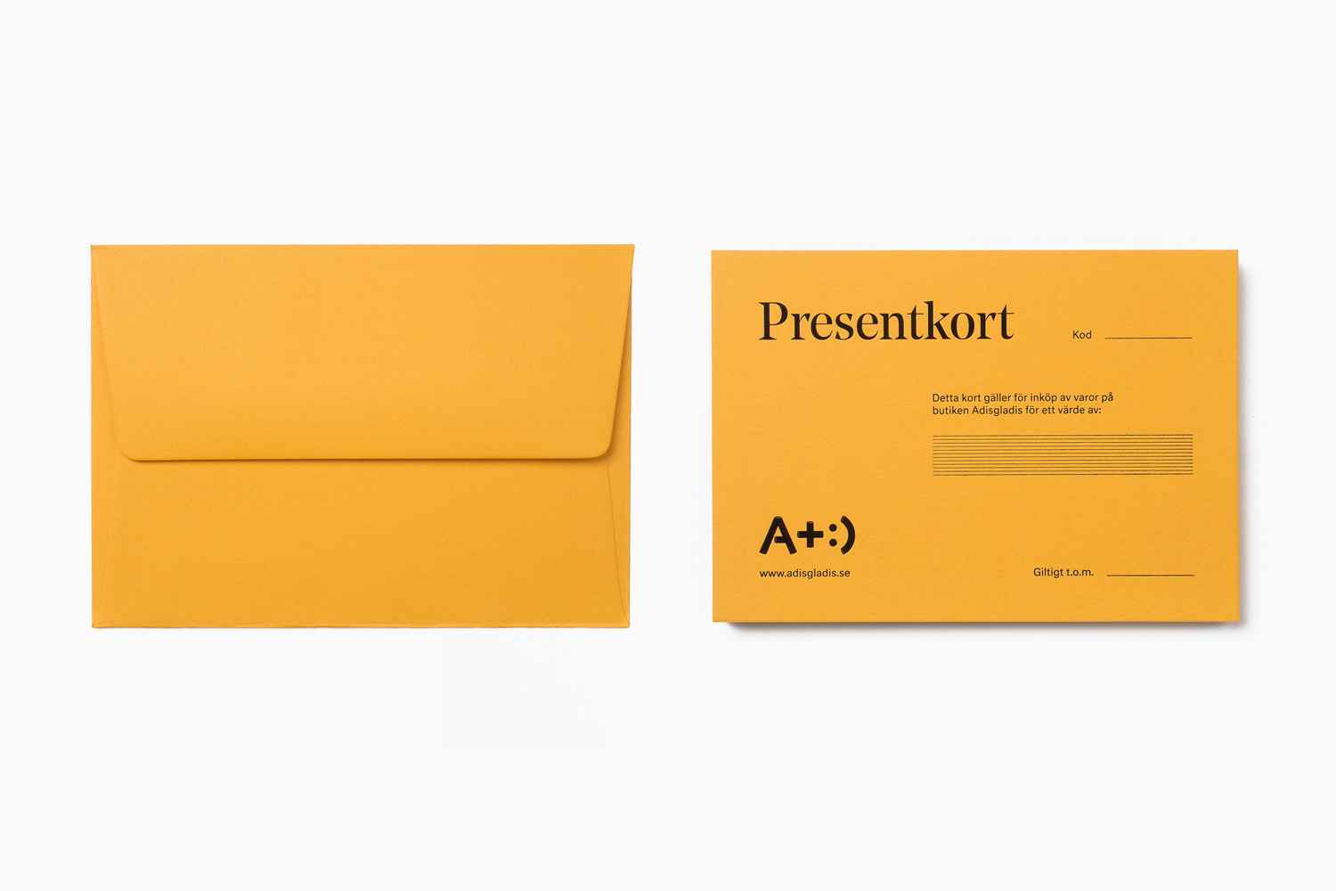
Adisgladis by Bedow, Sweden
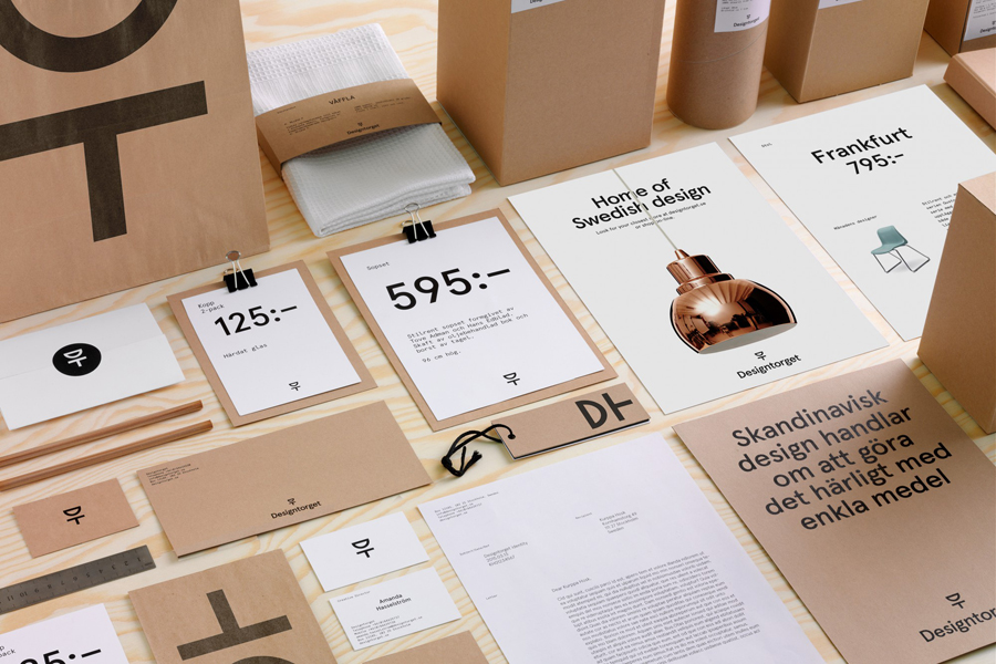
Designtorget by Kurppa Hosk, Sweden
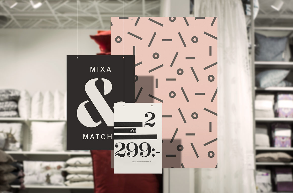
Åhléns Hem by 25AH, Sweden
