The Best of BP&O — August 2017
Opinion by Richard Baird Posted 31 August 2017

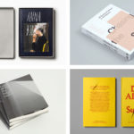
August’s highlights included Bielke & Yang’s continued work with coffee roaster and subscription service Talor&Jørgen and Akin’s packaging for Ki Sunscreen. BP&O also took a look back at Blok’s work on Rain, Gravity, Heat, Cold, a book that functioned as the strategic foundation for their brand identity design for architects Superkül. There were, however, five projects that stood out, and have made it into BP&O’s Best Of Series. These typically balance a strong singular concept, or an appropriate confluence of ideas, with a compelling stylistic character and clear communicative intention that appropriately plays with form, colour, type and layout, as well as material, texture, image and print finish.
Throughout the month BP&O also continued to expand on its collections series as another way to jump through to older posts on the site. New additions to this were Books and Illustration. Updated projects in August included Studio Dumbar’s work for Mauritshuis.

NAU by Design by Toko, Australia
NAU is a new Australian furniture brand created by the premium designer furniture and lighting retailer Cult, and features work by futurist designer Gavin Harris and Adam Goodrum, a designer that believes an object justifies its existence through story and detail. Design by Toko worked with Cult to develop name, and create a logo and brand identity for NAU that would extend across business cards, stationery, brochure, exhibition stand and website. This is inspired by and makes a connection with Australia’s unique and diverse landscapes through compelling photography by Brooke Holm, and using a broad but complimentary colour palette.
See more of this project here


The Broadview Hotel by Blok, Canada
Canadian graphic design studio Blok worked with The Broadview Hotel to develop a visual identity that would embrace and express the building’s contemporary new voice, possess a similar wit and attitude, and finally acknowledge and celebrate the hotel’s East End roots. This is achieved in the contrast and collision of image and type, emphasised by a simple colour palette, and in the variety of secondary typefaces. This run across and links a plethora of printed assets. These included business cards, menus and coasters as documents here, but also wayfinding and signage.
See more of this project here

Maven by Design By Toko, Australia
Maven is described by Design By Toko, the Sydney-based design studio behind its recent rebranding, as a top-tier architecture recruitment agency operating worldwide. Drawing on the built environment and with the intention of expressing the agency’s prominence within the architecture industry Toko developed a brand identity of simplicity and impact through bold solid form and single colour that links business cards, brochure and soon to launch website. This use of form and colour, its dominance across each touchpoint, establishes a strong continuity, yet is softened using lighter colour and over-print in its implementation across Maven Publishing’s Chasing the Sky, a book that showcases twenty of Australia’s leading women in architecture.
See more of this project here

Vestre Anniversary Book by Snøhetta, Norway
Vestre is a Norwegian, family-owned and run, furniture design and manufacturing business celebrating its 70th anniversary this year. Vestre’s extensive catalogue is characterised by an intersection between convivial colour detail, modern forms and long-lasting build. Snøhetta, who previously worked with Vestre on the development of a production facility in 2013, and the refurbishment of the company’s headquarters and showroom in 2017, continue to work with the business, this time on Folk+Form, an exhibition and book series that intends to bring to life the Vestre family legacy.
See more of this project here

Campus by MultiAdaptor, United Kingdom
Campus is Google’s network of co-working and event spaces for the many start-ups it has and continues to help fund. These are located in London, Madrid, Warsaw, São Paulo, Seoul, and Tel Aviv, with another to open in Berlin soon. The Campus community has over 80,000 members and collectively received over $537 million in funding which has created more than 11,000 jobs. Campus is described by MultiAdaptor, the design studio behind its recent rebranding, as being positioned slightly away from the main Google brand. The studio’s brand identity design for Campus reflects this. It also captures and expresses the startup spirit and energy of the entrepreneurs and founders, employees and investors, who make up the Campus community through a DIY aesthetic of words, images and colour. This approach intends to be democratic in nature and invite participation.
See more of this project here