The Best of BP&O — May 2018
Opinion by Richard Baird Posted 29 May 2018

Although May was a slow month for new work there were five projects that stood out and have made it into BP&O’s Best Of Series. Between them these typically balance a strong singular concept or an appropriate confluence of ideas with a compelling visual character and clear communicative intention that appropriately play with form, colour, type and layout, as well as material, texture, image and print finish.
BP&O, in this end of month review, tries to recognise both the smart use of small budgets—those that channel spending into the most appropriate assets—and those projects with a broad and holistic quality, establishing a continuity (conceptual and/or visual) across multiple touch points. Many of the projects share a concise aesthetic expression, yet there is nuance and strategic weight to these, so do click through and read more about each of these.
Throughout the month BP&O also continued to expand on its collections series as another way to jump through to older posts on the site. This included two additions to the Studio Showcase.
Wiener Moderne 2018 by Seite Zwei

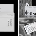
To mark the 100th anniversary of the passing of Gustav Klimt, Egon Schiele, Otto Wagner and Koloman Moser, four greats of Viennese Modernism, The Vienna Tourist Board is dedicating the year to bringing to light their collective talents and stories. Wiener Moderne 2018 will take the form of public exhibitions and events, promoted through national and international campaigns, and unified by a distinctive graphic identity system created by Austrian design studio Seite Zwei. This links a variety of print and digital communications, merchandise and website.
See more of this project here

Goldlink Magazine by Spy

Goldsmiths’ biannual alumni magazine Goldlink has been redesigned by Spy, the design studio behind the university’s graphic identity. The magazine is distributed to over 50,000 former students and staff nationally and internationally, and in the redesign, needed to strengthen the relationship with its readership and reflect Goldsmiths’ position as a creative force with a rich research and academic legacy. Spy’s approach develops and employs the bold graphic language of the university, built around Commercial Type’s Druk and a preference for eye-catching blocks of colour set alongside or filtered into emotive images.
See more of this project here
Näsby Slottspark by Bedow
Näsby Slottspark is a residential property development located in Täby, a municipality situated north of Stockholm. The development is built around a 17th-century castle and its gardens, and is made up of three distinct structural groupings, Södra Parken, Norra Parken and Strandängarna. Each of these is characterised by a Scandinavian simplicity, lightness and truth to materials inside and out and by their surroundings, a landscape of natural grasses, hedgerows and parkland. This mix of regional legacy, natural beauty and modern structure is expressed by the development’s visual identity, designed by Bedow, through logo design, type choice, illustration and photography online and in the material composition, finish and layout of brochures.
See more of this project here
Lukas/Markus – Kalle Sanner by Lundgren+Lindqvist

Lukas/Markus is a decade-long photographic project by Kalle Sanner shot with a large format camera and exploring the mirrored and connected chapels of Saint Lukas and Saint Markus designed by architect Sven Brolid. The structure was built during the 1960s, a period when Swedish functionalism was at its height, and is located in the Western Cemetery of Gothenburg.
The book, released May 2018 and co-published by ll’Editions and Blackbook Publications, exists in two versions. The first is an 82 page cloth-bound hardcover trade edition that measures 200 x 223 mm and the second is a special edition housed within a handmade clamshell box that includes an embroidered handkerchief and one of three c-prints signed and numbered by the photographer. Both of these books were designed by Scandinavian studio Lundgren+Lindqvist.
See more of this project here
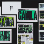
Shakespeare In The Park 2018 by Pentagram

Shakespeare In The Park is an annual and free series of performances presented by New York’s The Public Theatre that will take place at the Delacorte Theater in Central Park during May and throughout June. This year will see performances of Othello and Twelfth Night. These are being promoted by a campaign developed by Pentagram’s Paula Scher, with assets such as signage being designed and deployed by Public’s in-house team. This build’s on the enduring identity Paula Scher designed for the theatre in 1994, revised in 2005 and 2008, maintaining its impact and dynamic qualities whilst working in a new and distinctive colour palette of bright gradients, contrasting solid blocks of black and a strong sense of the systematised and the architectural. Alongside the tagline “Be In The Park” this links signage, static and dynamic posters and billboards, t-shirts, tote bags and newspaper advertising.
See more of this project here