BP&O Collections — Type Play
Opinion by Richard Baird Posted 16 July 2018
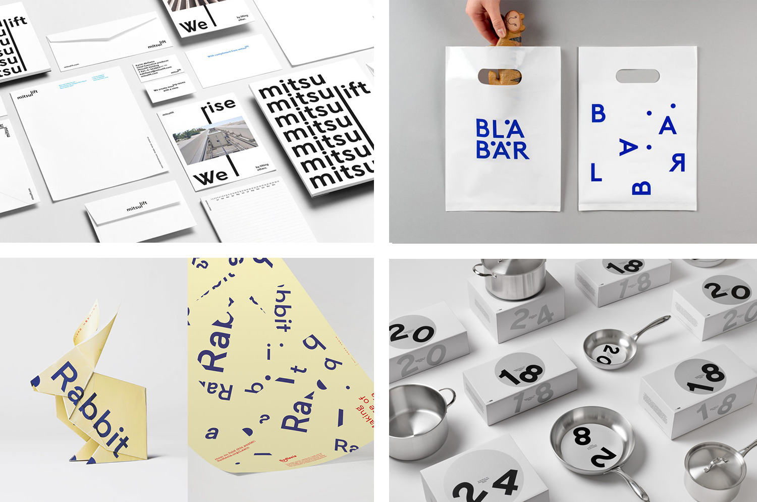
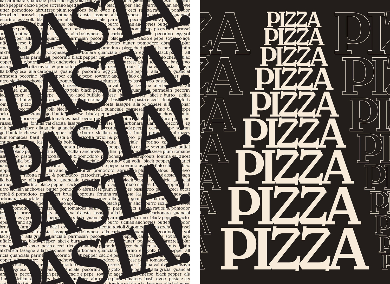
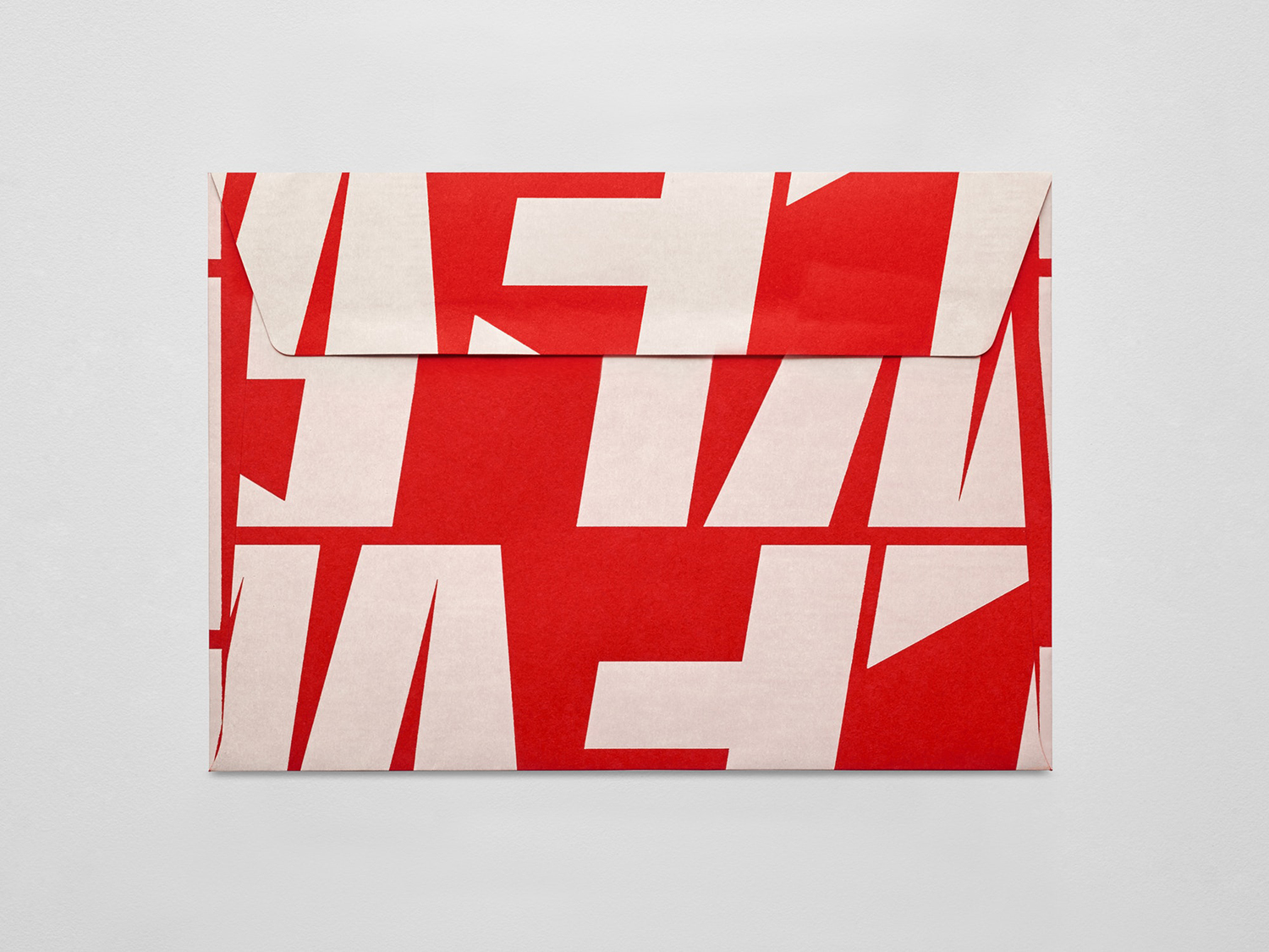
A continually updated collection of graphic identity design work with a playful typographical and/or lettering component, reviewed and published on BP&O. This post features work by Pentagram, Base Design and Glasfurd & Walker and includes seasonal poster campaigns, packaging, simple and broad brand identity systems.
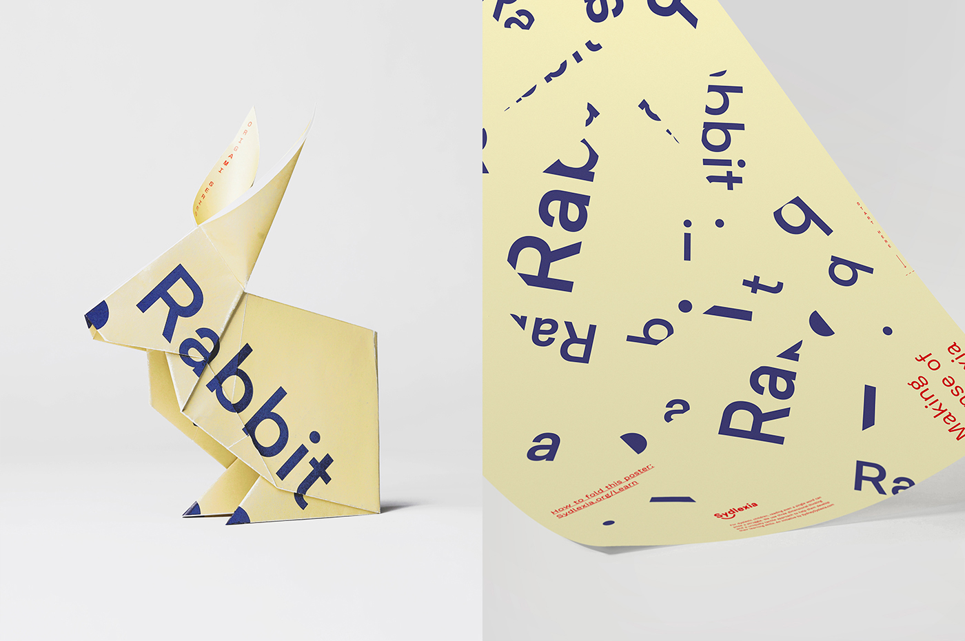
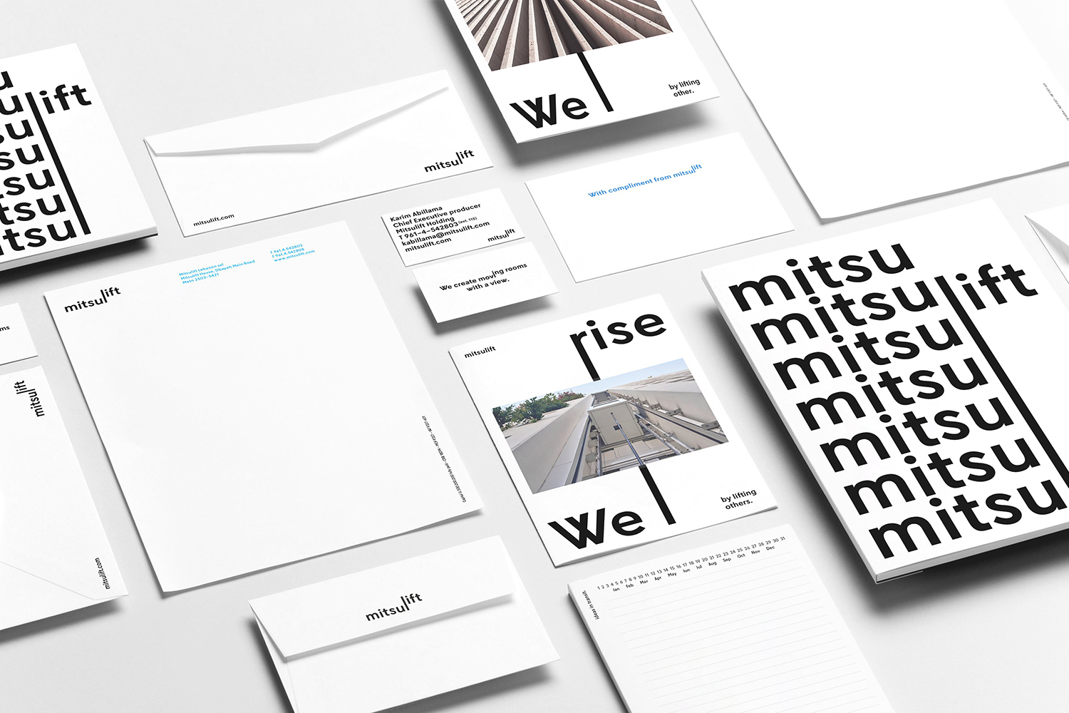
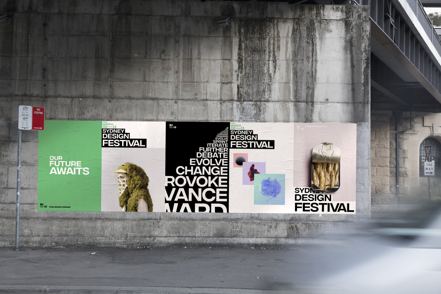
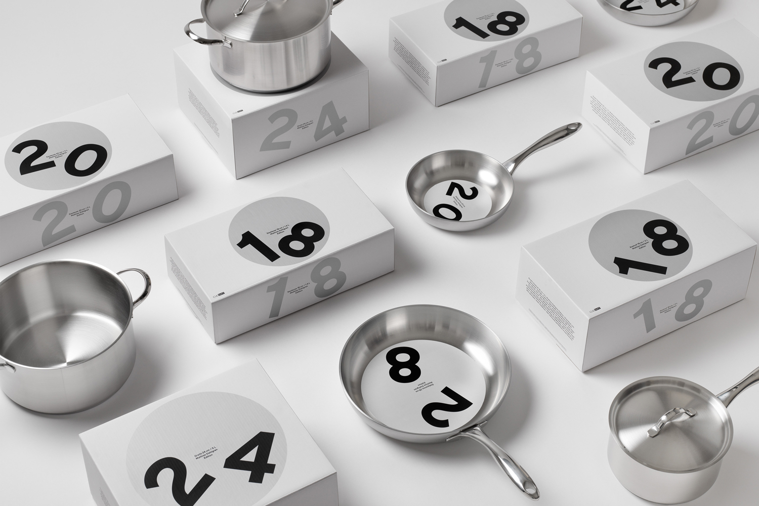
Projects typically share a strong visual impact and a graphic immediacy in the repetition and proportion of type across different surfaces. Some employ convivial visual languages such as Base Design’s work for Mitsulift and RE’s identity for Sydney Design Festival, while others use a playful intersection of type, material and material structure, check out BBDO’s work for Sydlexia and Essem’s packaging for Mathias Dahlgren Edition.
This post was published as a quick way to browse through BP&O’s content and get access to older but equally interesting projects through different themes, and expands on previous posts under the category The Best of BP&O. This series can be subscribed to here.
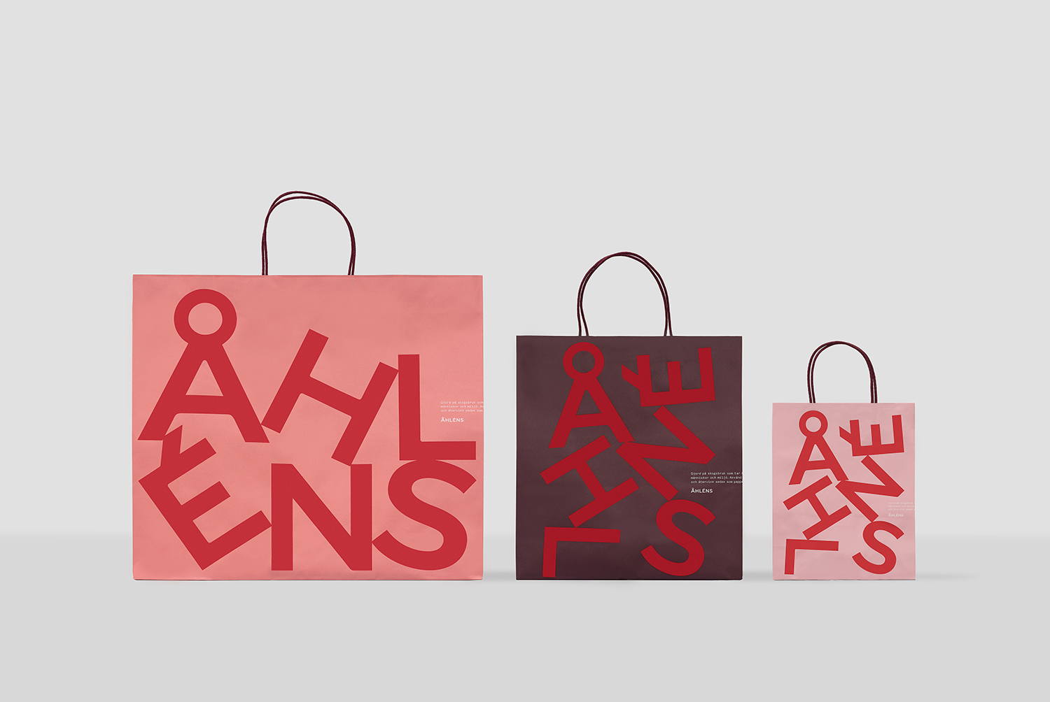
Åhléns by Happy FB
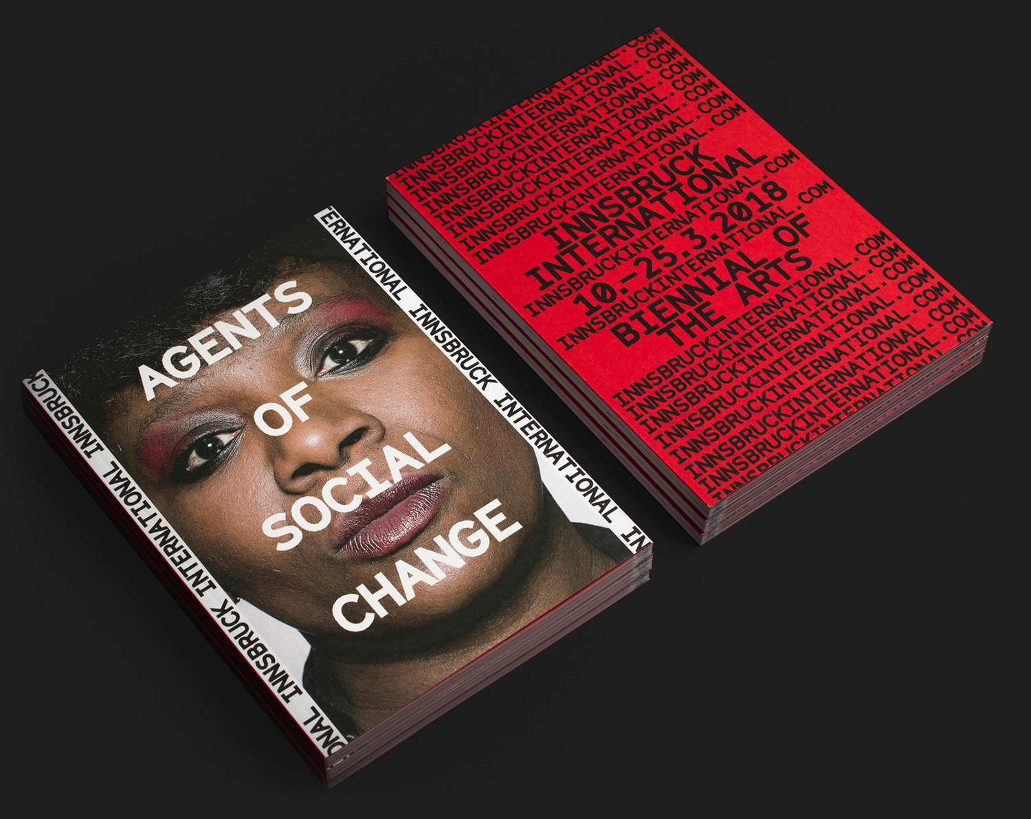
Innsbruck International, Biennial of the Arts Studio Mut
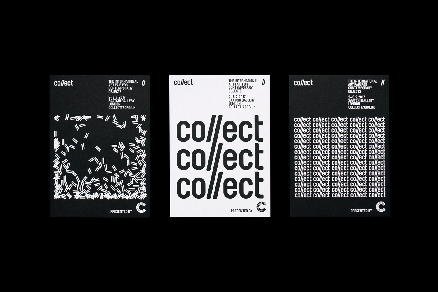
Collect by Spin
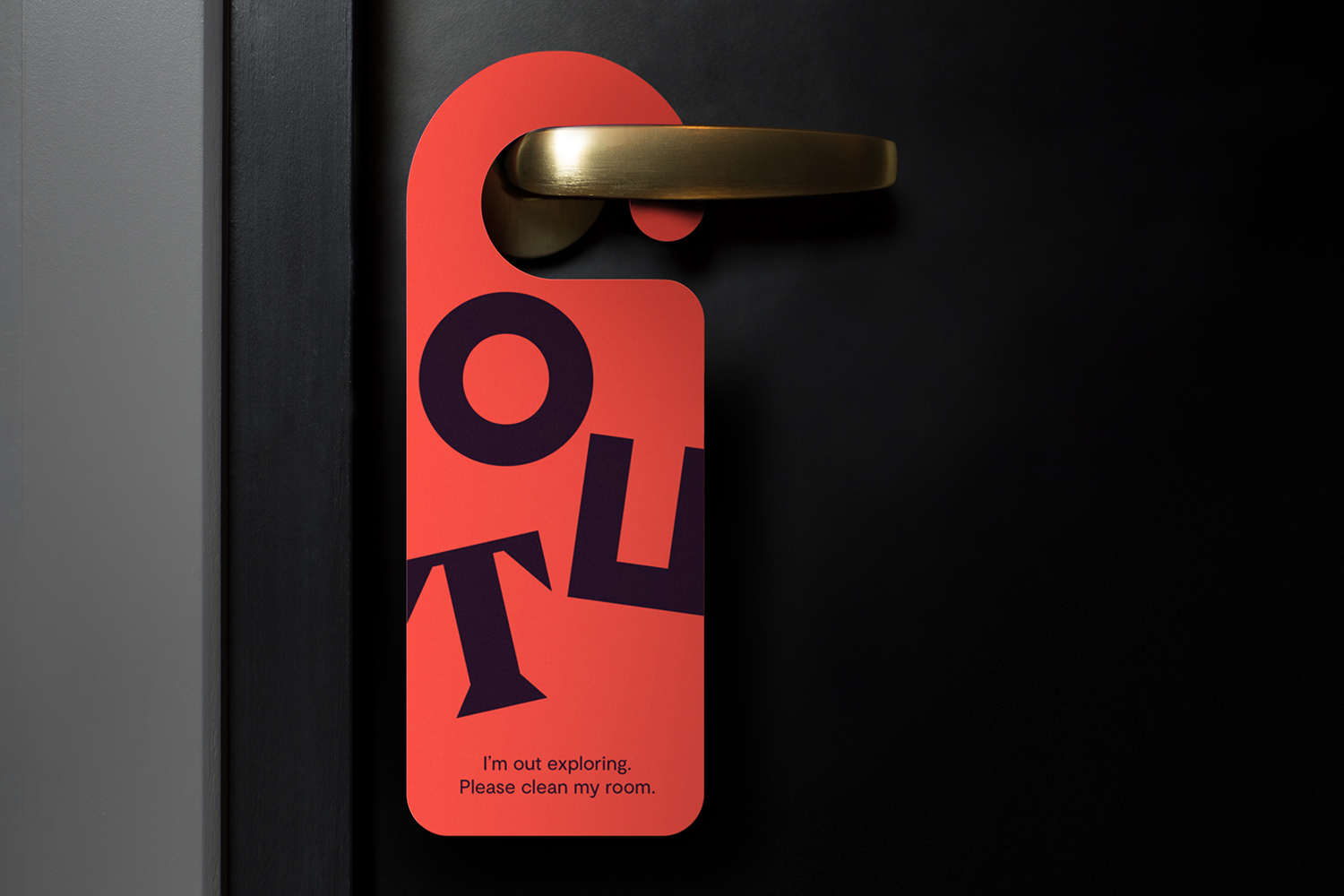
Assembly by Ragged Edge
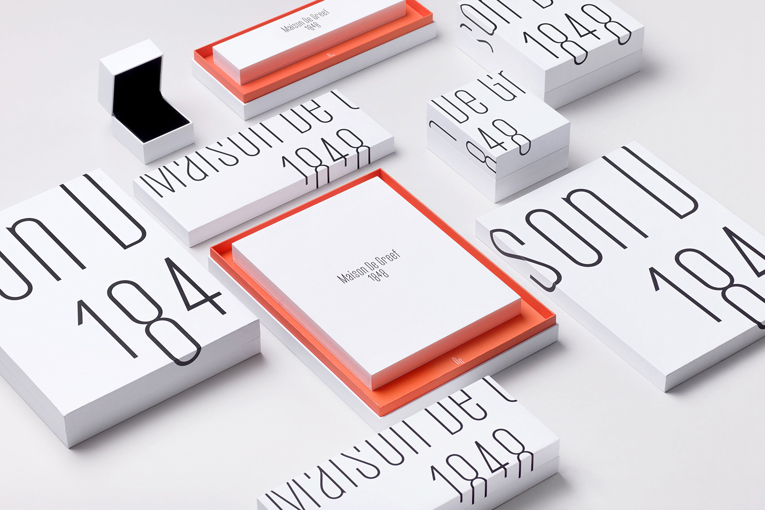
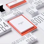
Maison De Greef by Base Design
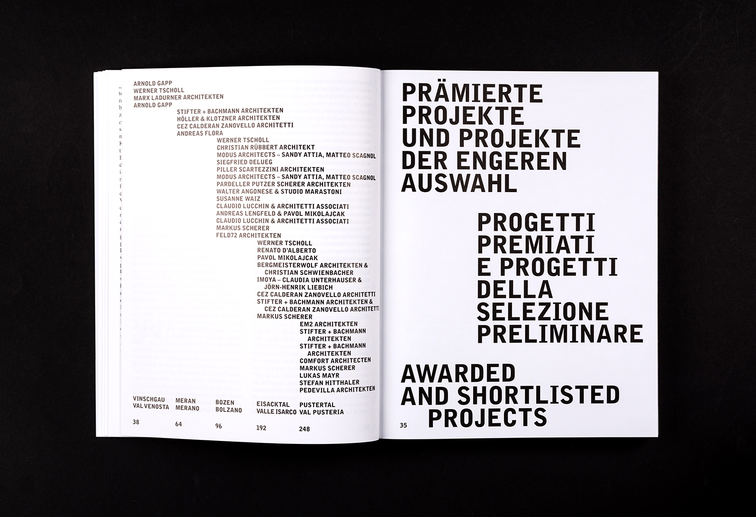
New Architecture in South Tyrol 2012—2018 by Studio Mut
Sydlexia by BBDO Dubai
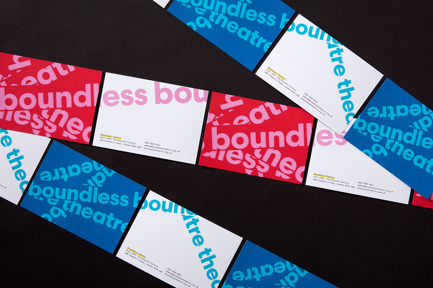
Boundless Theatre by Spy
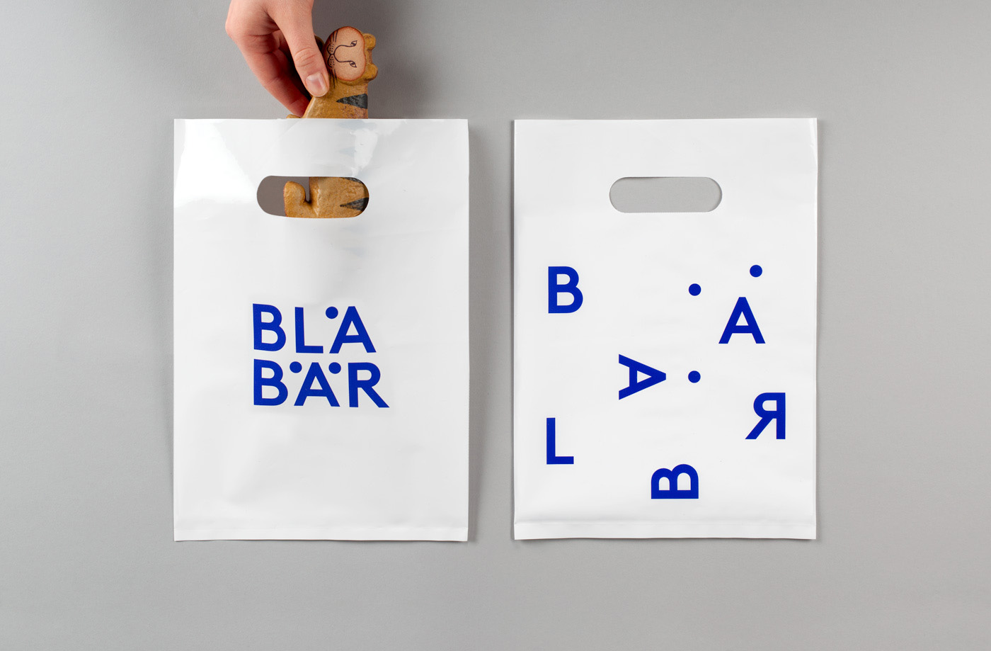
Blå Bär by BVD
Mitsulift by Base Design
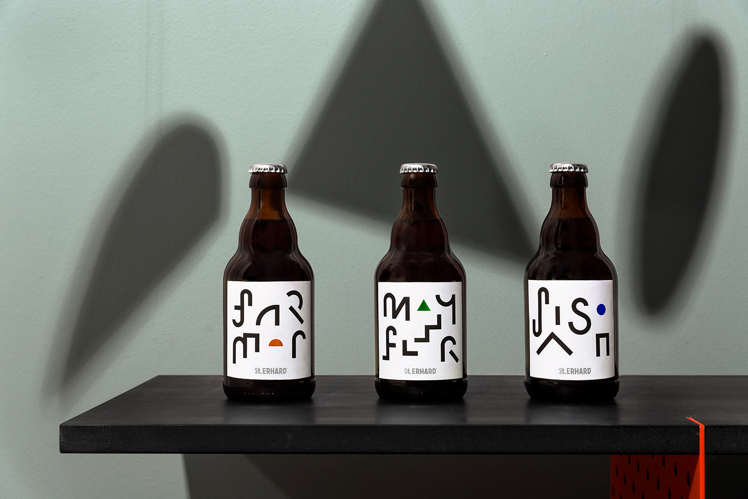
St Erhard by Bedow
Sydney Design Festival by Re
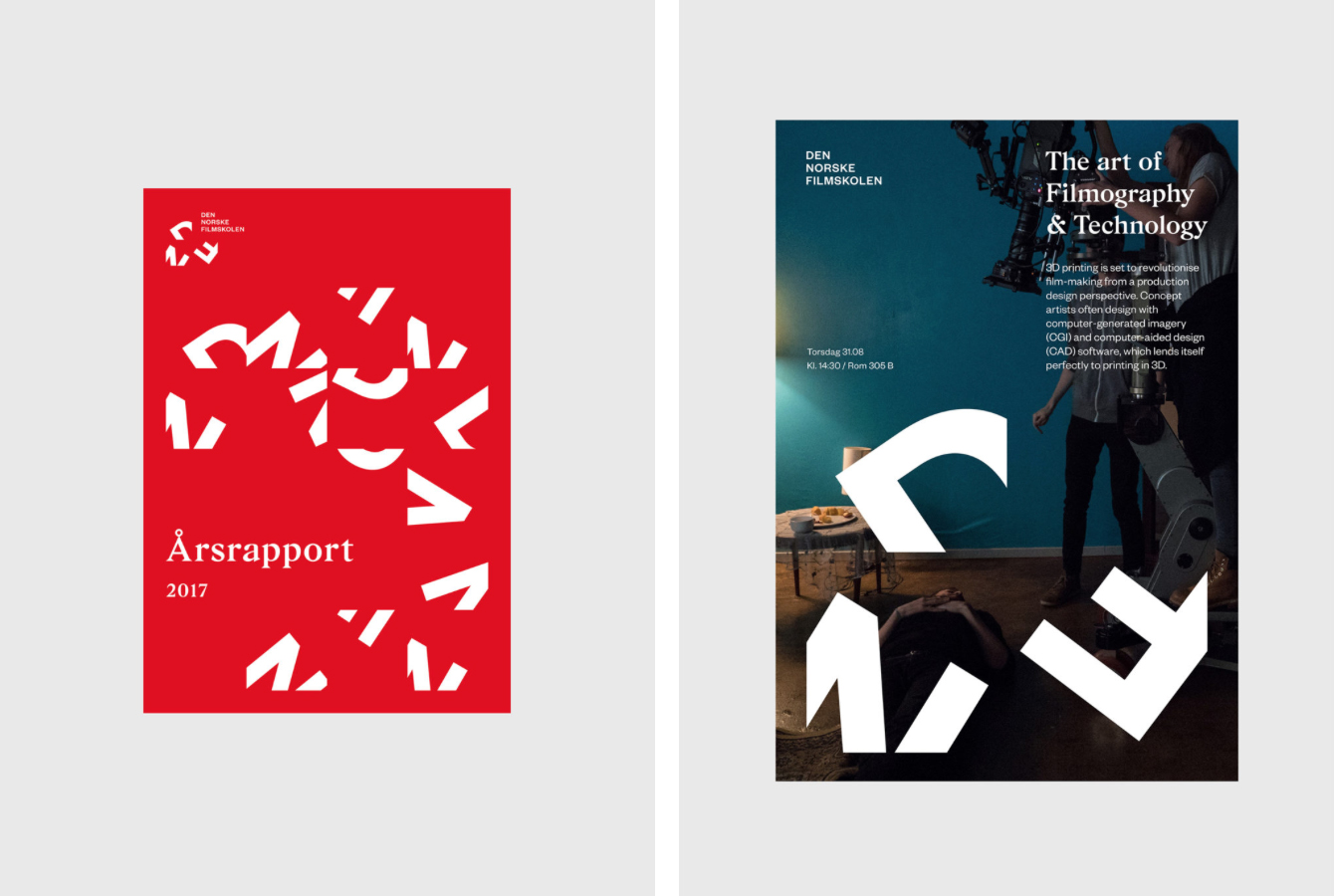
Den Norsk Filmskolen by Neue
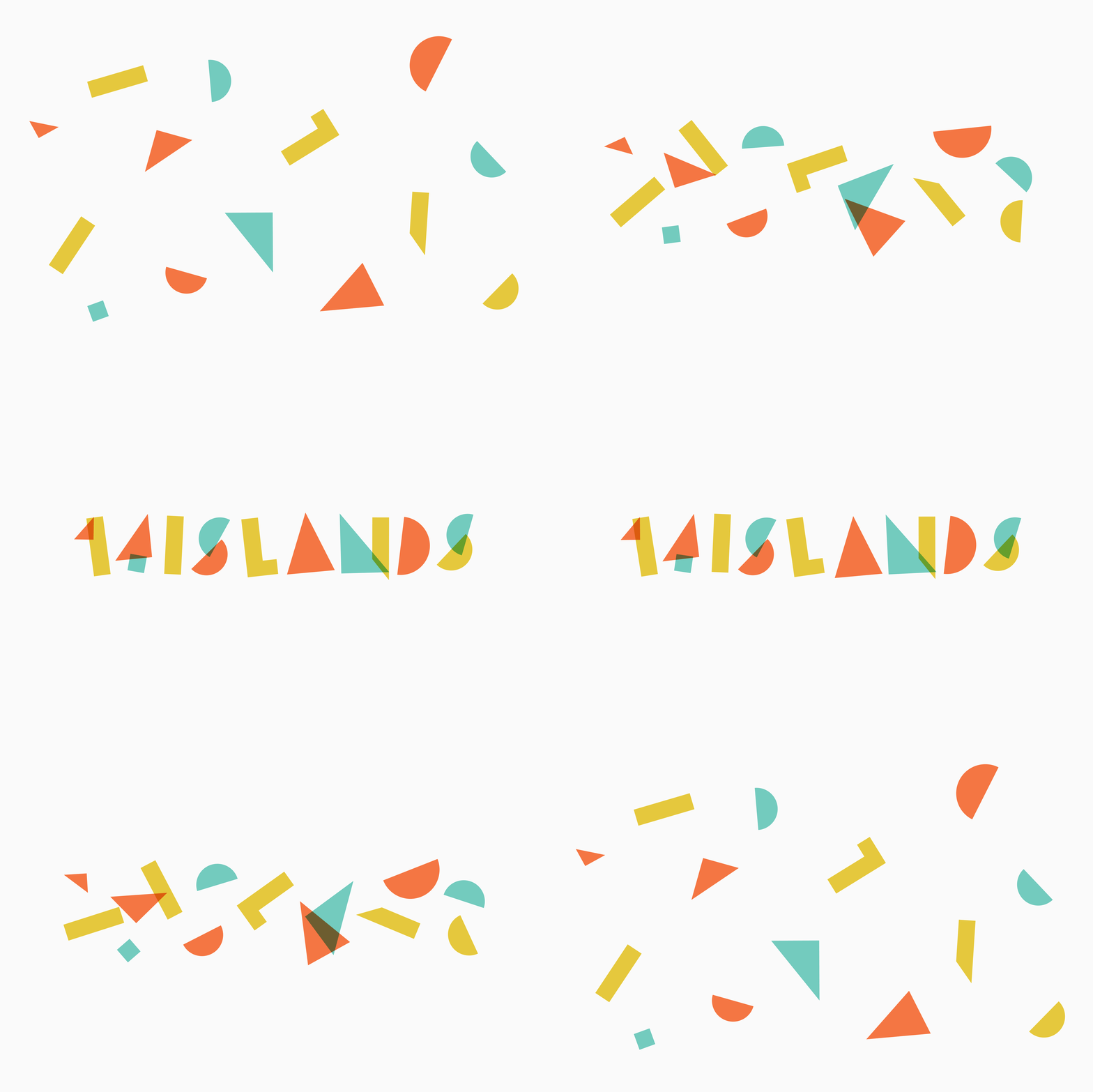
14 Islands by Bedow
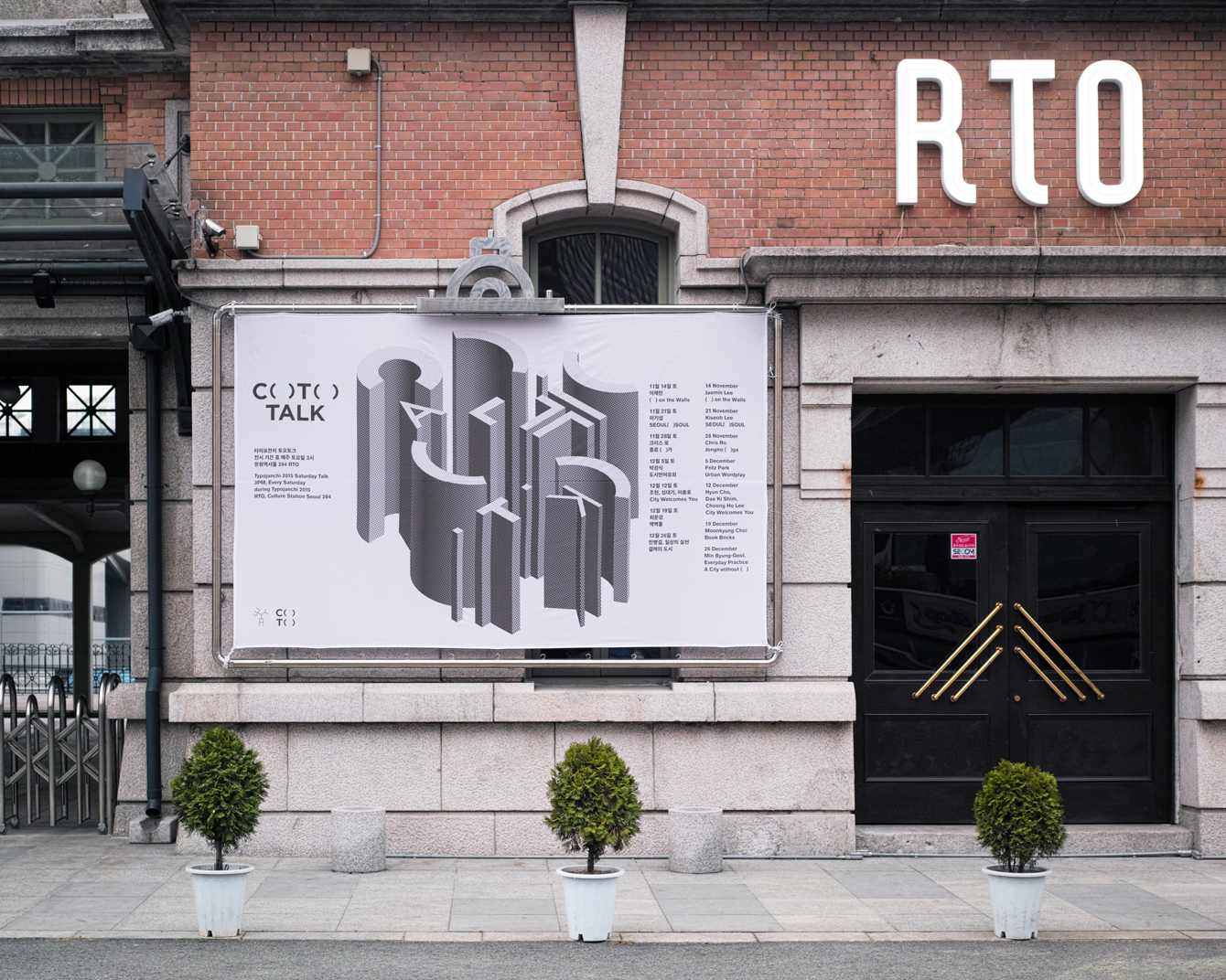
C( )T( ) – Typojanchi 2015 by Studio fnt
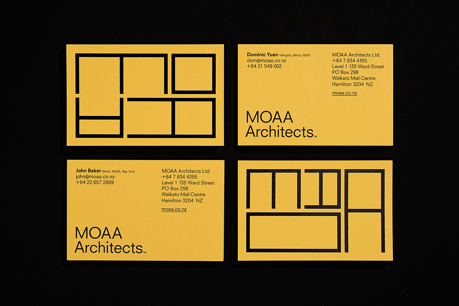
MOAA by Inhouse
Di Beppe by Glasfurd & Walker
London Fashion Week by Pentagram
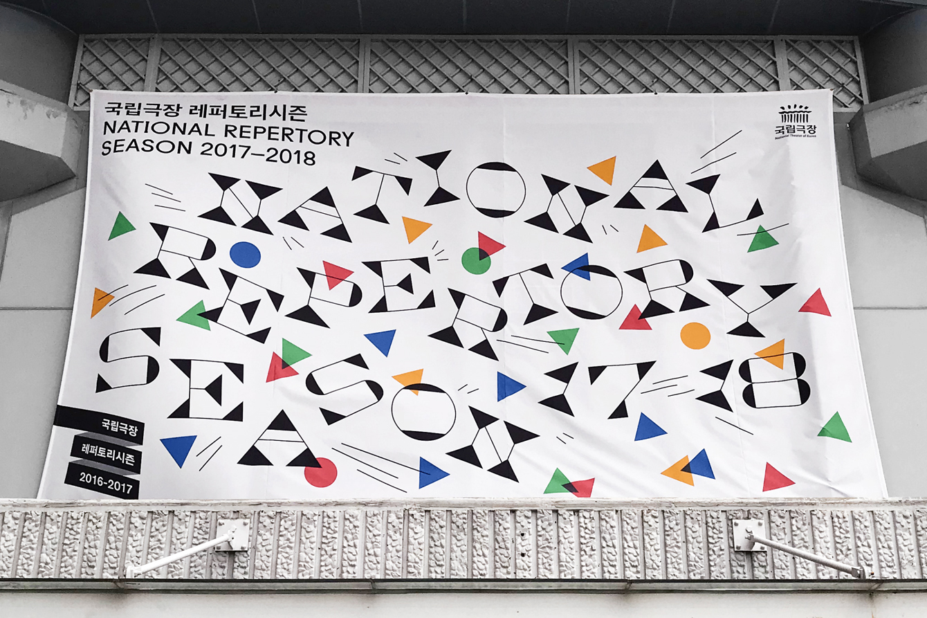
National Theatre of Korea by Studio fnt
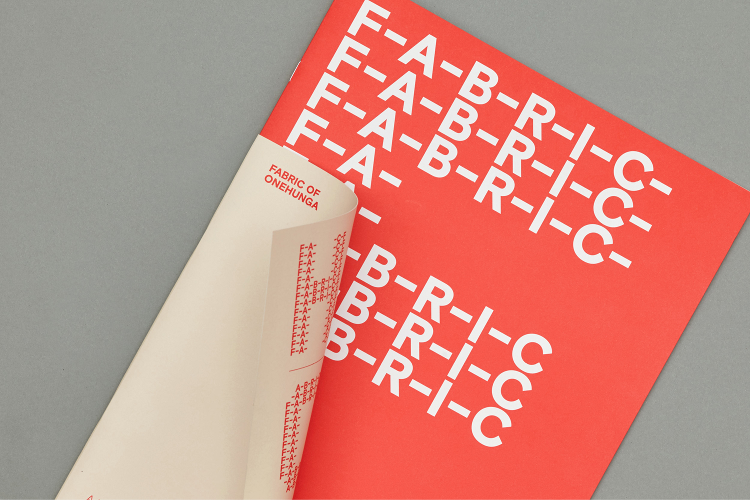
Fabric of Onehunga by Richards Partners
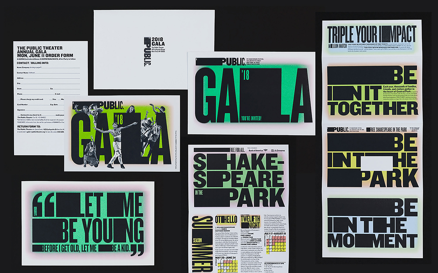
Shakespeare In The Park 2018 by Pentagram
Mathias Dahlgren Edition by Essen International
