BP&O Collections — Banners
Opinion by Richard Baird Posted 15 October 2018
A continually updated collection of banners, designed as part of a larger brand identity progrmme, published on BP&O. These typically deliver an immediate graphic expression through type and form language, colour and image. This selection features the simple and singular, and those that pair a strong stylistic impact with informational detail, and includes work by studios Hey, Studio fnt and Mucho.
In the spirit of trying to challenge the chronological value-hierarchies of the traditional blog format, this post was published as a quick way to jump through BP&O’s content and gain access to older but equally interesting projects through different themes. Further, this is less about the aesthetic of a singular asset, although that is a consideration, but how each of these may fulfil a role within a broader system, click each image to read more. This expands upon previous posts under the category BP&O Collections.
Self, Made by Collins

See more of this project here.

MoMA by Order

See more of this project here.
East Cut by Collins
See more of this project here.
Cult 20 Years by Toko

See more of this project here.
UNSW Built Environment by Toko

See more of this project here.
MACBA Dissabtes by Hey
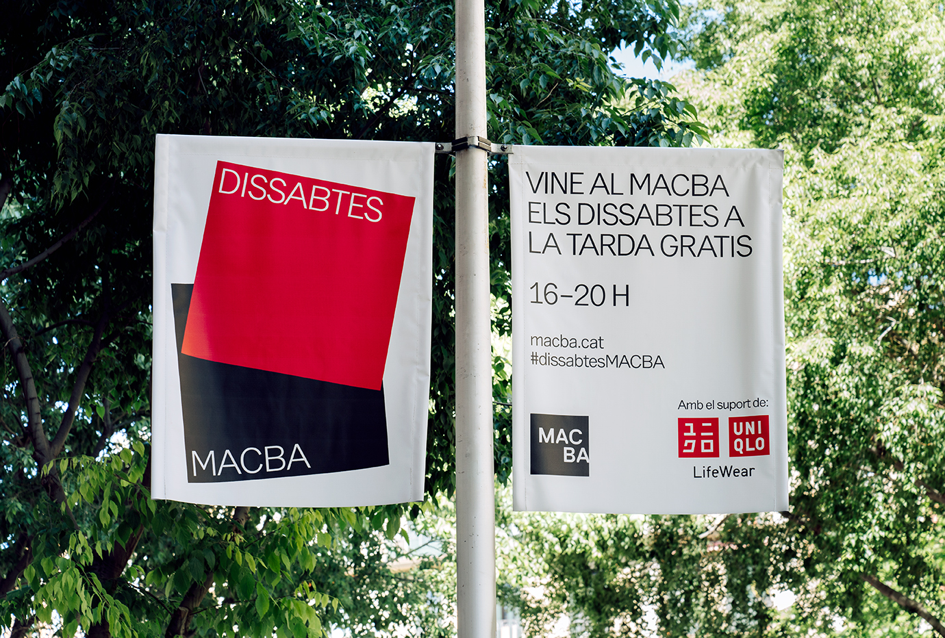
See more of this project here.
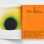
National Theatre of Korea Repertory by Studio fnt

See more of this project here.
Den Norske Filmskolen by Neue

See more of this project here.
Sydney Design Festival by Re

See more of this project here.
Wiener Moderne 2018 by Seite Zwei

See more of this project here.
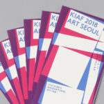
Korea International Art Fair 2018 by Studio fnt

See more of this project here.
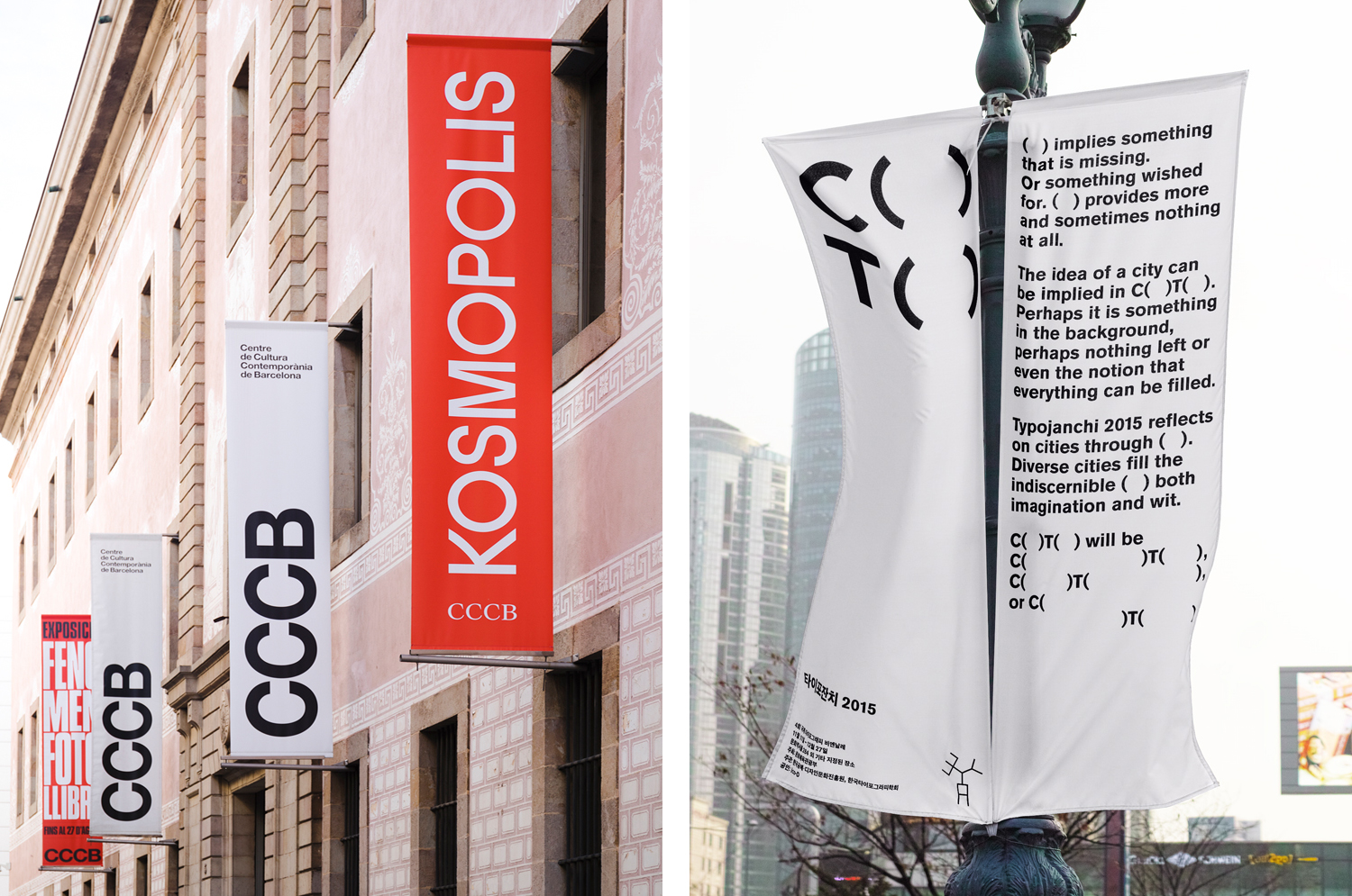
Kosmopolis by Hey

See more of this project here.
Karla Black + Kishio Suga: A New Order by O Street

See more of this project here.
BIFAN 2016 by Studio fnt

See more of this project here.
Art Museum by Underline Studio

See more of this project here.
C( )T( ) – Typojanchi 2015 by Studio fnt
T( ) – Typojanchi 2015 by Studio fnt")
See more of this project here.