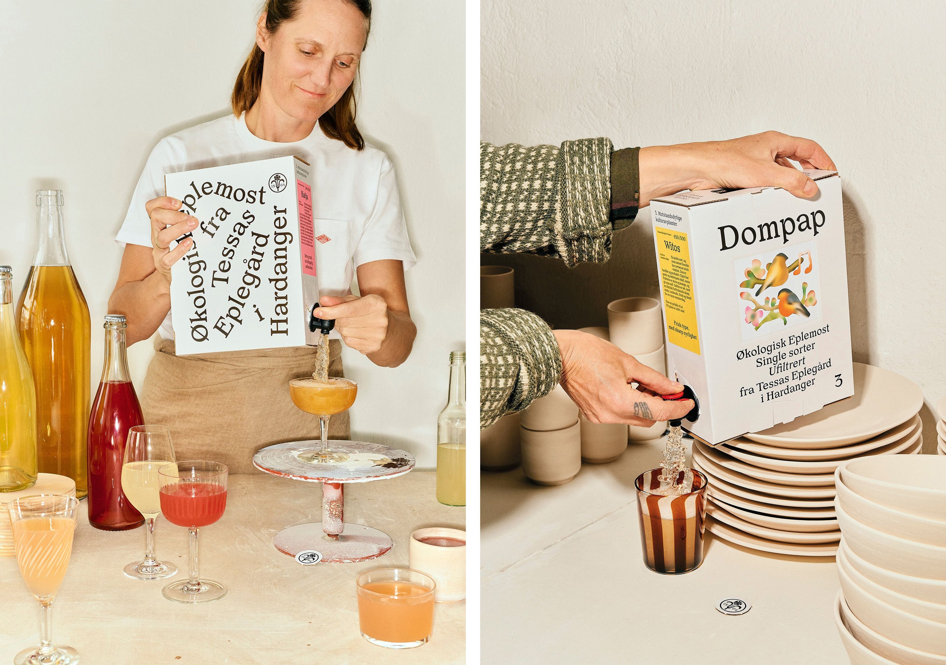
Tessas Eplegård by Olssøn Barbieri
Opinion by Emily Gosling Posted 11 July 2024
One of the many brilliant things about the world of branding is that to work in it, write about it, or just take an interest in it forces you to learn something about pretty much everything. Maybe that’s how LEGO might actually be a better investment than gold; or that Murray’s Parmigiano Reggiano cheese pairs well with a nice New World Cabernet.
And in exploring this new work from Oslo-based design studio Olssøn Barbieri, you learn all about things like the 1930s ‘pest war’, and that ‘Eplegård’ translates from Norwegian to English as ‘apple farm’.
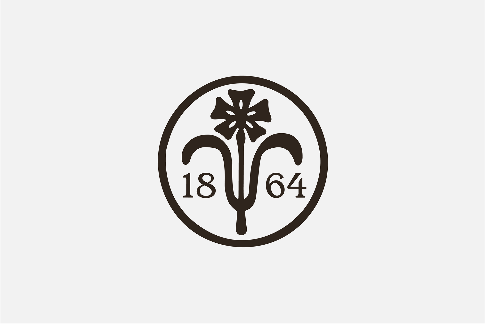
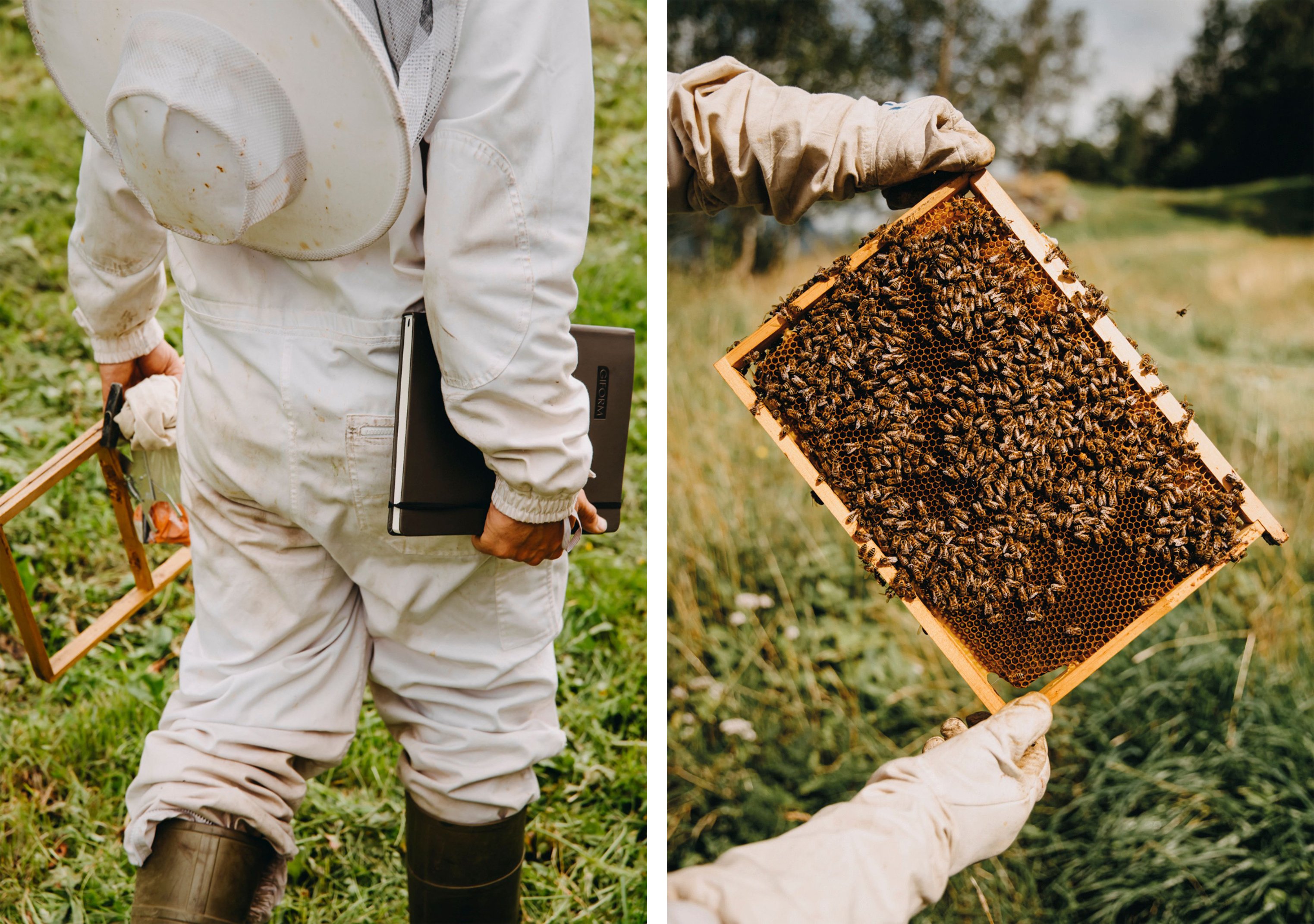
To explain: Olssøn Barbieri recently created the branding for Tessas Eplegård, a range of apple juice, cider, and honey created at the titular apple farm belonging to ‘self-proclaimed happy amateurs, Tessa and Ander’. The studio was responsible for working across the entire design strategy and branding, including naming, packaging design, storytelling, art direction and illustration.
Tessa and Ander operate one of the few organic orchards in Hardanger, an area on the Norwegian west coast ‘historically known for its beautiful nature and delicious fruit’, according to Olssøn Barbieri. The studio continues, ‘While fruit growing has long traditions here, it is not as romantic as it sounds. Insects and animals damaging the crops, alongside the discovery of diseases and fungi in the 1930s, initiated “the pest war” that escalated with the first experiments with pesticides and herbicides’. That meant that soon, all fruit farms in the area started to use chemical agents to keep the pests at bay.
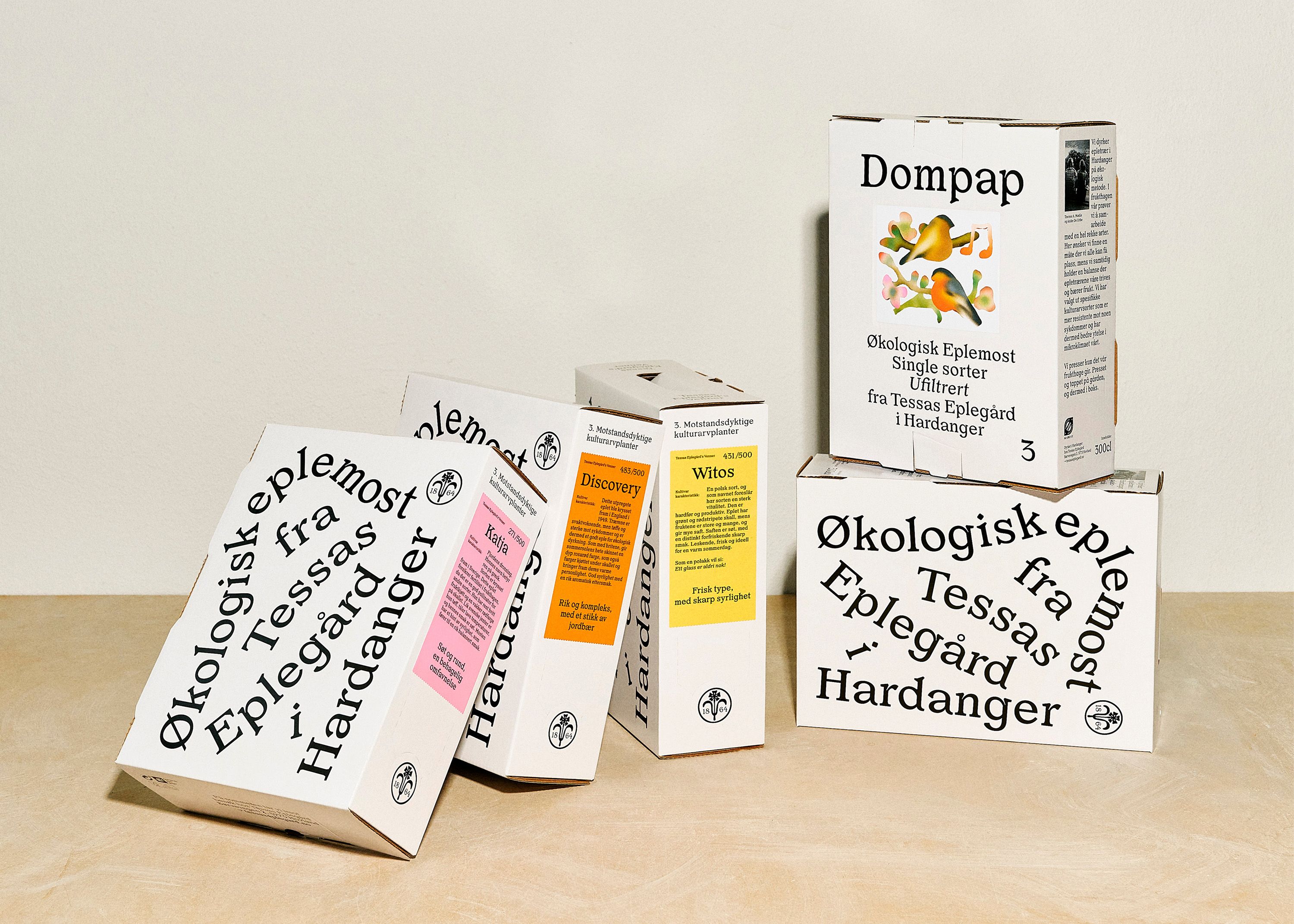
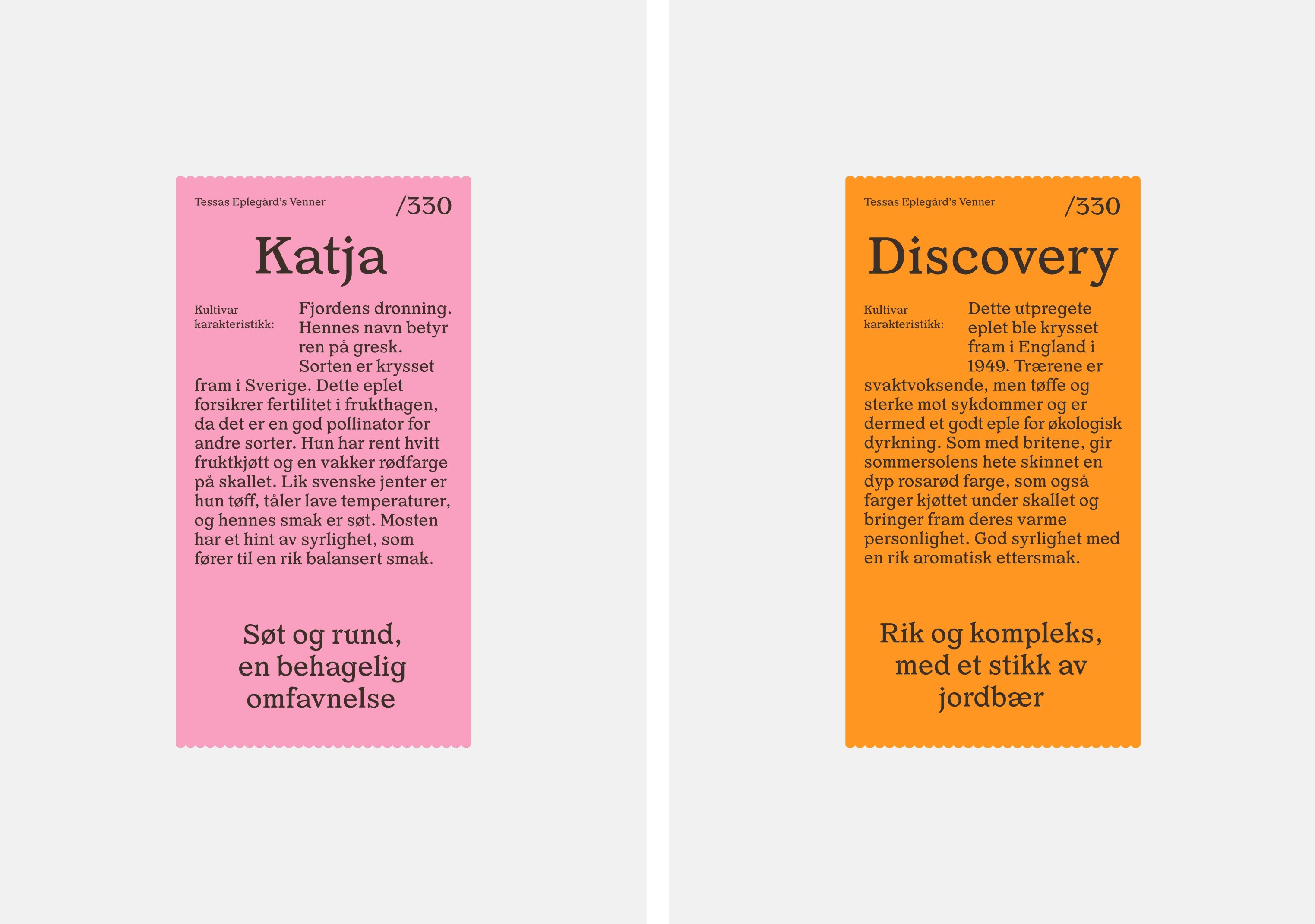
The branding for Tessas Eplegård places the founders’ stance on such things at the fore: the farm is proudly organic, shunning chemicals in favour of a more labour-intensive, but ultimately environmentally-friendly solution.
As such, a crucial aspect of the design strategy was conveying to people the idea of a local farm using honest, non-traditional approaches to farming. The studio has done a great job of creating a look and feel that nods to that homely, local, natural side of things while keeping things firmly contemporary to chime with the founders’ ‘new radical approach to fruit growing’, as Olssøn Barbieri puts it.
At the heart of the design work is the idea of a new ecological approach to agriculture that invites ‘us to think about how everything is connected’, says the studio. ‘Tessas Eplegård’s work is one based on collaboration and friendship with the natural habitat, exploring alternative ways to the current practice’.
Tessa and Anders both have a background in biology, hence the focus in the products on the ‘intrinsic value’ of insects to their orchards: ‘There is a big interplay of species, especially during the summer, and we try not to disturb that balance… We operate organically not only to avoid injecting residues into our apple juice, but also for the insects and birds out there that deserve to live in a good environment.’
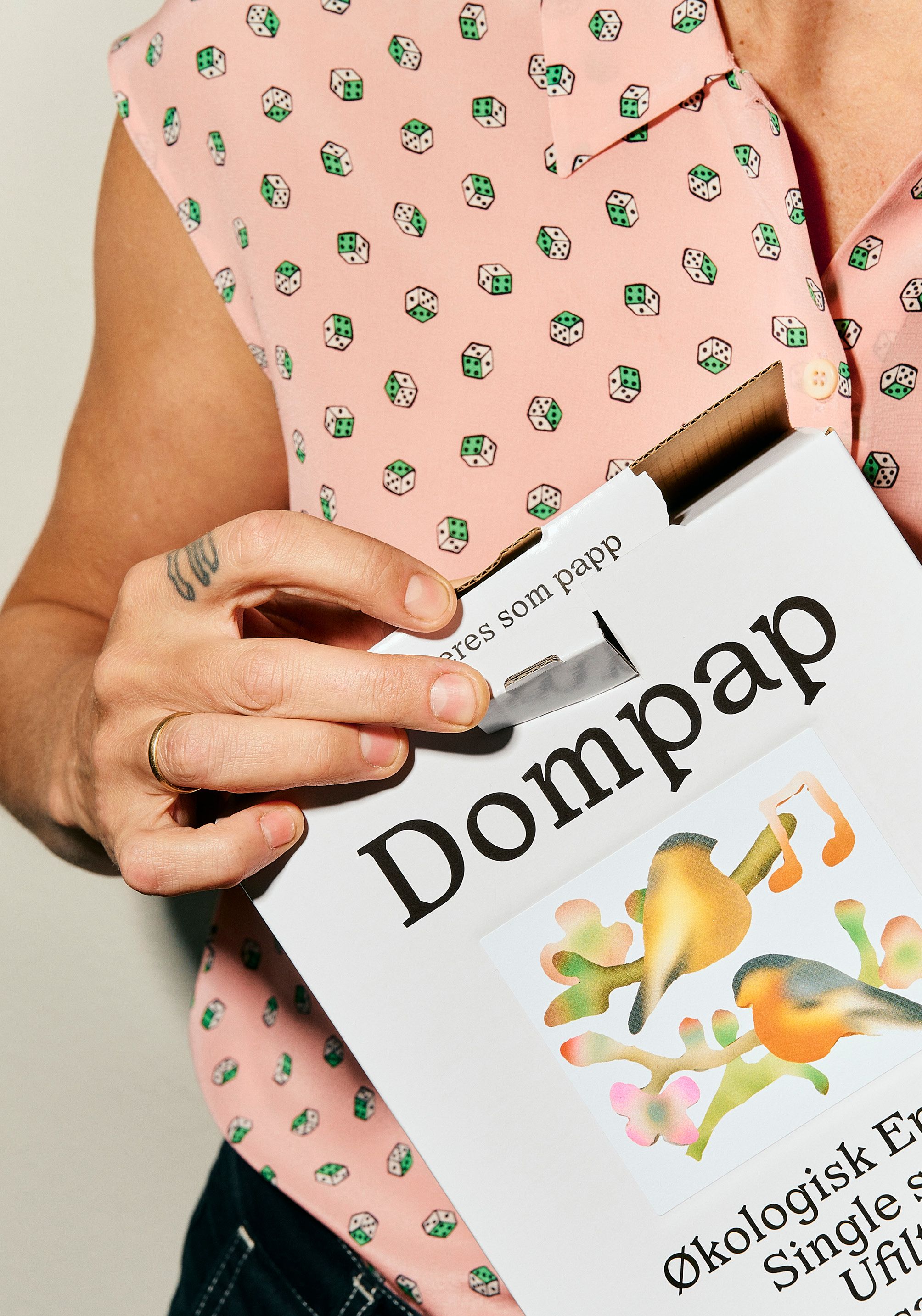
That idea of friendship with the natural habitat comes through beautifully in the pared back, but confident designs; and especially in the use of illustration, which errs just on the right side of twee thanks to the use of effects like blurring and some unusual, yet still resolutely organic-feeling colour palettes.
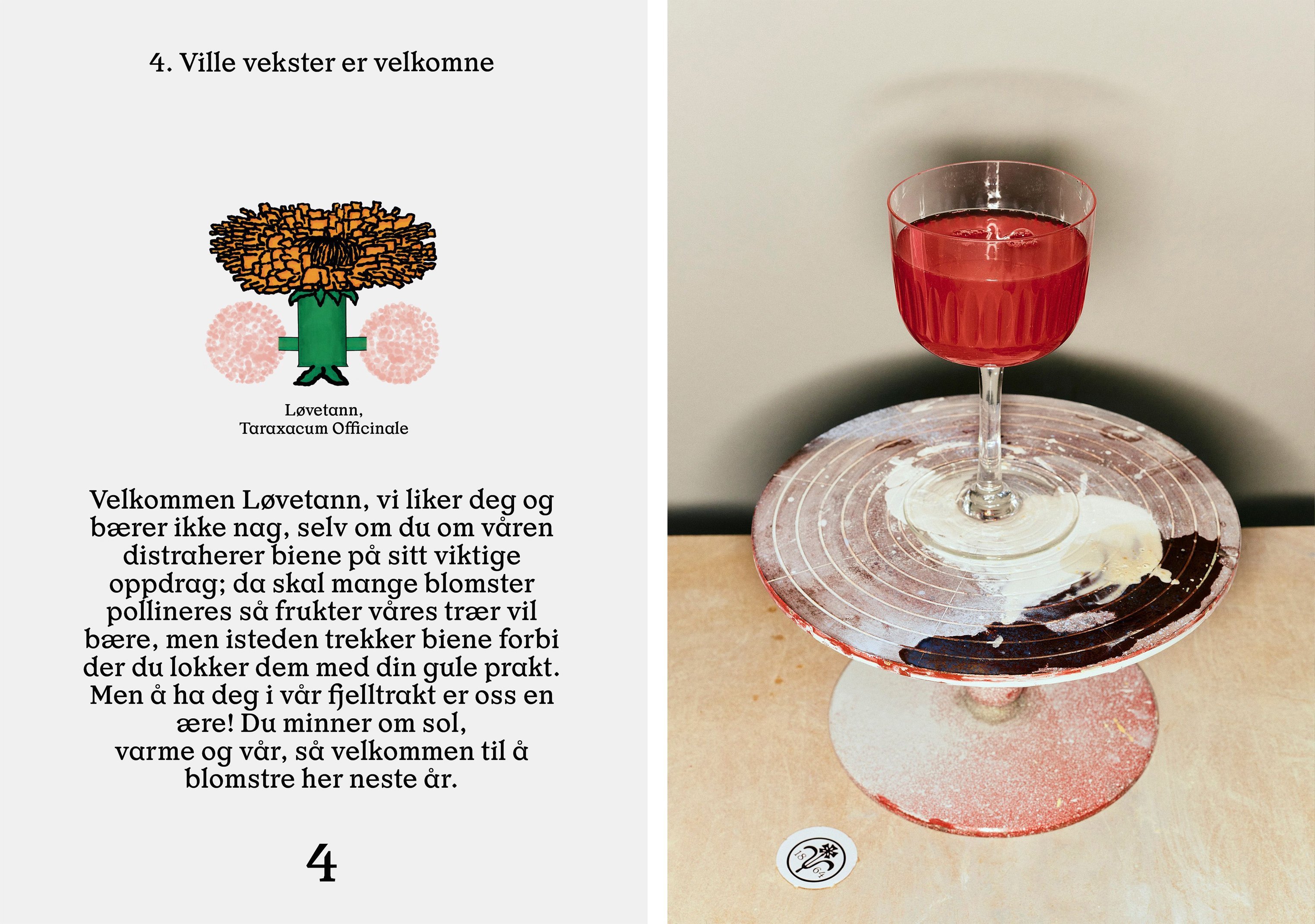
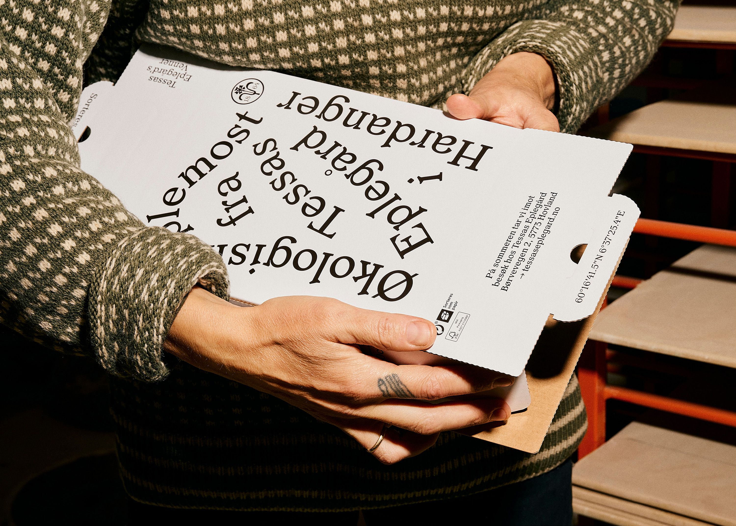
The traditional stuff largely comes through in things like the name: ‘Tessas Eplegård’ (Tessa’s apple farm) couldn’t sound more rustically hand-wrought if it showed up with ruddy cheeks and a pail of fresh milk, covered in bits of straw and missing a few teeth.
There’s a rather charming splash of tongue in cheek here, too, especially in the concept that underpins the branding: ‘Hello friends, we come in peace’, which ‘makes an effort to understand ourselves as part of the ecosystem and to bring us closer to those “others” that have been excluded from discourse, creating a new proximity that generates different types of relationships and care’, as Olssøn Barbieri puts it.
That wry sense of humour also comes across in the names for the individual products that the studio chose: rather than going the usual route of making them sound appealing and inviting, Olssøn Barbieri used names inspired by the birds, insects, and diseases considered ‘enemies of apple trees… each product is playfully thanking each critter for its contribution to the life on the farm’. The apple juice, for instance, is called ‘Dompap’, one of the migratory birds who like to eat apples.
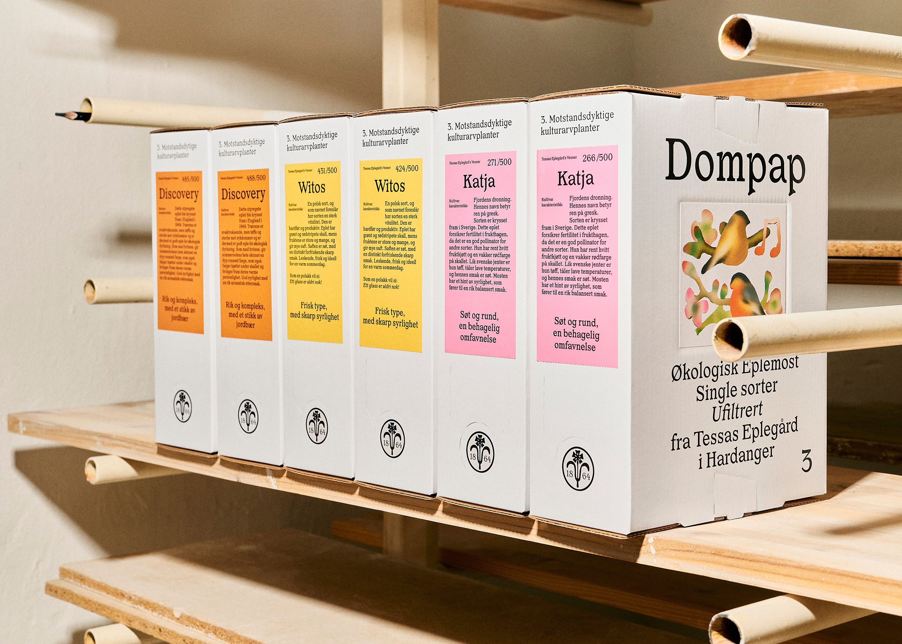
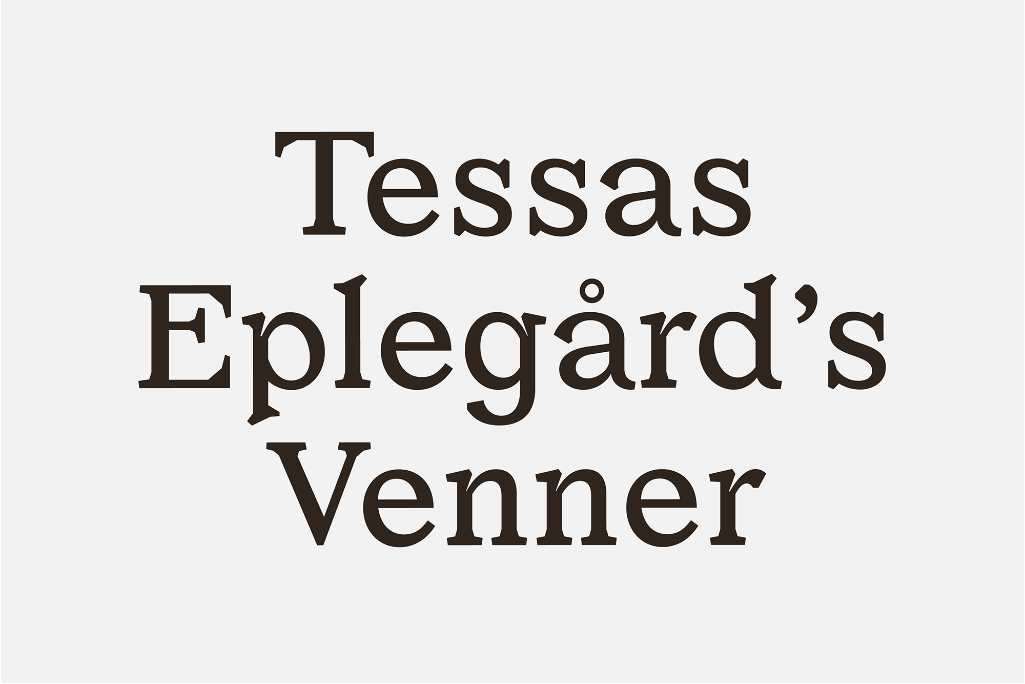
The use of the thoroughly legible, fairly straightforward typeface Or Lemmen throughout – usually in black on white – demonstrates that the brand itself doesn’t romanticise a long-gone (if ever-existent) myth of pastoral beauty and harmony. Deftly shunning cliched cues of green and gold palettes and faux-vintage crayon-like illustrations, instead the identity situates the products thoroughly in the here and now, showing that local need not mean antiquated, and organic need not be a shorthand for ‘hummus-toting yummy mummy’ or good old fashioned barefoot hippy.
