Dirty Vegan by Jens Nilsson
Opinion by Emily Gosling Posted 20 August 2024
Having been a vegan for almost 20 years now, various tropes have come and gone. In the early days, for the health conscious it was pretty much all about brown paper packaged Holland and Barrett goods, and references to the Young Ones cooking lentils. For the not so health conscious (hello!) it was ketchup sandwiches.
Gradually the Quorn contingent came in, with lovely (jk) dry chicken chunks et al; and there was a smattering of incredibly dicey dairy-free cheese that felt more analogous to the Get Your Own Back gunge tank than gorgonzola.
And then, over the last decade or so, in came the influencers; the ‘wellness gurus’; the ‘clean eaters’ – a movement that was arguably pretty damaging, especially in terms of deeming all food that wasn’t within their limited frame ‘unclean’. Often, it seemed, ‘influencing’ was a thin smokescreen for the promotion or platforming of eating disorders like orthorexia.
It was a shame, I think, for veganism to be lumped in with all that stuff. But it seems we’re on the other side now: maybe, just maybe, we’ve reached an era where being vegan isn’t associated with smug hippies; animal rights lesbians (a very positive thing indeed IMO, but a limited stereotype); wellness content in floaty white dresses; or borderline dangerous dietary trends.
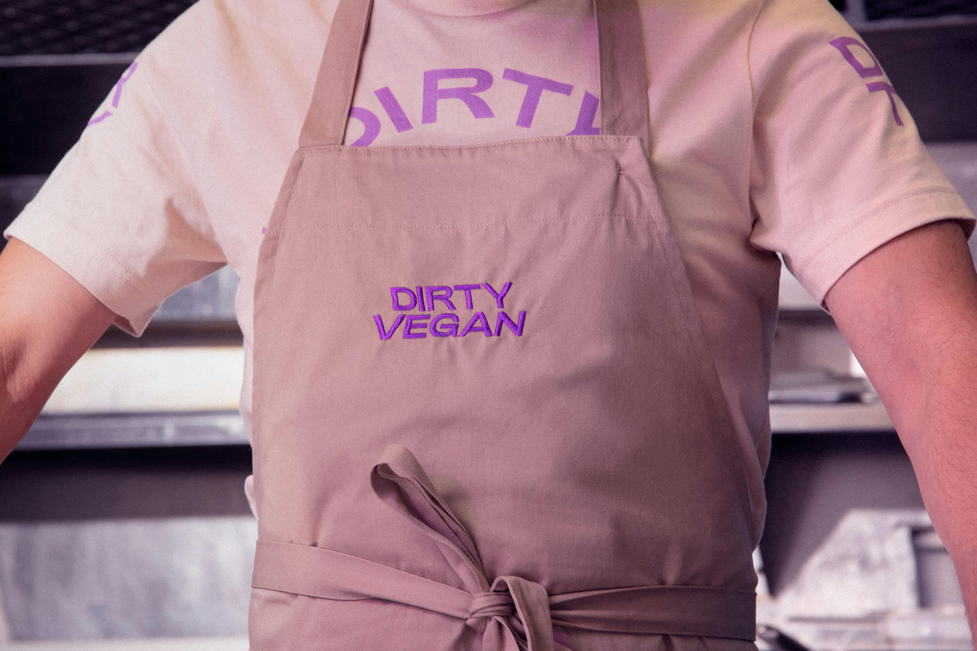
Vegan stuff has been veering into ‘dirty’ (good dirty) territory for a while now, with the emergence of the likes of Hail Seitan east London popups years back; but until now, we’ve not seen an offer with such superb branding. Welcome, then, Jens Nilsson’s design for Swedish restaurant and bar concept Dirty Vegan.
Stockholm-based Nilsson worked across the creative direction, design, photography and motion for the project, working on the latter alongside fellow Stockholmers Brikk Studio, a film studio and directors’ collective.
The whole identity is brilliantly, unashamedly trashy; flirting with the seediness of Soho late night bookstores and borrowing heavily from ‘questionable nightclub vibes’.
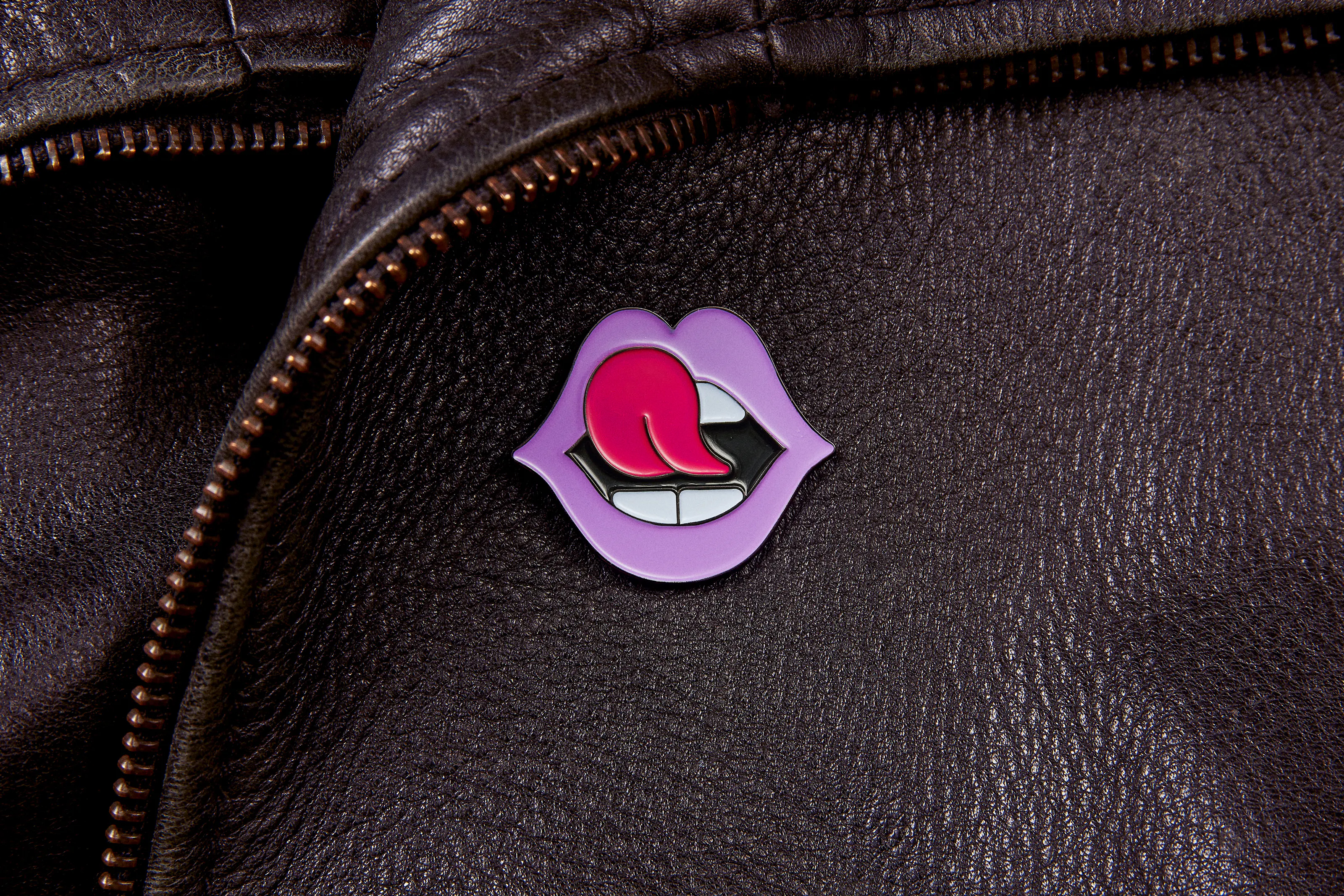
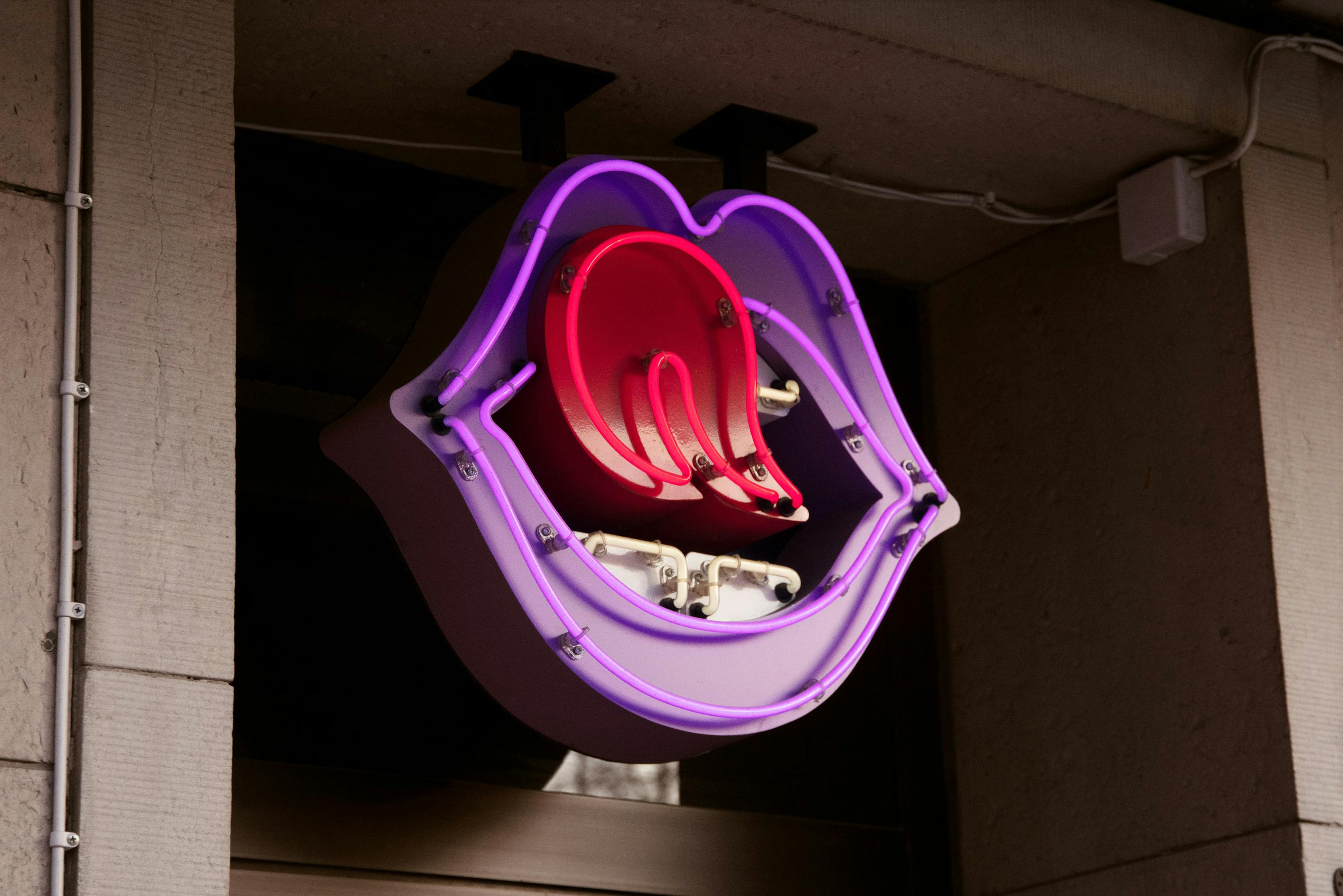
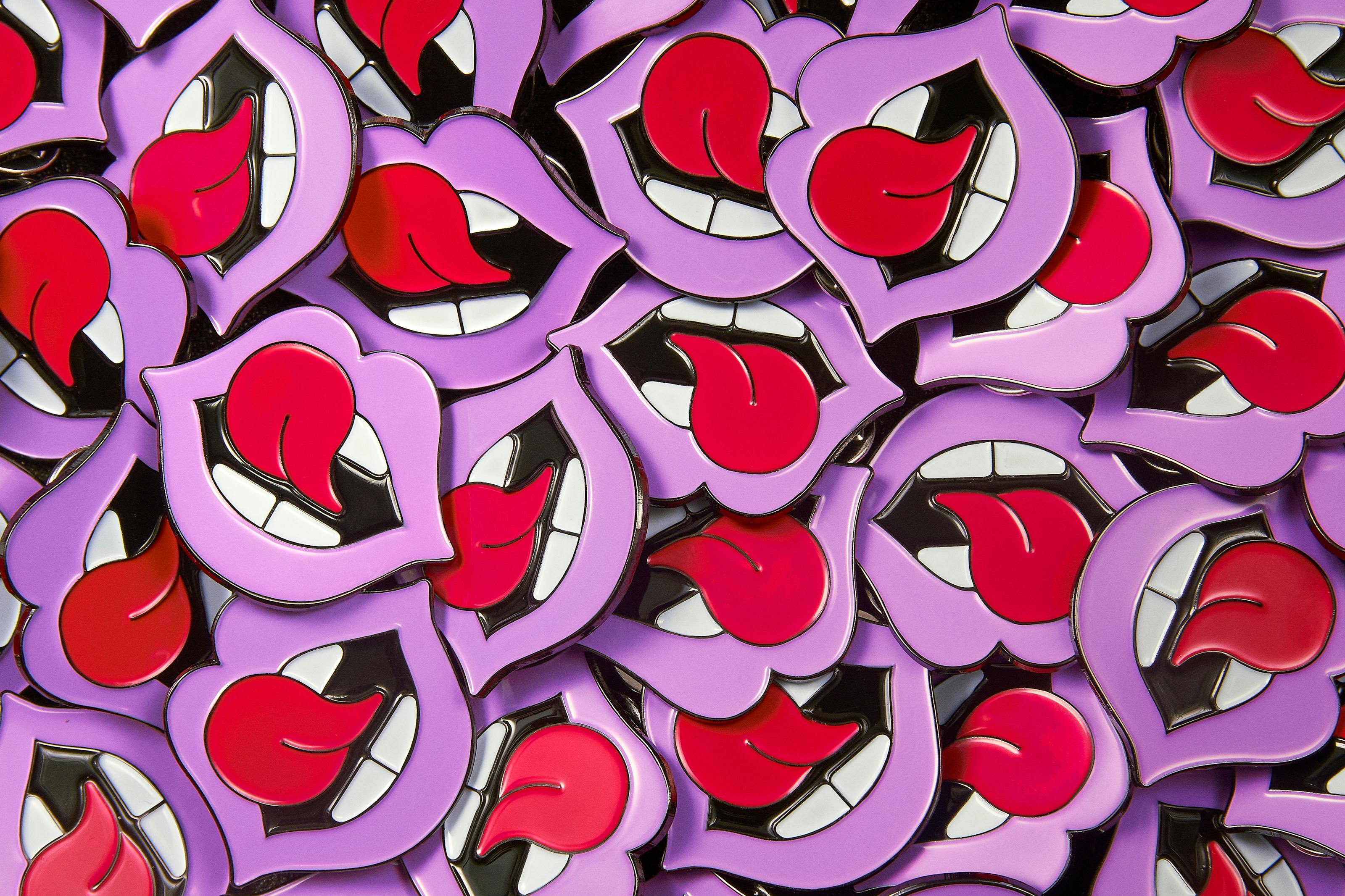
At the heart of it all is a mouth: a big, raunchy, lip-licking, siren of a mouth. This works as the anchor tying the whole thing together, and firmly placing the ‘dirty’ of the name in the realm of ‘John Walters-esque filth’ as much as in the sphere of junk food.
Dirty Vegan ‘specialises in unhealthy junk food such as burgers and craft beers’, says Nilsson. And this is made very clear throughout the branding: not a splash of green in sight, no twee ‘bio’ stuff here whatsoever. It’s all naughty, all playful, all fun, and crucially, it’s all disarmingly direct.
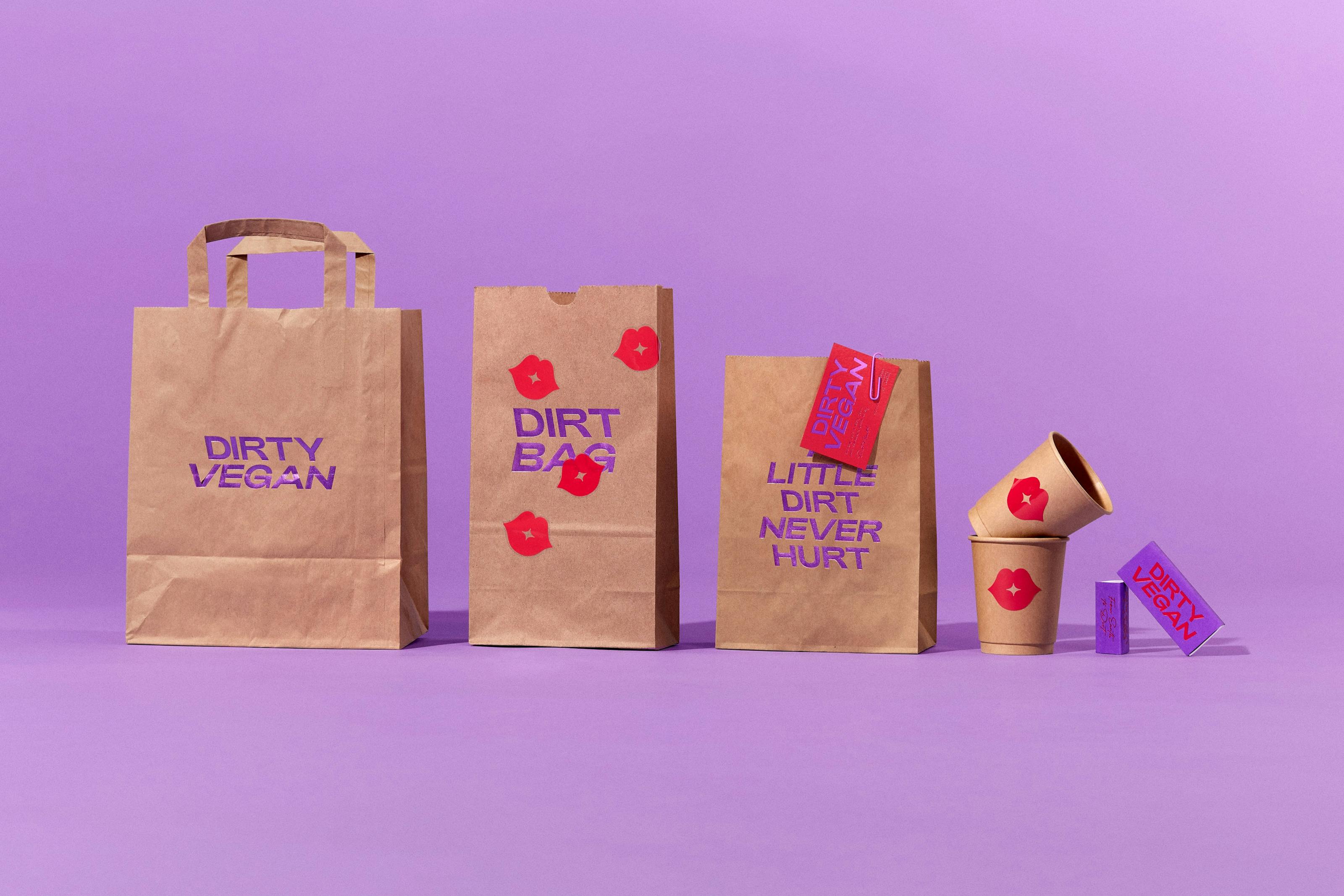
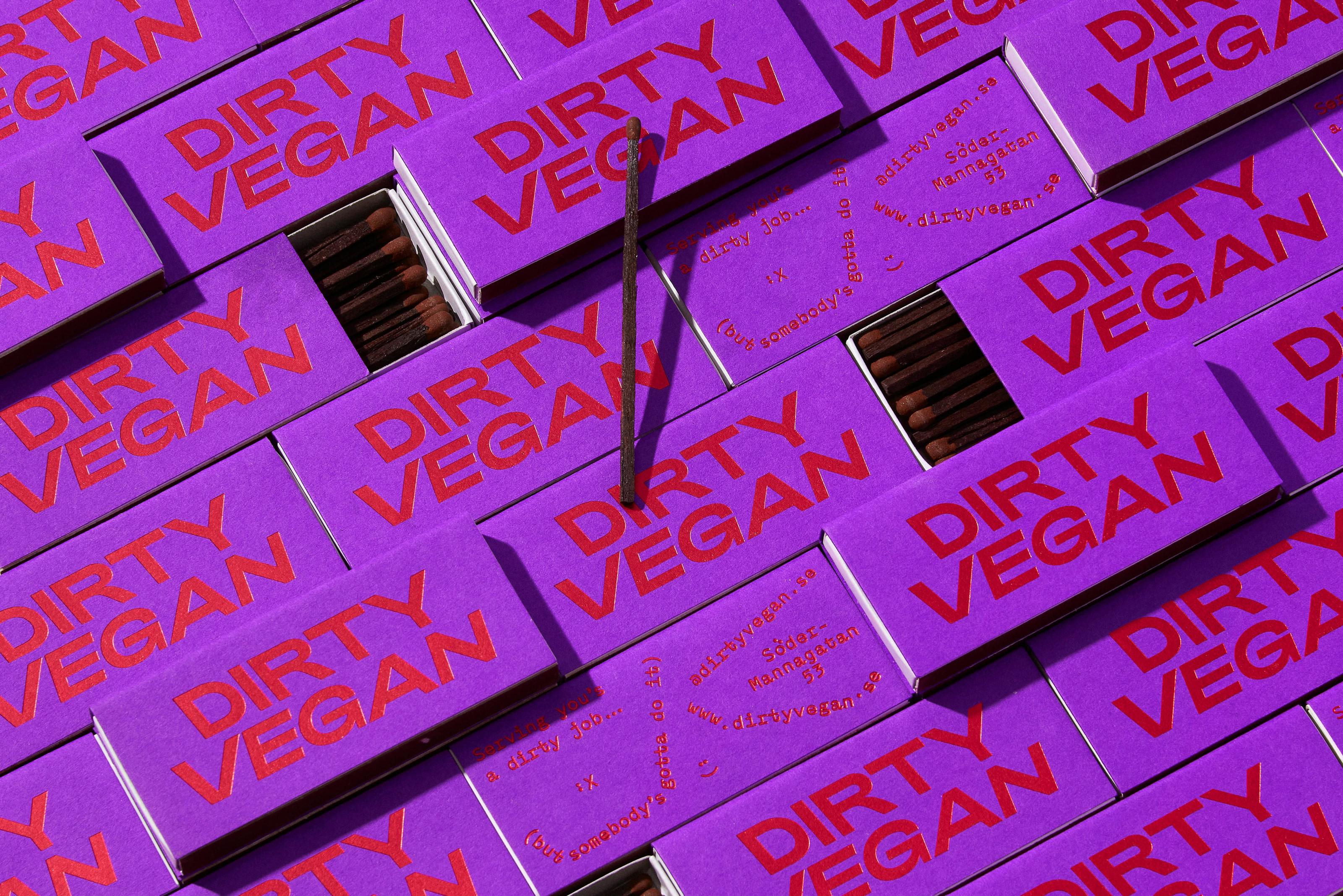
There is absolutely no messing about with the colour palette, limited to a stripclub shade of purple and a vibrant red. Aside from the palette, the entire identity hinges on those lusty lips and some all caps type. We’re not 100% sure of the typeface the wordmark uses, but it looks a lot like the Bold weight of Adieu by Good Type Foundry, based in Oslo, Norway, with some adjustments to the slanting and the kerning.
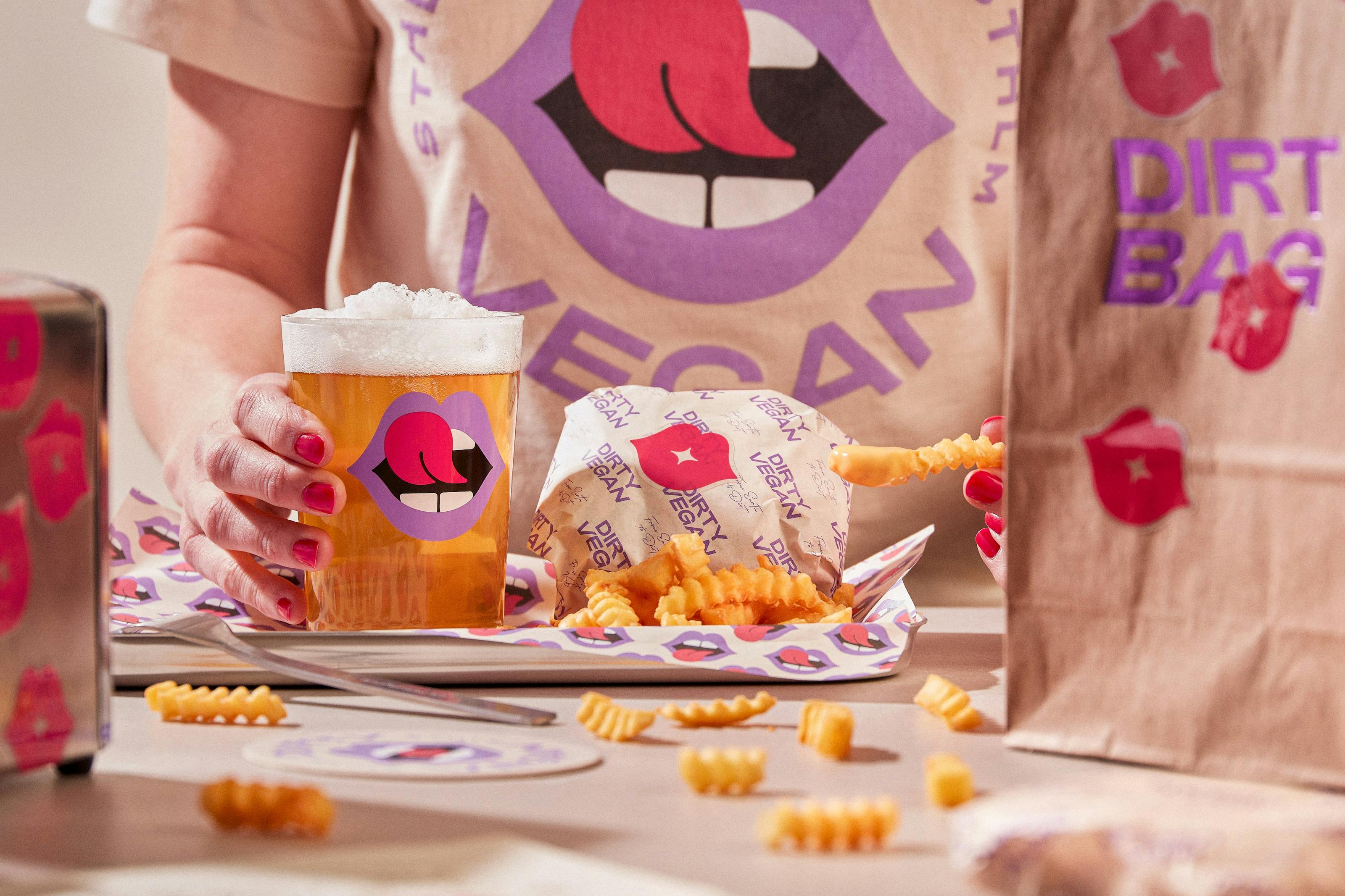
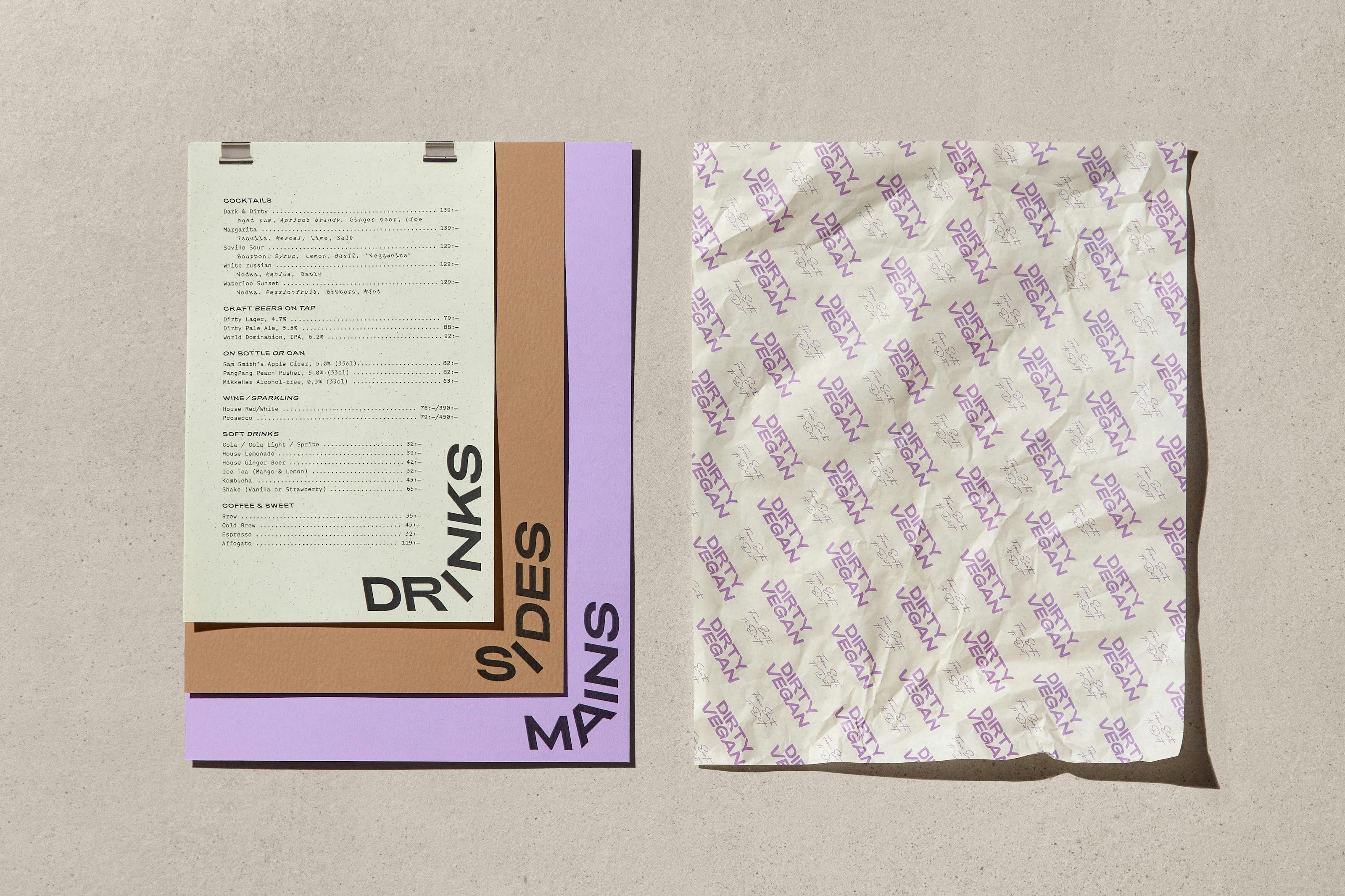
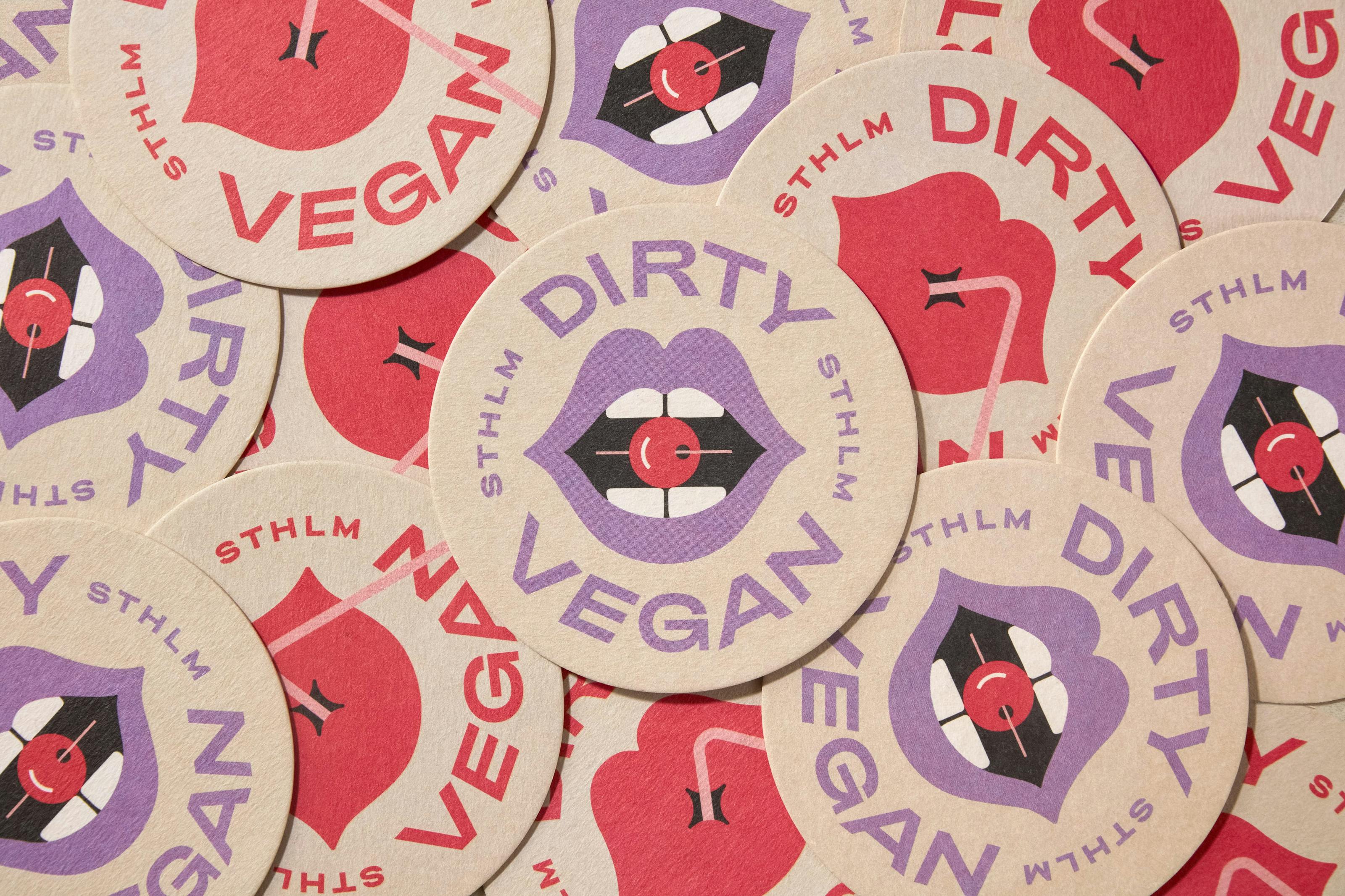
The choice of materials works really well with such a simple identity; and it’s clear that a lot of thought has been put into the tactile elements. Often, organic but utilitarian materials like brown kraft paper make an appearance; but with an added element of sass – the shiny foiled embossed block type on the branded envelopes, for example.
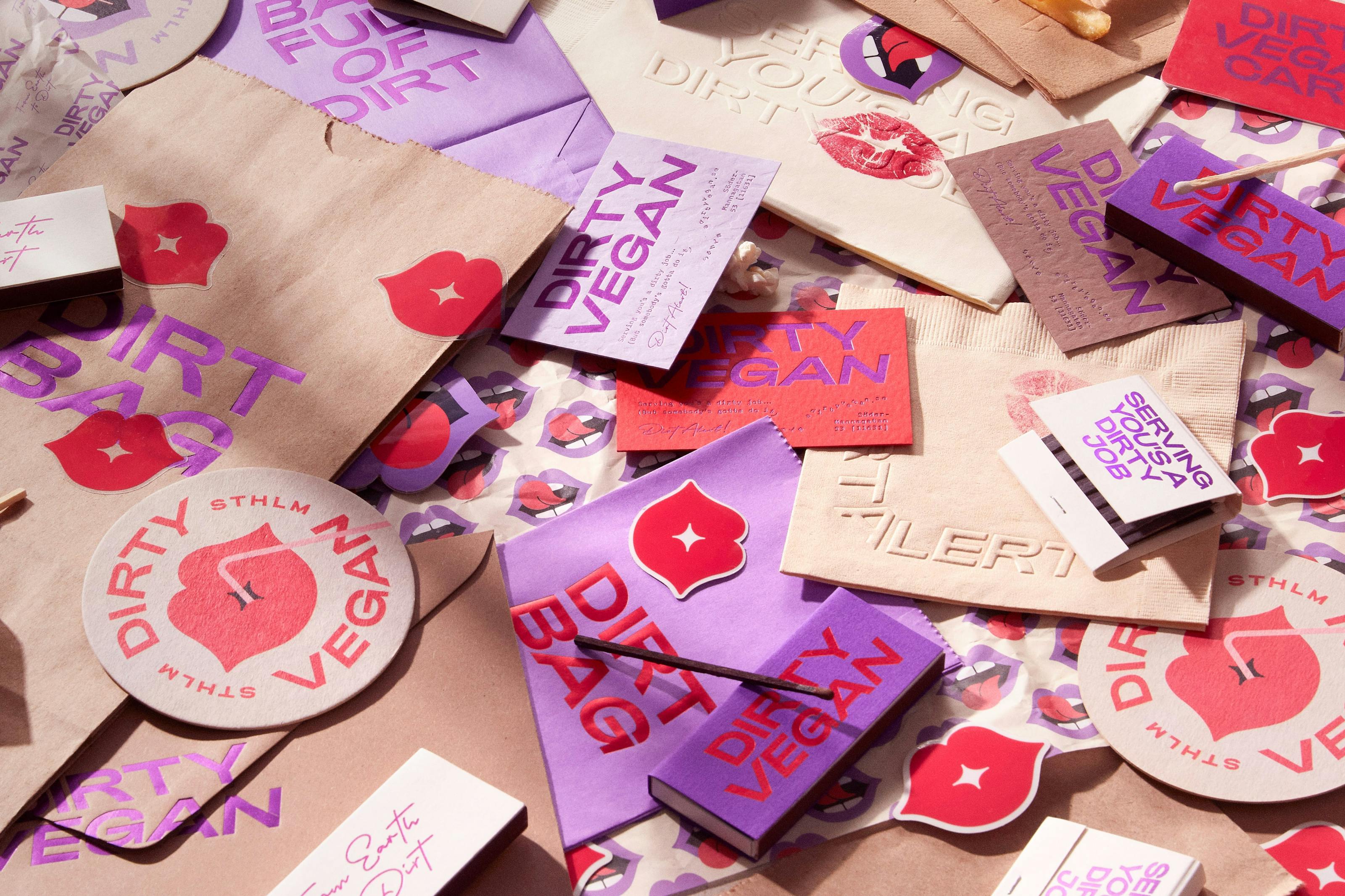
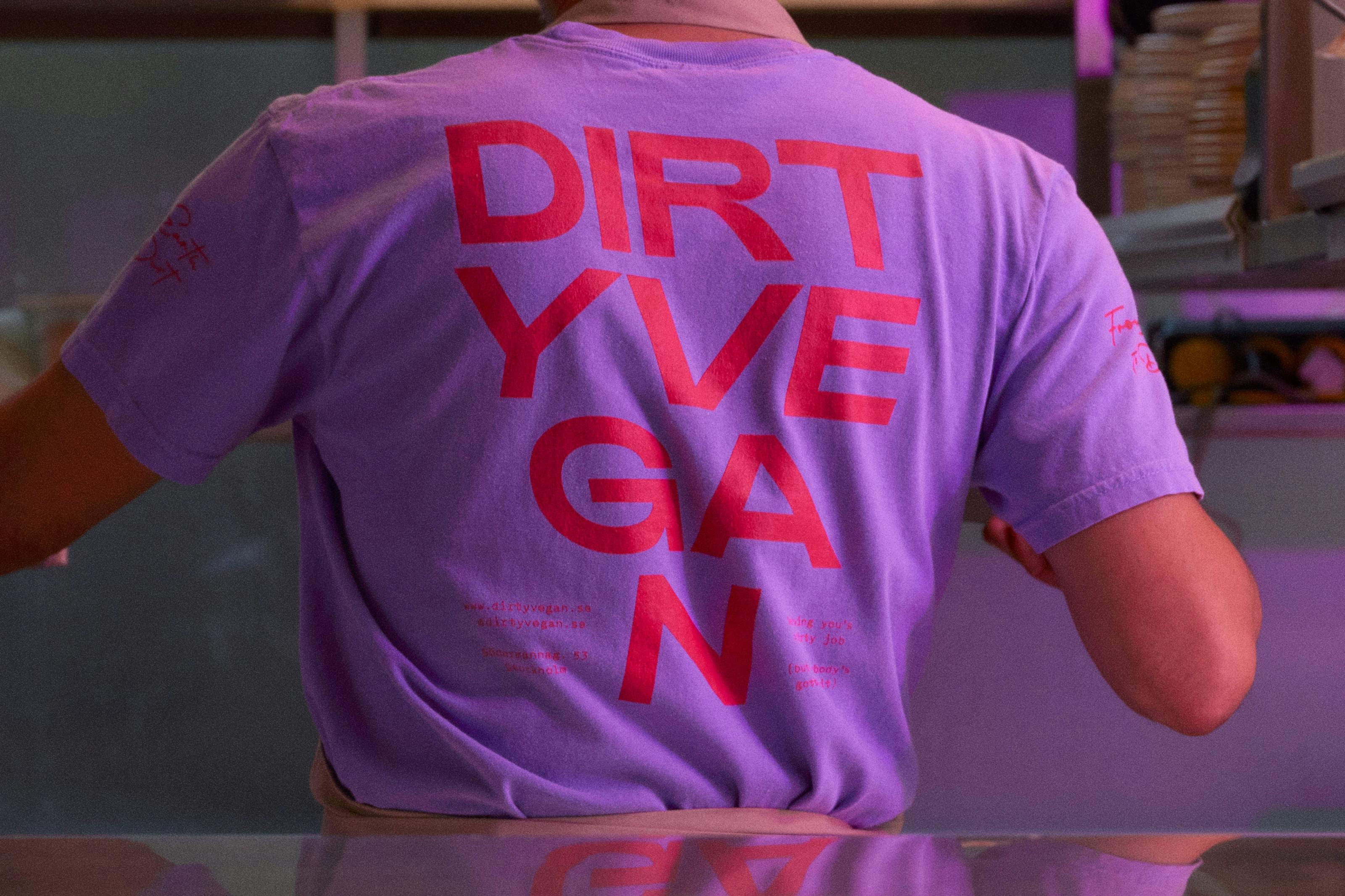
Nilsson was keen for the identity to shun ‘the conventional image of a traditional all-green, health-centric vegan culture’ and he’s certainly achieved that. Sadly, the site itself is shut for now, but according to the designer there are ‘plans in motion to reopen in a new, highly desirable location in the near future’.
The identity works brilliantly as stark, flat, two dimensional graphics and in motion online; as well as when it comes to life in physical manifestations such as on food packaging; merchandise such as pin badges and (obv) tote bags; pint glasses; and in the restaurant interiors as big, in-your-face decorative neon pieces. It’s a lot of fun – just like vegans. Honest.
Discover more assets from Dirty Vegan and thousands more assets from brands past and present at Brand Archive.
