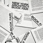
New York Architecture Book Fair by Pentagram
Storefront for Art and Architecture is an independent not-for-profit art and architecture organisation, located in New York’s Soho, dedicated to advancing architecture, art and design. To further this remit the organisation developed the New York Architecture Book Fair, an event and platform that brings together authors, designers, publishers, critics and readers to consider, through a programme of discussion, installation and pop-ups,...
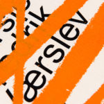
Fredrik Værslev As I Imagine Him by Zak Group
Fredrik Værslev as I Imagine Him is an exhibition of work by Norwegian contemporary artist Fredrik Værslev produced over the last decade. The exhibition runs from September 2018 to January 2019 at Astrup Fearnley Museet in Oslo. Through a focus on process, modes of abstraction and representation, motions between the painterly and the architectural and in the use of untraditional tools...
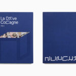
Nunchi by Bedow
Nunchi is an Italian startup and the vision of Cedric Naudon, a self-confessed gastronome. This follows his ambitious project to create an entirely new creative neighbourhood of restaurants, fashion boutiques and design stores in Le Marais, Paris. Nunchi intends to frame and connect all of Cedric Naudon’s gastronomic projects. The first of which is a reimagining of Edouard Nignon’s classic cookbook L’Heptameron des Gourmets,...
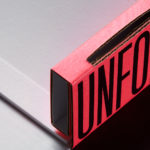
Unfolded by Commission
Unfolded is a design and print festival that celebrates the creative work happening across Europe in the disciplines of design, printing and brand communication. This was held by and at The Gmund Paper Factory in Germany on the 9th November 2018. The event created a space for sharing ideas and fostering dialogue between creative individuals, providers of printing services, brand...
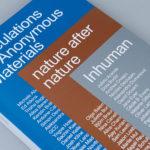
Speculations On Anonymous Materials by Zak Group
Speculations on Anonymous Materials (2013), nature after nature (2014) and Inhuman (2015) is a trilogy of exhibitions, curated by Susanne Pfeffer, that took place at Fridericianum, Europe’s oldest public museum, located in the German city of Kessel. The exhibitions, which mark the institution’s turn towards post-humanist thinking, intended to demonstrate how current artistic practices shift the theoretical boundaries separating the...
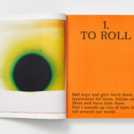
MacGuffin Magazine. No.6
MacGuffin is a biannual design, art and crafts magazine that commissions stories on, around or jumping off from ordinary things, uncovering personal and curious relationships with the objects that surround us. Issues 1 to 5 explored The Bed, The Window, The Robe, The Sink and The Cabinet. The Ball, MacGuffin Magazine No.6 Autumn/Winter 2018, the one BP&O has its hands-on,...
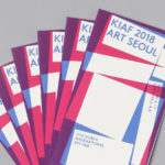
Korea International Art Fair 2018 by Studio fnt
Each year KIAF plays host to and brings to the Korea domestic market the artworks of international artists and galleries. This year, the 17th Korea International Art Fair took place between the 4–7 October in the city of Seoul. With a desire to become the pre-eminent art platform of South Korea, serve as a conduit between the Asian and international art...

Rimowa by Commission
Rimowa is a Cologne-based manufacturer of luxury luggage. It has a significant history, beginning in 1898 as a travel and leather goods maker known for its innovative approach, and growing to become an international brand with a line of polycarbonate and aluminium products with a distincive ribbed relief. Commission worked with Chief Executive Alexandre Arnault and Chief Brand Officer Hector Muelas to create...
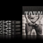
Tatau by Inhouse
Tatau chronicles the rich cultural history of Sāmoan tattooing, from its beginnings 3,000 years ago to the practices of today. Tatau takes the form of a 320 page hardback book (255 x 200mm) illustrated with historical photographs from the nineteenth, twentieth and twenty-first-century, diagrams, film stills and images of posters and related artefacts. These were brought together by Sean Mallon and Sébastien Galliot,...
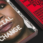
Innsbruck International, Biennial of the Arts by Studio Mut
Innsbruck International, Biennial of the Arts is a 16-day event set over 10 locations presenting the work of over 20 international artists who are invited to make use of Innsbruck’s historical and contemporary venues. Together, these works reach across the wide spectrum of the visual arts; from painting and sculpture, film and sound to performances and installations. Although events of this kind...
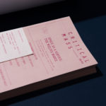
Critical Mass by Foreign Policy
Critical Mass is a biannual magazine that explores a brand’s ripple effect across the globe, from patterns in consumer spending to environmental implications. It intends to showcase, in its curation, commissioning and design, how a brand’s living legacies extend beyond mere aesthetics and profit margins in the face of fast-moving and ever-changing global consumerism. Issue 1 explores the lines blurred between...
Mies In London by OK-RM
Mies In London is a project by Real Foundation that seeks to document modernist architect Mies van der Rohe’s only design for the United Kingdom, Mansion House Square; a bronze tower and grand plaza located at the heart of London opposite the bank of England and commissioned in 1962 by Lord Peter Palumbo. Following a long struggle with Royal and...