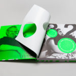
Eero Aarnio by Bond
Eero Aarnio is a Finnish designer and one of the great innovators of modern furniture design. He is perhaps best know for his Ball, Bubble and Puppy toy, and his pioneering use of plastics and fibreglass during the 60’s. 2016 saw the release of a book that celebrates much of Eero Aarnio’s work, selected from a portfolio that spans several decades,...
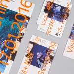
M+ Screenings by Project Projects
M+ Screenings is an event that showcases a diverse collection of work unified by one theme and single screen. It is an ongoing event that takes place over one weekend three times a year. The first of these, Visible Places, took place in mid-January at the Broadway Cinematheque, which is located within Hong Kong’s West Kowloon Cultural District, the second, Forty Years, in...

Prism by Matchstic
Prism is a new thermally fused laminate brand from Arauco—a global manufacturer of sustainable wood products—created to appeal to the art and design market currently dominated by well-known brands. Arauco worked with American graphic design studio Matchstic to develop a brand identity for Prism that would communicate the value of a product often perceived as low-value within a market that often favours reclaimed woods and...
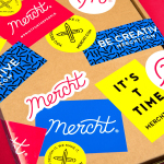
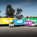
Mercht by Robot Food
Mercht is a UK based custom merchandise business, created by the team at Awesome Merchandise, that offers its customers a risk-free way to design, sell and ship customised t-shirts and wearable accessories, through an online showcase and print on demand service. It is a platform where, if designs sell well, both parties profit, with neither loosing if they do not. Leeds based graphic design...
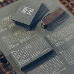
HEWN by Föda
HEWN is an American architectural woodworking shop, custom furniture fabrication and metalworking business with extensive facilities, a team of master-craftsmen, a national presence and local legacy. It also has a preference for native Texas and reclaimed woods. HEWN worked with Austin based graphic design studio Föda to develop a new brand identity that would help ensure market share and longevity, and would lay the...
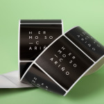
Hermoso Cariño by La Tortillería
Hermoso Cariño, a name taken from the title of a Mexican love song, is a gift shop with unique line of products. These are described as Mexican in the least expected way, leaning more towards the contemporary, but not forgetting tradition, and crafted by a new generation of designers. This is expressed throughout Hermoso Cariño’s brand identity, created by La Tortillería, through a mix of type,...
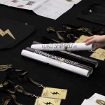
Latin American Design Festival ’16 by IS Creative Studio
The Latin American Design Festival is an organisation that promotes Latin American Design internationally and looks to highlight the social potential of design using lectures, workshops, exhibitions and complementary activities. This year’s festival, as with previous events, took place in the Peruvian city of Lima, with guest speaks that included Stefan Sagmeister, Yuko Shimizu and Stockholm Design Lab. IS Creative Studio, who worked on LADFest’s 2015 visual identity, continue to...
LeMise by DIA
LeMise is a Brooklyn based art and design advisory business, established by Andi Potamkin, described as being guided by the concept of mise-en-scene. LeMise considers the environment as a whole and works with its clients to bring together works of art and design, drawn from a vast network of designers and artists, to enhance space. New York graphic design studio DIA worked with Andi to develop...
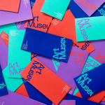
Art Museum by Underline Studio
Art Museum unites the Justina M. Barnicke Gallery and the University of Toronto Art Centre as one new institution dedicated to exhibition and education. It is one of the largest gallery spaces for the visual arts in Toronto and is housed within an iconic gothic-style building. The museum worked with Canadian graphic design studio Underline to develop a new visual identity system that...
InsideSource by Mucho
InsideSource is an American office space planning, design and installation business with 25 years experience and past clients that have included Facebook, Box, Shutterfly and Tango. InsideSource worked with graphic design studio Mucho to help them better express who they are and what they do through a new visual identity. This was achieved using a modular and custom type-based system that runs across tote bags,...

Swedish Forest Industries Federation by BVD
With the intention of better communicating the endless possibilities of the forest, the concept of Bioeconomy and a commitment to a sustainable future, Skogsindustrierna, the representative of the Swedish pulp, paper and woodworking industries, worked with Scandinavian design studio BVD to help move them away from a complicated tonality and give their communication a clarity, focus and accessibility. With this in mind,...
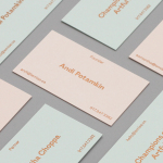
Héctor Ayuso by Mucho
Héctor Ayuso is the founder and director of renowned festival OFFF, a celebration of creative process that takes place each year in the Spanish city of Barcelona. Héctor recently looked to graphic design studio Mucho to help define and express who he is and how he works through a new visual identity. This extends across business cards, postcards and moodbook, and features loose hand...