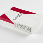
ARTIST | WORK | LISSON by Irma Boom
It’s rare that an art book comes with a personal story. As we ease ourselves into this new strand of the Voices column and as we begin to get to know each other, let me share one with you. I first discovered ARTIST | WORK | LISSON on a shelf in the office at Whitechapel Gallery and thought it was...
Eames Institute by Manual
American industrial designers Ray and Charles Eames fundamentally believed that good design should be available to everybody. It’s ironic, therefore, that today – in part due to institutional bodies, galleries, collectors and capitalism – their work has been elevated far beyond the reach of the common person. Design that was supposed to be accessible has become a symbol of taste,...
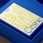
Crane by Collins
In 1775 Crane paper was used to print the first money for the American colonies, and by 1801 the company was the primary paper producer for local and regional banks. Later that century, equipped with an arsenal of innovative techniques from Europe, Crane won a contract with the Bureau of Engraving and Printing and became the supplier for the US...
Logo
Focus Lab
Focus Lab
2021, USA, Design
Logo
Conflict
Boy Bastiaens
2005, The Netherlands
Logo
ArtBird
Mission Design
2022, Norway, Art
The Art Gallery of New South Wales by Mucho
The Art Gallery of New South Wales, founded in 1872 as the New South Wales Academy of Art, suffered from a fragmented brand architecture. Addressing this through a rationalised and simplified system, and reinforcing the master brand across all Gallery collateral became a central part of developing of a new brand identity which would support a repositioning strategy that moved...

Think Packaging by Seachange
Cutting and creasing since 2010, Think is a design-driven structural packaging agency with an over-arching emphasis on form: ‘the neat bevels, the tight creases, the perfect fit’. The team of cardboard engineers has an international reputation thanks to its portfolio of award-winning work for global studios and brands, from startups to industry leaders, including Marx and Supply (New Zealand), OMSE...
Metamorphoses by A Practice For Everyday Life
Metamorphoses is a contemporary art gallery that curates unique pieces by makers who turn one thing into another. It takes a special interest in works that are inspired by the past while displaying keen attention to present issues. These pieces, selected by the gallery, are often drawn from a body of work by artists who reflect on aspects of cultural...
Cable Factory by Bond
Cable Factory (Kaapelitehdas) is one of Helsinki’s most famous buildings, originally designed by the Finnish industrial architect Wäinö Gustaf Palmqvist in 1939. For many decades it was the largest building in Finland with a footprint of 56,000 m², and it remains one of the most iconic. In 1991 the site was redeveloped to become the country’s biggest cultural centre, housing...
LogoArchive – Akogare 憧れ by Hugh Miller
LogoArchive returns with its fourth collaborative Extra Issue and first bi-lingual release, documenting the forms of Japanese logo design. Through the distinctive smaller format of the bound booklet LogoArchive seeks to surprise and delight with each new issue, introducing new collaborators to offer unexpected interpretations of the ubiquitous logo book. For this Extra Issue, Hugh Miller orchestrates graphic impact and...
Ekta: 160 Faces by Lundgren+Lindqvist
160 Faces is a new publication from Swedish artist Daniel Götesson working under the name Ekta, designed by Lundgren+Lindqvist and distributed under the studio’s publishing arm ll’Editions. The book collates 160 drawings made by the artist in 2019, and sequenced, rather than in logical pairs and with a curated rhythm, but by using an algorithm developed by the studio. Applied...