Artek Helsinki by Tsto
Artek is a Finnish furniture and product design business and retailer with a flagship store in Helsinki. It was founded in 1935 by architect Alvar Aalto and wife Aino Aalto, the arts promoter Maire Gullichsen and art historian Nils-Gustav Hahl. Artek grew alongside and shared many of the qualities of the 20th century modernist movement, blending art and technology, and making the...

Modern by Dwell Magazine by Collins
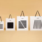
Modern by Dwell Magazine is a new range of home decor products, tablewear and furnishings for those who want to create a welcoming space with a modern aesthetic. It is a collaborative project between design and architecture magazine Dwell, designers Chris Deam and Nick Dine of Deam+Dine, and the American retailer Target. The range features over 120 products. From chairs, tables and glassware to kitchen utensils,...
AIGA Design Conference by Mother Design
The American Institute of Graphic Arts (AIGA) is a professional design organisation with a membership that covers all forms of visual communication, from graphic design, typography and interaction to branding, motion graphics and environmental design. As well as supporting a community of over 25,000 nationwide members, advancing design as a professional craft, strategic advantage and vital cultural force, AIGA organises two...

Galerija Kranjčar by Bunch
Galerija Kranjčar is an art gallery, located at the heart of Zagreb, opened in 2006 to showcase the work of Croatian contemporary artists and function as hub for a variety of cultural activities. The gallery is a long and unique space, one that balances the modern and historic. This can be seen in the meeting of smooth white walls, concrete floor...

In Search Of The Present at EMMA by Werklig
In Search Of The Present is a new series of exhibitions on a 3–4 year cycle held at Helsinki’s Espoo Museum of Modern Art (EMMA). These intend to tackle many of the existential questions that we face in an ever changing world. The first exhibition, inspired by Olavi Paavolainen’s essay collection from 1929, took place between October ’16 – January ’17 and was a study in the representations...

Norwegian Structure by Bielke & Yang
Structure is an exhibition of Norwegian contemporary crafts and design that began its European journey at Milan Design Week in April 2017 and is currently being held at Norwegische Botschaft in Berlin until April 2017. The exhibition features the work of 26 designers and studios, and covers a variety of products and prototypes; from furniture to lighting, to ceramics, textiles and home accessories....

Bespoke by DIA
Bespoke is a New York-based boutique digital retouching company working within the fashion industry and moving into its tenth year of business. With a desire to appeal to an increasingly more commercial clientele while not undermining their roots Bespoke commissioned graphic design studio DIA to develop a new brand identity. With a strong favour for contrast; in colour, proportion and type, DIA establish a bold visual expression...
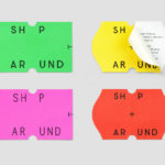
ShopAround by Design by Toko
ShopAround is described as a creative supermarket, however, in more conventional terms, began as an artist representation agency in 1998. It has grown, since then, to become a creative production agency specialising in contemporary illustration, graphic design, animation, motion graphics and interactive design. ShopAround co-ordinates a network of over 80 international freelance designers, and fosters new creative talent from its offices in New York, Amsterdam...

Printed by Somerset by Leo Burnett
Somerset is described as being Canada’s top printer, known for its precision, attention to detail and ability to pull off complex jobs. Alongside reproduction services, Somerset, a family-run business, also provides extensive print finishing services. Inspired by this, the stacked paper of the press, and with the intention of engaging a new generation of designers, Toronto based studio Leo Burnett developed a new brand identity...

Tilly Sveaas Jewellery by Bond
Tilly Sveaas is a London-based jewellery designer, and the designer behind Silver Service Jewellery. This year sees the launch of her first collection under her own name. This features a brand identity created by the London office of international design studio Bond, and included art direction, postcards, business cards and packaging. Through typographic form, colour, material, print finish and image, Bond’s...

Karla Black + Kishio Suga: A New Order by O Street
A New Order is an exhibition of the work of Karla Black and Kishio Suga taking place at Modern One of the Scottish National Gallery of Modern Art between 22nd October and 19th February. The artists, unaware of each other’s work prior to the conception of the exhibition, working on opposite sides of the world, are described as being united in their use of...
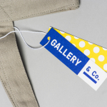
Gallery & Co. by Foreign Policy
& Co. links museum shop, a food and drink retailer and cafe housed within the National Gallery Singapore. These share a brand identity designed by Singapore-based graphic design studio Foreign Policy, built around the basic foundations of modern art and design; primary colour, geometric form and repetition, and Grilli Type’s GT Pressura. This runs across and unites a variety of printed materials that includes, but is...