INTL 2025 by Warriors Studio and NAM
International Assembly began life as Graphic Design Festival Scotland back in 2014, founded by then-recent-ish grads Beth Wilson, James Gilchrist. The pair also helm Warriors Studio, which has been taking care of the festival’s creative direction, branding and design since its inaugural edition, too. GDFS became International Assembly, or INTL, in 2020; and when the new name and identity, also...
Philadelphia Art Museum by Gretel
Creating museum and gallery identities must be both a dream brief and an intimidating prospect for brand designers; a poisoned chalice of sorts. We hear the same challenges time and again when agencies discuss such projects: creating a brand that’s both strong and ownable but which lets the artefacts/art take centre stage; an identity that takes an institution into the...
IAAC by Mucho
The IAAC (Institute for Advanced Architecture of Catalonia) is an organisation which boasts a remit that feels both nigh-on impossibly wide but also hyperspecific. Based in Barcelona and founded in 2001 as a hub for innovation in architecture and design, IAAC describes itself as ‘a platform for producing knowledge to shape the future of cities, buildings and society’. The long...
Windham Campbell Prizes by Pentagram
Back in 2013, Michael Bierut’s team at Pentagram (Twelve Labs, Becan & Natural History Museum) created the identity for Yale University’s inaugural Windham Campbell Prizes, a major literary award that honours outstanding achievement in the fields of fiction, non-fiction and drama. Bestowed by the estate of the writer Donald Windham and his companion Sandy M. Campbell, the awards are administered...
Siuru by Bond
Estonia’s Siuru plays with important questions, subverting and, at the same time, fulfilling expectations. Is it an art museum? A library? A cinema? Or a cultural institution? For a Bond (Veikkausliiga, Saaristo, Cable Factory) the design studio in charge of developing a brand identity for Siuru, this raised the concern, how do you brand something that seeks not to be characterised...
Sustana by Collins
For non-design nuts or print nerds, paper might seem pretty high up in the scale of banality and boringness. That’s likely the reason that the Wernham Hogg paper company was the setting of The Office: paper, and Slough, formed an easy sitcom shorthand for all that was unremarkable, trivial, and emphatically dry. But in fact, there’s a lot more to...
PAC NYC by Porto Rocha
There have been some brilliant logo designs inspired by the very buildings they represent. The Centre Pompidou, for instance, bears a powerfully stark logo that’s been largely unchanged since it was first created in the 1970s: six black stripes crossed by two zigzags representing the site’s ‘caterpillar’ escalator, one of the most famous parts of Renzo Piano and Richard Rogers’...
Beams by Only Studio
The Beams is ‘an expansive new venue and event space on the Royal Docks in the heart of East London’ (that’s as long as you prefer your cartography loosely impressionist). Manchester-based Only Studio was tasked with branding the former Tate & Lyle sugar factory. The award-winning agency has previous form in the field of London industrial-eyesores-turned-cultural-juggernauts: it was also responsible...
GUT by &Walsh
Guts aren’t exactly glamorous. And the connotations of the word ‘gut’ are multifarious: there’s the gory (‘blood and guts’); the Germanic ‘good’; the straightforwardly corporeal; or for those with an interest in newer psychological findings, it’s a wondrous ‘second brain’. Ad agency folk, however, have long taken the word ‘guts’ far outside of the bodily. For many of them, ‘guts’...
National Portrait Gallery by Edit Brand Studio
In June 2023, a giant of British cultural life awoke from a three year slumber. The return of the National Portrait Gallery evokes a joy that is made all the keener when one recalls the troubled time in which it closed its doors: March 2020, as the COVID-19 pandemic took hold and public life evaporated in the announcement of that...
Whale Tales by Interbrand
Every year an impressive 40,000 humpback whales travel along the Sydney coastline. This annual migration pattern is one of the many awe-inspiring natural spectacles that make the city so unique. It is fitting then, that the New Sydney Waterfront Company chose to revitalise Sydney’s Western Harbour Precinct with an installation of thirty whale tail sculptures, telling thirty individual stories, or...
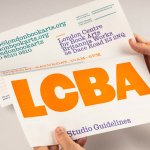
LCBA by Studio Bergini
Not a new project, but a lovely one nonetheless; it seems there couldn’t have been a more perfect fit for London Centre for Book Arts than Studio Bergini when it was looking for a design team to task with creating its new visual identity. Formed by two Central Saint Martins grads – Norwegian Kristian Hjorth Berge and Italian Francesco Corsini (hence...