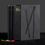
Ekta Sketchbooks Vol. I–III by Lundgren+Lindqvist
Ekta Sketchbooks is a three volume book collection dedicated to the work of Ekta, the moniker of Swedish animator, sculptor, designer and illustrator Daniel Götesson (b. 1978). Limited to 300 copies and available from ll’Editions these present—through pages thickened by collages, drawings and layers of paint and tape—moments of creative relief, and represent the context for the endless experimentation that characterises Ekta’s...
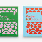
Vestre Anniversary Book by Snøhetta
Vestre is a Norwegian, family-owned and run, furniture design and manufacturing business celebrating its 70th anniversary this year. Vestre’s extensive catalogue is characterised by an intersection between convivial colour detail, modern forms and long-lasting build. Snøhetta, who previously worked with Vestre on the development of a production facility in 2013, and the refurbishment of the company’s headquarters and showroom in 2017, continue to work...
NAU by Toko
NAU is a new Australian furniture brand created by the premium designer furniture and lighting retailer Cult, and features work by futurist designer Gavin Harris and Adam Goodrum, a designer that believes an object justifies its existence through story and detail. Design by Toko worked with Cult to develop name, and create a logo and graphic identity for NAU that...

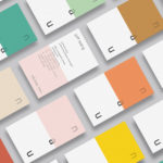
Institute by Commission Studio
Institute is a full service creative studio from New York working with clients to connect with people through creative direction, live experiences, concept development, content creation, production and post-production services. Institute’s work is described as being underpinned by thoughtful and meaningful creativity, and although their clients are often high profile, their presence is intentionally modest. London-based Commission Studio worked with Institute to develop...

Kosmopolis by Hey
Kosmopolis is a five day literature festival that takes place in Barcelona every two years, but also has a programme of ongoing events in between. The festival, since 2002, has been organized by the exhibition and arts centre Centre de Cultura Contemporània de Barcelona, and intends to promote literature in its many different forms. It does this through a series of talks and...
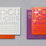
Highlights by Studio fnt
Highlights is an exhibition of works from French contemporary art museum The Collection of the Fondation Cartier pour l’art contemporain at the Seoul Museum of Art (SeMA). The exhibition runs from May 30th to August 15, 2017, features work by artists such as Ron Mueck, David Lynch and Sarah Sze, and also includes commissioned pieces and major artworks by Korean artists. Highlights is curated...

Anna Bjerger Book by Bedow
Anna Bjerger is a Swedish artist, born 1973 in Skallsjö, now living and working in Älmhult. Through a process of reconfiguring found imagery, bought from secondhand stores and garage sales, by transforming their context and reordering hierarchy with paint and a focus on dimension, Anna intends to intensify experience and create new narratives. Swedish design studio Bedow were commissioned to design...
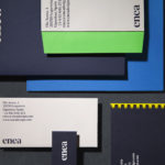
Enea by Clase bcn
Enea is a contemporary furniture manufacturer, located in Spain’s Basque Country, collaborating with respected designers such as Josep Lluscá, Gabriel Teixidó and the trio Lievore Alhterr Molina. Enea has a distinctive catalogue of versatile, comfortable and durable products, developed for both the private and commercial markets, with unique character in their play with form, colour and texture. With a desire to differentiate...
Endgame: Duchamp, Chess, and the Avant-Garde by Hey
Endgame: Duchamp, Chess, and the Avant-Garde was a temporary exhibition that took place at Barcelona’s Fundació Joan Miró between October 2016 and January 2017. It was curated by Manuel Segade, explored the history of modern art through the lens of its relationship to chess, and featured a variety of works by 20th century artist. These included Marcel Duchamp’s La Partie d’échecs, Max Ernst’s...
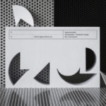
Roger Burkhard by Lundgren+Lindqvist
Roger Burkhard is a creative web development and interactive studio based in Bern, Switzerland, with a roster of clients throughout the creative industries. The studio worked with Scandinavian designers Lundgren+ Lindqvist on the development of a new brand identity. This included monogram, brand guidelines and website, as well as a stationery set that covered business card and promotional cards, letterhead,...
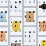
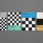
Label Lab by TM
Arconvert, a division of the Fedrigoni Group, will be hosting Label Lab, The Forum for Label and Packaging Innovation, on May 17th at Priory Church on St. John’s Square, London. The event will celebrate the aesthetics and craftsmanship of labelling and packaging design, and will showcase the materials of Fedrigoni’s labelling division Arconvert has to offer. The evening will also include talks by Pablo Martín...
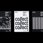
Collect by Spin
Collect is an international art fair that this year took place between the 2–6 of February at London’s Saatchi Gallery. Presented by the Crafts Council, Collect gave visitors the chance to see and buy museum-quality and contemporary ceramics, glass, jewellery, wood, metal and textiles created by established and emerging artists and makers represented by over thirty of the world’s best galleries. Collect’s...