Bag Design
12 by Base Design
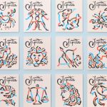
If New York really is the city that never sleeps, that’s in no small part thanks to coffee – and now, increasingly, a newer entrant to the socially acceptable uppers scene, matcha. Capitalising on the growing interest in the sludgy green pick-me-up is 12, a new-ish matcha-centric café and retail store that opened last year in Manhattan’s NoHo area. Sited...

Tsukiyo by The Colour Club
I’d never really heard of Osaka’s Dotonbori district before encountering this project, let alone been there. Neither, I’d guess, have many of the patrons of Tsukiyo, a modern Japanese street food restaurant inspired by the area and based in Sydney’s Darling Square. But the power of great branding is such that even just looking at the identity in 2D, on...
Lunge by Porto Rocha
With trend-forecasting agency WGSN identifying ‘multi-species homes’ as one of the ‘top trends of 2024’, the global market for pet products is project to hit £28.75 billion by 2025 – and this excludes the food category. Even furniture design is increasingly influenced by the penchants of our four-legged friends. Catering to this pet-first design movement, Liberty London, Prada, Louis Vuitton...
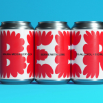
Jupiter by Triboro
Triboro worked on its first restaurant branding project over a decade ago, at a time when the folklore was that if you were a restaurant serving traditional food the visual language should evoke the region and time period of the cuisine. This was intuitive and, as Triboro founder David Heasty recounts, led to some well-crafted and beautiful results but often leaned...
Mama Mexa by Seachange
Tacos are a Mexican staple, consisting of a small hand-sized corn or wheat-based tortilla topped with a range of fillings. They make for perfect on-the-go food, packed full of flavour. This combination of convenience (quick to make or eat) and tastiness has seen the traditional dish rise in popularity as an ideal product to package and sell in many markets....
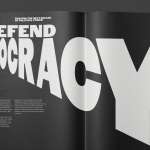
Forward Majority by Order
The balance of power in the US isn’t decided in Washington. It’s decided in state capitols where Republicans have gained overwhelming control, asserting systematic bias on voting rights and election processes. Through policies of suppression and gerrymandering, certain priorities and populations are often neglected in election results. Forward Majority is a political action committee on a mission to accelerate Democratic...
Eames Institute by Manual
American industrial designers Ray and Charles Eames fundamentally believed that good design should be available to everybody. It’s ironic, therefore, that today – in part due to institutional bodies, galleries, collectors and capitalism – their work has been elevated far beyond the reach of the common person. Design that was supposed to be accessible has become a symbol of taste,...
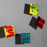
Brutal Burrito by Tres Tipos Gráficos
In 1984, the death of the wrestler Rodolfo Guzmán Huerta – commonly known as El Santo – sent shockwaves through Mexico. Over the course of five decades and 15,000 matches, the legendary fighter had captivated audiences, helping to fuel the growth of Lucha Libre around the world. Through his appearances in film, comic books and cartoons, he established himself as...
Petit Planet by Studio fnt
The Hyundai is one of the three major department stores in South Korea, with its 15 branches across the regions of Seoul, Yeongnam and Hoseo accruing more than $6 billion in annual sales. Petit Planet is the Hyundai’s new specialised children’s division, presenting premium brands in an environment designed to stimulate young imaginations. This post includes Extended Insights for BP&O...
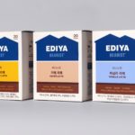
Ediya Beanist by Studio fnt
EDIYA is a well-established South Korean coffee brand, with franchised stores and array of drinks and branded products. It has the largest number of stores, exceeding that of Starbucks and any other international brands, opening its 3000th store at the end of 2019. With such a strong foothold in the market, and with the rise of at-home and ready-to-drink variations...
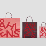
Åhléns by Happy FB
Åhléns began in 1899 as a small mail-order business. Aside from it being one of the oldest it has also grown to become one of the largest retail chains in Sweden. By carefully collating a variety of items across brands and price categories, the retailer maintains its relevance today, understanding and responding to the many ways in which its customers...
Tea & Glory by Socio Design
Tea & Glory are loose-leaf tea experts and are described as the antithesis of fast-paced coffee culture. In the same spirit of ancient tea drinking rituals, the brand is interested in the continued promotion of slow-living, a lifestyle that seeks to place more focus on the small details and experiences of everyday life. With a desire to better express this position Tea &...